Okay, so I had my suppositions about this, but I decided to solve the problem once and for all with some font forensics. Check this out:
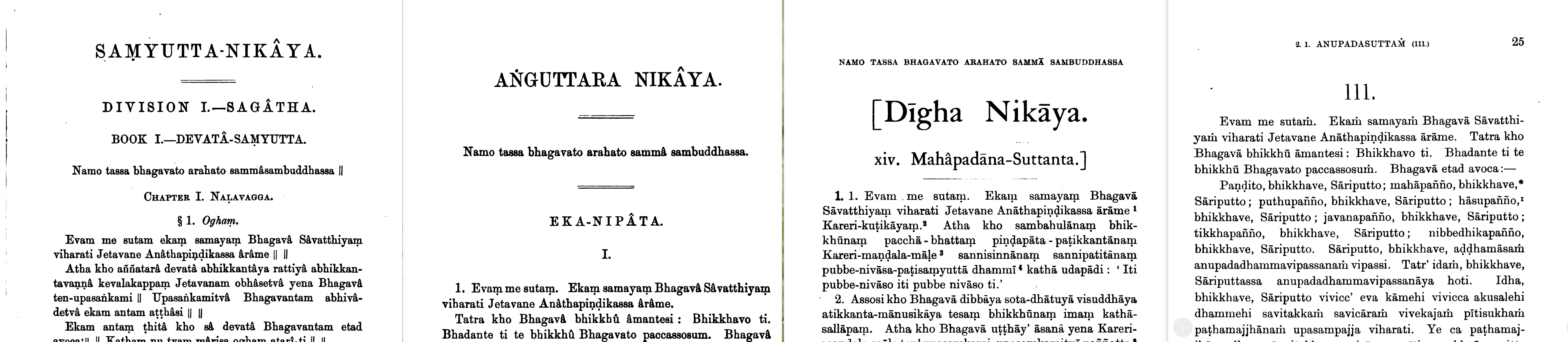
These are scanned images of the original PTS editions, which are still the standard Pali editions in academia. The one on the right is the Majjhima.
As you can see, SN, AN, and DN use the ṃ, while MN uses the ṁ. So we can see that this schism is very old!
Okay, so what’s the difference? Look closer, it’s all in the J. The fonts used for these editions are all quite similar, and it’s hard to tell them apart through the fog of printing and scanning. But the J is noticeably distinct. In SN, AN, and DN, the bowl of the J is like this:

While in MN it’s tighter, curling a little closer to the bottom:

It also seems like the serifs are lighter in the MN font; and the stem is straighter.
Anyway, this confirms my long-held suspicion that the reason for the difference is simply the availability of the letterforms. In the old days, these would be cast as distinct piece of metal, and a print shop would have a limited range of choices. Once the font is fixed, it’s not easy to change it.
Comparing DN vol i and MN vol i, they were published at the same printers, and only two years apart: MN in 1888 and DN in 1890. Yet the typographic styles are quite distinct. DN, for example, uses letter-spacing for emphasis (presumably in the absence of an italic), but this is not used in MN. So it’s likely they were set by different people, and either using their favored fonts, or just what was available.