Back to the main job, how are we going with things? I’ve been pretty much distracted these past few days. I think the relevant bugs are squashed, is that right?
If so, there’s another mobile-oriented job i wanted you to look at. That’s the search result pages. They are not too bad, but could probably do with a little mobile optimization.
Can I ask you to check these and similar pages on mobile and ensure they display well? For the “define” pages, we can suppress the left column on narrow screens if need be.
Sorry, I had some distractions as well over the last few days. Back in the saddle here now and here is where we stand:
The bug regarding the disappearing header does seem to be fixed, but the first thing I will be looking into this morning will be how it was fixed and if my changes were incorporated from staging back into Master. There was a message in this thread regarding a “stab in the dark” by Blake to fix things and that may or may not have been using the code that I wrote in the branch. I will see if I can get a hold of @blake to confirm/determine where we stand with all of that integration stuff.
I still need to look into these other bugs you mentioned:
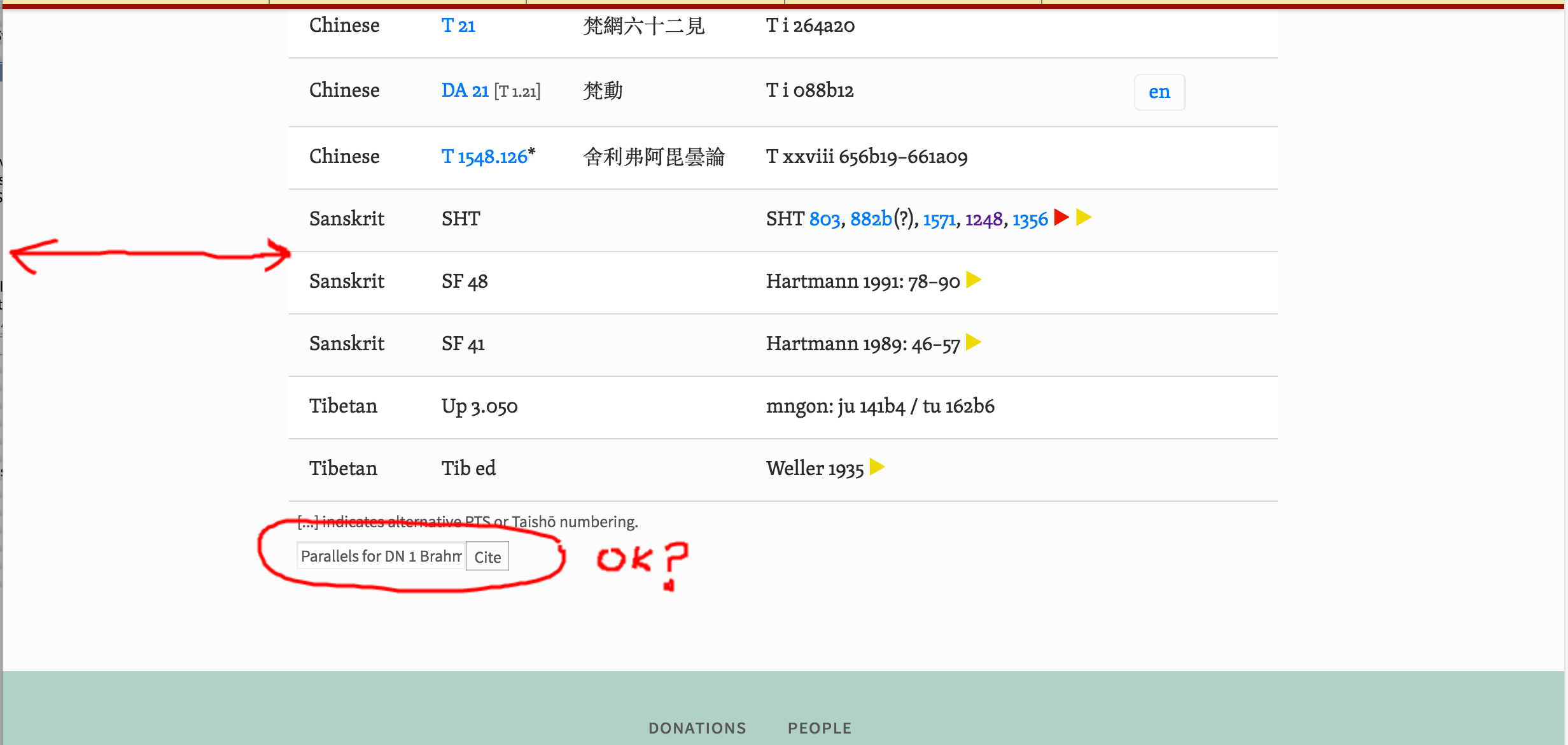
Here is a 2em triangle. Is this about the size you are looking for (note that you might have to base you decision on the relative difference between the old and new size since suttacentral distorts images)?
I could not see anything different in the location or behavior of the ‘cite’ widget on the two pages. However, I did see a big difference in the page margin (see images for both pages below):
I also noticed that the popups (on hover) are not visible at very small widths (ie portrait mode iPhone for eg). It looks like the are being clipped rather than floating above their container as they do on larger width screens. Do you WANT to hide the popup at small widths? Or shall I show them? Note that either choice will require some mods.
The triangles are too small, here, this is why I said 2em; however in the examples you give above, the basic size is fine, and the “2em” size is way too big. So it must be something in how the CSS is interpreted differently. On my mobile (Galaxy Nexus) they show up just as in your screenshots, which is fine. So there is a glitch in the desktop CSS.
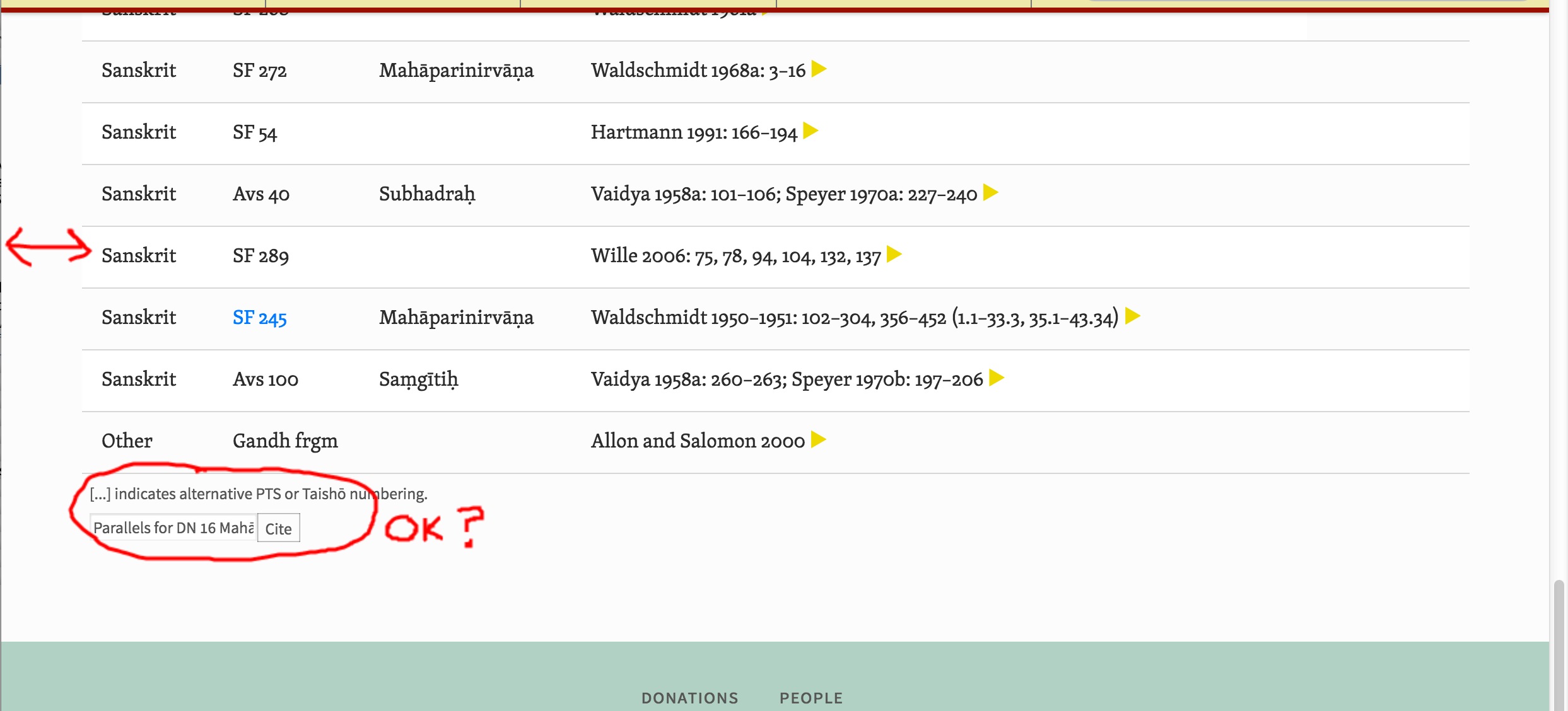
The cite widget is indeed fine, must have been some glitch, so we can forget that. The difference in page margins is fine, the tables are flexible because they include different amounts of infomration.
The popups should show, and they should be consistent across platforms. They are too far away currently from the triangle. If there’s a widley-employed standard for this, we should use it. Popups are never a great idea on mobile; so if you have a better suggestion I’m open to it. However the information in them is very specialized, so it won’t be that often it’s needed on mobile anyway.
Thanks for getting back to me. In regards to this:
I would argue that these pages are actually identical in content (5 columns each, column titles are exactly the same, both are using the same grid layout, etc.). These should really have the same size grid IMHO. For example, if the grid width jumped around like that while scrolling down the page of an excel document (ie somehow based on the content of the particular rows) it would be very disruptive. You can most easily see the problem by opening your browser to a fairly wide width and then put this in as the URL: SuttaCentral . Next, put this in as the URL: SuttaCentral. Now use the ‘forward’, ‘back’ buttons of your browser to switch back and forth. Ugly.
Here is one for Blake to look into. From the ‘textual details’ pages such as the ones that Sujato mentioned above ( eg URL: SuttaCentral), if you select one of the main navigation tabs (say, “Sutta”), then you are taken to this page: SuttaCentral Which looks like the drop down menu, but actually is not. Once this is displayed, the real menu will simply display over it.
Give it a try and you will see if this is not clear.
I see what’s happening, not sure if there’s anything wrong with it. The menu “panels” have their own URL, and if you click on them you are on that “page” Like all pages on SC, they have the top menu bar.
If I remember correctly this was in case of JS failure.
Hmm, hopefully we are not understanding each other as I can see no reason that the menus should behave differently on this particular page as opposed to any other page. Maybe this short video will explain better. Notice how the first click brings up the menu page rather than the popup menu (which is what happens on every other page when you click the tab): https://youtu.be/qilfMDKO3S4
Wanted to let you know that all of the changes discussed in this thread are now in staging.
This includes fixes for:
Popups as discussed (placement and working now on small screens).
Side panel swipe.
This issue:
Cleanup and refactoring of some of the result pages (but I did leave the extra wide page margin that you said was ‘ok’).
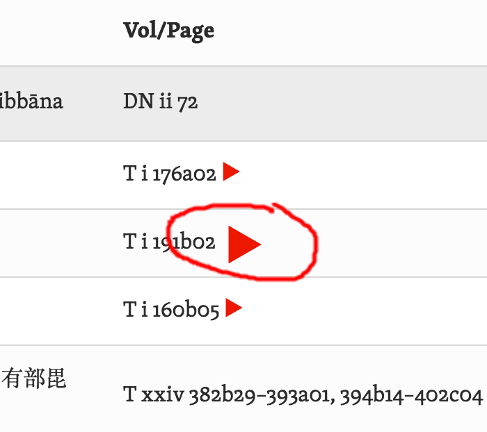
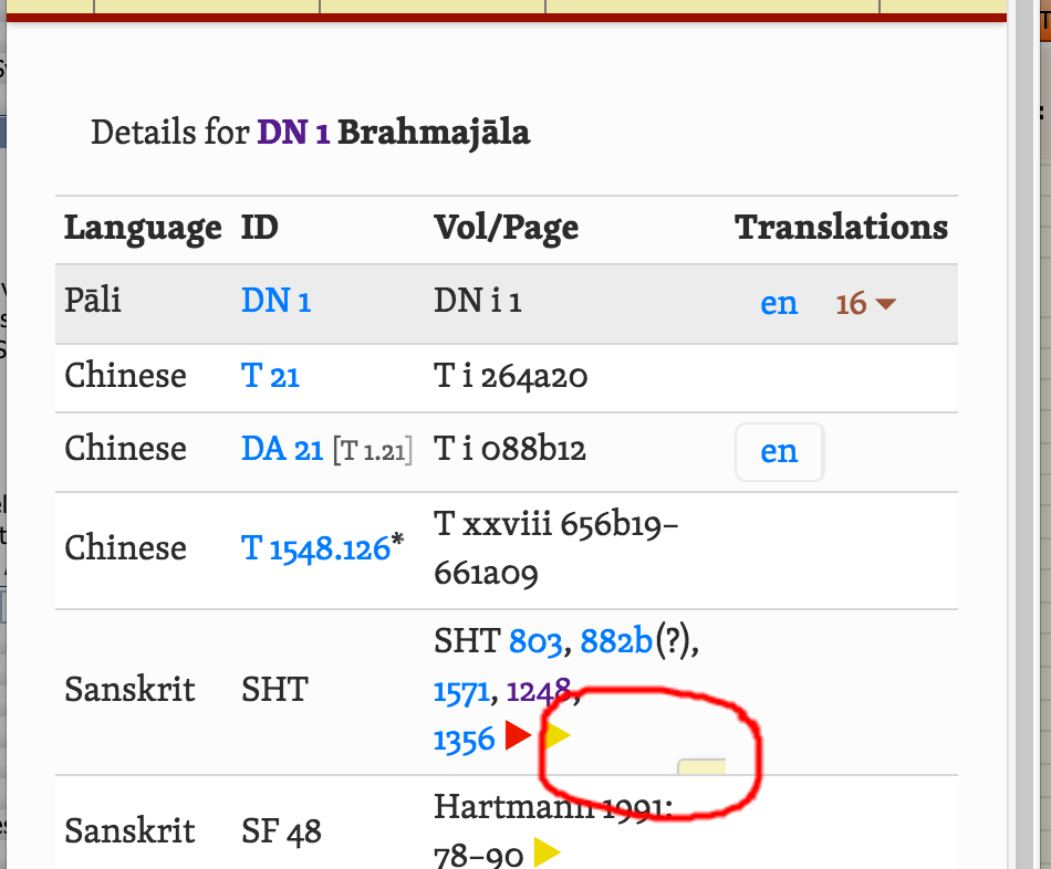
One thing I could not duplicate was those small triangles that you are seeing (as shown in your screenshot above in this thread). I tried a bunch of things (massive screen sizes, etc.). It is especially odd given that those triangles are actually characters and not drawn with css. Let me know if you have any more clues/ideas on how I can reproduce and thus fix.
Make sure to deploy to production once satisfied with changes so that we can avoid the big refactor that happened last time as Master progressed far beyond what was in Staging.
Looking closer, I think the issue may be with font selection. The triangles in Skolar are smaller than those for Source Sans. Probably our web version of the font is missing these glyphs, so it falls back to the Sans serif, but I see the Skolar version because I have it installed. So that means, don’t worry about it, it will only affect those with Skolar installed (not many people!)
I’m also still seeing inconsistent sizes for the triangle in the sidebar. But let’s chalk this up to fonts as well. Actually we have some updates to how we want to handle fonts, this is on Blakes 2do list, so let’s assume these very minor issues will be addressed then.
I’m not seeing any changes on the results page: are we talking about the same thing? We previously discussed the margins on the “details” page, eg SuttaCentral
The problem that needs attention, however, is the appearance of the search results pages, eg
Poor use of margins, sometimes none at all, sometimes excessive
In the “define” pages, the left column (adjacent terms etc) overlaps the main results, it should either disappear or be placed at the bottom of the entry rather than the side.
Right-pointing triangle is missing.
In “search” results page, the search options boxs (just under the search input box) spill on to two lines.
In the two different pages, <span class="type"> and <small class="source"> have the same role in the page, but are styled differently: they should be the same. Best use <small> for both of them, style as for <small class="source">.