It is actually treating it as a desktop with a tiny display, and this is exactly why it is not intended to be used in this way (responsive design tries to adapt to a smaller viewport created by magnifying the browser display, but it reaches its limit sooner or later and then breaks miserably).
Responsive web design by itself is not panacea for all form factors (but it should enable the web site to adapt to the constraints within the different sizes of a single form factor).
Discourse has a separate layout especially for mobile, where space for navigational elements is scarce and needs to be handled differently (and there is a whole lot of magic behind it, because it is needed for this type of an interactive app, while others can do with just a single responsive design for all form factors).
You can select mobile view on tablet or desktop, but it is neither intended nor well adapted for this form factor, because now most of the screen real estate is underutilized (e.g. only one user icon next to the topic, the post navigation tool covers the text, edit pane preview window is hidden,…)
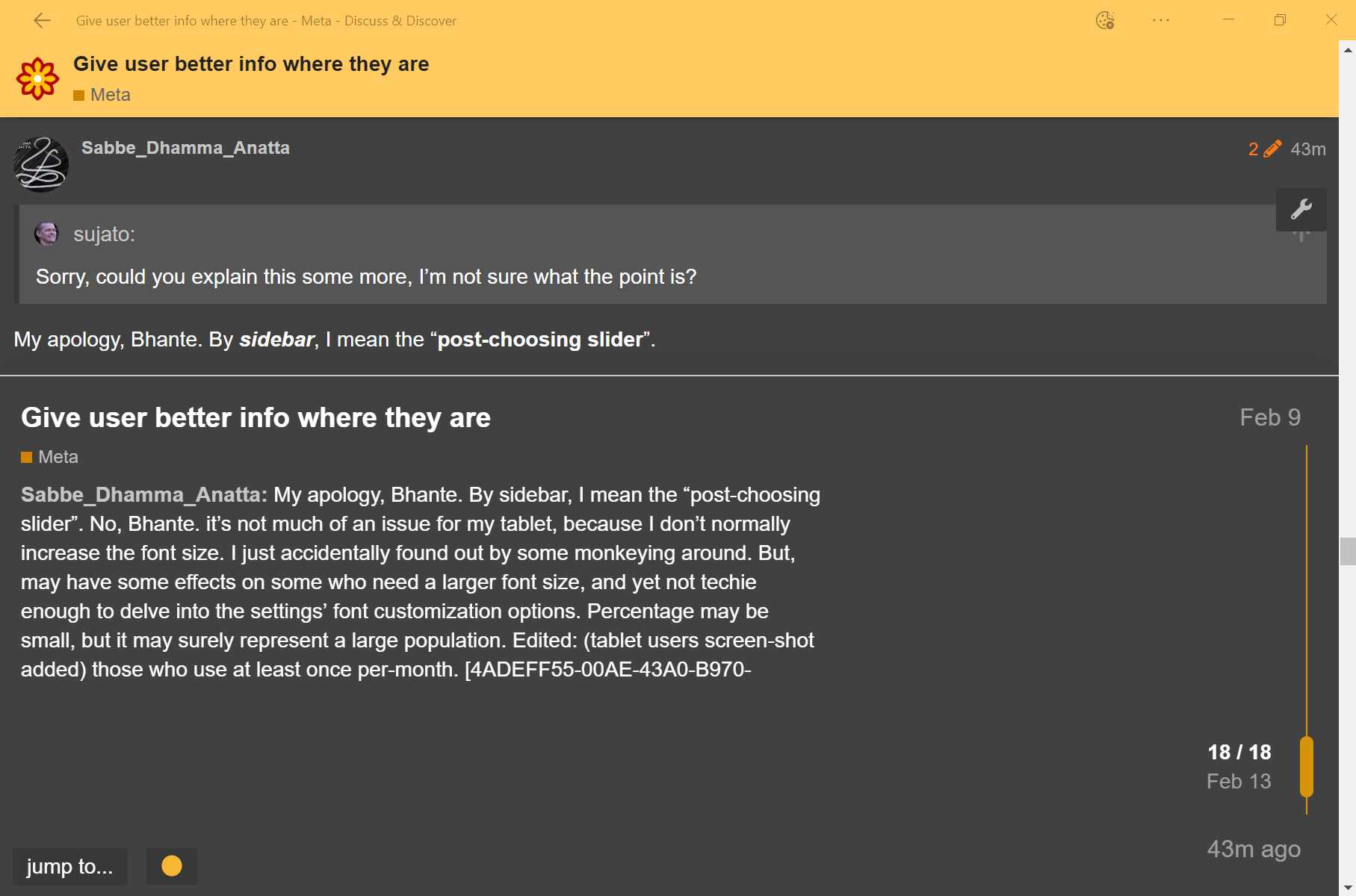
Here is a comparison side by side:


But that doesn’t resize the chrome, just the content, right. The tabs and navigational elements of the browser itself are absolutely tiny on large monitors.
I have encountered many users with diminishing eyesight arguing for a larger screen to help them see better, only to end up with a scaled down physical resolution (which looks horrible on LCDs), because the screen was larger, but so was the native resolution that made every element on screen microscopic.
I firmly believe that this is an OS’s job, to scale the entire display to fit the size, resolution and viewing distance to the same apparent size for the user (and offer the user an option to scale the entire display).
And therefore I see the browser magnification tool as just a crutch for badly written web sites that don’t scale well or at all (I’m horrified when I see people reading such sites on mobile, and two-finger resize all the time just to be able to see anything).
Interesting article, and the responses even more so. But the main feature for me is not the reading speed but the overall feeling of immersiveness. Much like as with the book designs, where you just feel when it is perfect—when there is no more book, nor page, margin, text or font left—just the experience of reading itself.
I use tablets and mobiles exclusively, and the current layout at 80+ characters per line, with the current font size doesn’t really work for me on a tablet (it’s difficult to put it into a metric, it just doesn’t feel right).
But it works surprisingly well on a mobile that has ~35 characters per line, which is on the low side. Perhaps the portrait orientation works better with shorter lines than landscape does with longer ones?