Of course.
After using it a little, I have a fairly significant change to suggest to the design: let me know when you’d like to discuss it.
 SuttaCentral
Of course.
After using it a little, I have a fairly significant change to suggest to the design: let me know when you’d like to discuss it.
I’m not ready implementing the design yet, still working on it. But do you mean a change to your specs above?
yes, that’s right.
OK new version just uploaded to github so have a look at that and I will be with you in 40 minutes.
Ayya, the CSS that’s causing the annoying gaps in the table borders is fixed by the border-spacing. For this design we must separate the table borders (which is the normal default), and then define the spacing. Something like this is a start:
table {
border-collapse: separate;
border-spacing: 0px 8px;
}
https://www.w3schools.com/cssref/pr_border-spacing.asp
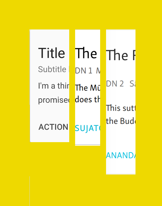
One other thing that we didn’t talk about last night. In the expanded view, each of the suttaplex items for the parallels should contain the same basic elements as the main entry, except for the description. That means we should, I think, add the vol/page info, so for the first entry under DN 1 we would have something like:
Some parallel sutta
EA 1.34 Chinese title of suttaT i 343c
BODHI SUJATO Other ⏷
However, while the content is mostly the same as the main entry, we should make the styling more compact where we can. MD offers the option of:
So let’s use the large title for the main entry, and the small title for the parallels in the table.
For the large title we should use the normal weight: bold is too much. For the small title, let’s see. Try the normal weight, and if that is not prominent enough, use bold.
We want to avoid making these parallel items too tall. So let’s see how it goes; we might want to reduced the vertical padding, for example, above the translator buttons.
Ayya, I have updated the spec for the Suttaplex list in accord with our discussion yesterday.
Just a few notes on this.
I have adjusted the vertical metrics especially, and they are now fairly accurate. I noticed one thing with the MD specs. Check out, eg. this image:

If you look at the main title, you can see that the bottom padding is calculated starting from the baseline of the text, i.e. it doesn’t include the suspender on the “g”. But if you add padding in CSS it usually applies to the whole line-height, which extends beyond the suspender on the “g”. So if you just add the same px to the padding, it ends up way too big. I don’t know if there’s a general solution to this, apart from just visually comparing them. But anyway, for now that’s what I’ve done.
Another point. As we discussed, I had originally placed the expander in the middle of the row, but it is now at the bottom. This is correct as per, for example:

This is not exactly what we have, but the main point is that expander is on the same level as the buttons. That makes sense, since this is the “action row”, and all the things that you can do are gathered here.
However, in the expanded view, the “go to parallels” downwards arrow is still vertically aligned in the middle, and occupies its own table cell. But it would be better for it to be handled the same way as the “expander”, i.e. on the “action row”.
This means that we can get rid of the extra table cell. Since we have already got rid of the first cell, containing the ID, the whole parallel item is now in one table cell, which is nice and simple.
@vimala, @blake I’ve updated the spec for the expanded view. Enjoy!
Also, Ayya, I’m not sure if this is of any use, it’s a polymer element for the expand/collapse behavior.
https://www.webcomponents.org/element/vitantonioc/visual-collapse
I prefer to stick to the more official elements or write my own. Although they can be useful to look at the code and pick out the things that are helpful. Right now I wrote our own element with this one:
webcomponents.org - Discuss & share web components because the paper version had some annoying features that could not be overwritten:
webcomponents.org - Discuss & share web components
Material design icons for bookmarks: I can only find the three variations here https://material.io/icons/. What would you prefer for that icon?
Use the one just called “book”.
@Vimala, @blake, I’ve just updated the spec again. Main changes:
/dn2, i.e. the same as the old “details” view, and like the “details” view it shows the expanded suttaplex for that sutta only.OK, made another draft on https://samanerivimala.github.io/polymer-mockup-sc/
Some remarks:
that’s all looking excellent. We can chat again soon, but to respond to the things you mention:
Fine.
Yes, i see the issue. I think it’s fine for now.
Fine.
Good.
Yes, I agree, let’s use a different color for the original languages
Yes, that should be fine, I think I have reduced the number to four.
Okay, I have looked more closely, and here are some adjustments to look forward to when you get back.
I will reply to this more in detail later, but I have followed MD specs to the letter everywhere. That is why it took so long: to get the vertical spacing right in all cases.
 I am sure you have. Design is hard! Here’s a side-by-side with:
It’s difficult to match things up exactly, what with different font metrics and screen rounding, etc. But anyway, these are as close as I can get it.
So the mockup is close, but the live version has currently got too much vertical space.  OMG! Now we have to find out what is going on. Could it be related to the issue with how MD measures vertical metrics?
One related detail. If you check out the shots above, you can see the that line-height for the supporting text on the MD website image is slightly taller than ours is. I’ve mentioned this before, but just to re-iterate: ours is better! MD has, IMHO, too much line-height on body text. So no need to change anything here.
I guess on this one it is difficult to see: https://www.webcomponents.org/element/PolymerElements/paper-card
because we are missing a few lines and stars.
But please note that one of our buttons is a lot higher than the others, namely the “other languages”; you wanted it to show the words “other languages” above the actual language when one is selected to that button is much higher and will need a minimum of space not to run into the text above.
The buttons are now spaced 8px in between buttons. Buttons are not just the text, but a lot more around the text (I did not add a background to the buttons so you cannot see it, but it shows up when you click on one and the ripple takes the entire button space (it ripples from the point where you click so not necessary in the middle)).
I also don’t think that the vertical expanding card is such a problem on mobiles because on mobiles (or anything under 600px) it will not expand because it does not expand the width but the max-width. The whole view takes up 100% width up to a maximum.
But maybe we should discuss this in person when I get back, I think that will be easier.
Sure, ping me when you’re ready.