You can download spell checker and hyphenator from this link:
https://drive.google.com/open?id=16MB_rIOypsVkPTnbso3BfBBGmAdkI5Tc&authuser=antoniokostanzo%40gmail.com&usp=drive_fs
So, when you have downloaded it, please set the files in the right folder for Affinity Publisher, so that you can use it. Please tell me if you have issue with it.
Remember that you have to choose whether you use Pāli ṃ or Pāli ṁ. You could choose both, but in that case you should create two different languages with two different folders in order to allow Affinity work with both.
3 Likes
Perfect. Thank you. I’ll let you know how I get on
1 Like
Well this is just great. That’s saved a lot of fiddling about. Thanks so much Antonio.
I’m using the Windows version of Affinity Publisher. For those who want to know, I did the following:
- Download the .oxt file that you want (I used the dot over m one)
- .oxt files are like zip files, so run an extraction process on it. I use 7zip for all my archive purposes. In addition to a few other files, that gives you a folder with (I think just) three crucial files: hyph_pali.dic, pali.aff, pali.dic
- rename these files hyph_pi_PI, pi_PI.aff, pi_PI.dic respectively
Now open Affinity Publisher
- Go to File | Preferences
- Click Tools on the left hand side
- At the bottom of the dialog window, press Open to open Windows Explorer in the right place to add the custom dictionary.
- Create a subfolder called pi_PI in that directory and copy hyph_pi_PI, pi_PI.aff and pi_PI.dic into it.
Restart Publisher
To test it:
- make a new document and paste some pali text into it
- create a new paragraph style and edit it. Under Language make sure that Spelling and Hyphenation are both set to: Unknown Locale (pi_PI), and under Hyphenation click Use auto-hyphenation
*Apply the paragraph style you’ve just created to the text and voila:
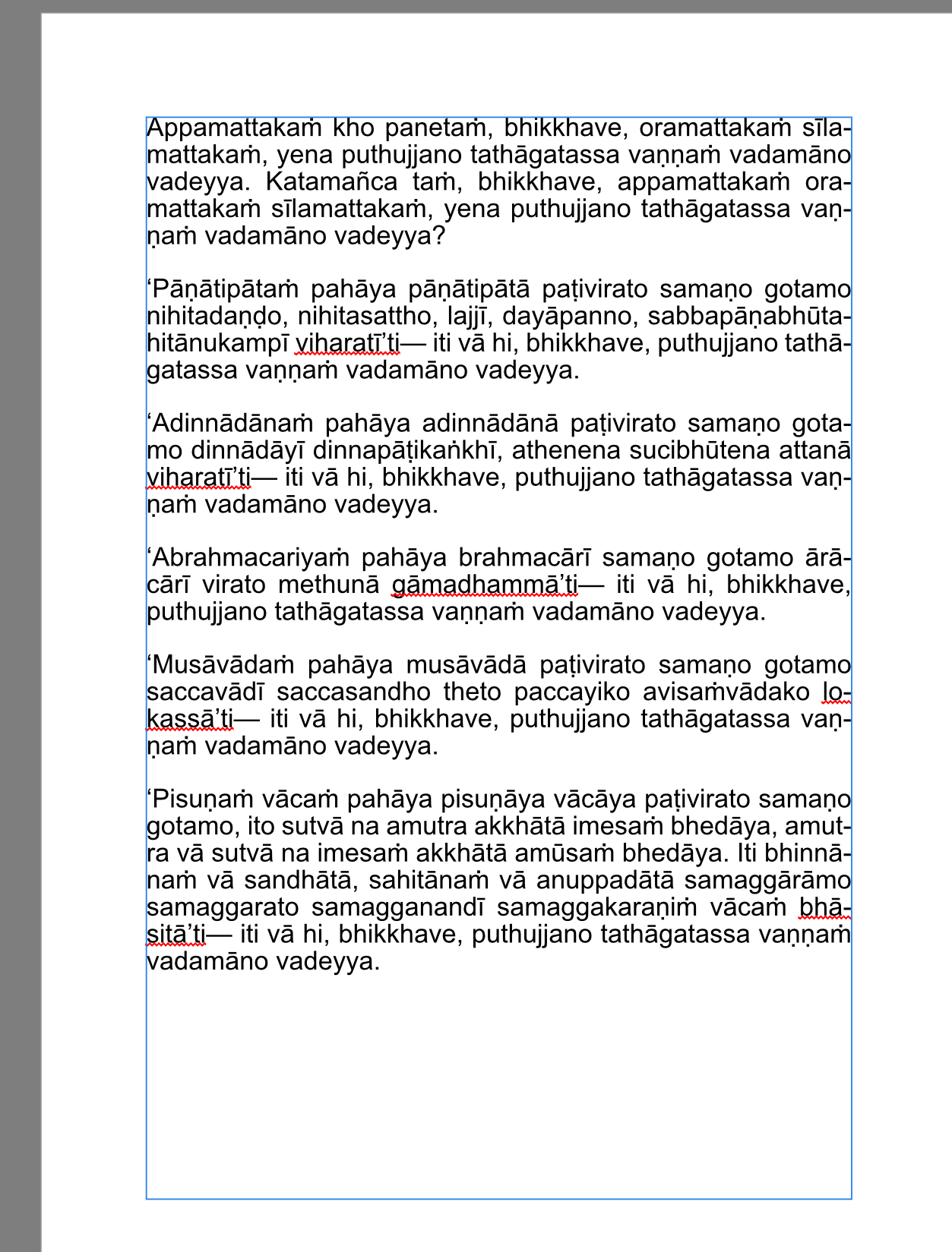
OK, so the 'ti bits don’t spell check, but on the whole that’s fantastic!
Thanks Antonio ![]()
3 Likes
Awesome. Thanks for sharing the instructions.
As a former type nerd I squirm at the sight of full justified pali text. So many hyphens, often line after line. I’d be doing left justified and getting in there and bumping some of the short words around if needed.
1 Like
I’m just learning about typography, Venerable. What a lovely art (maybe craft?).
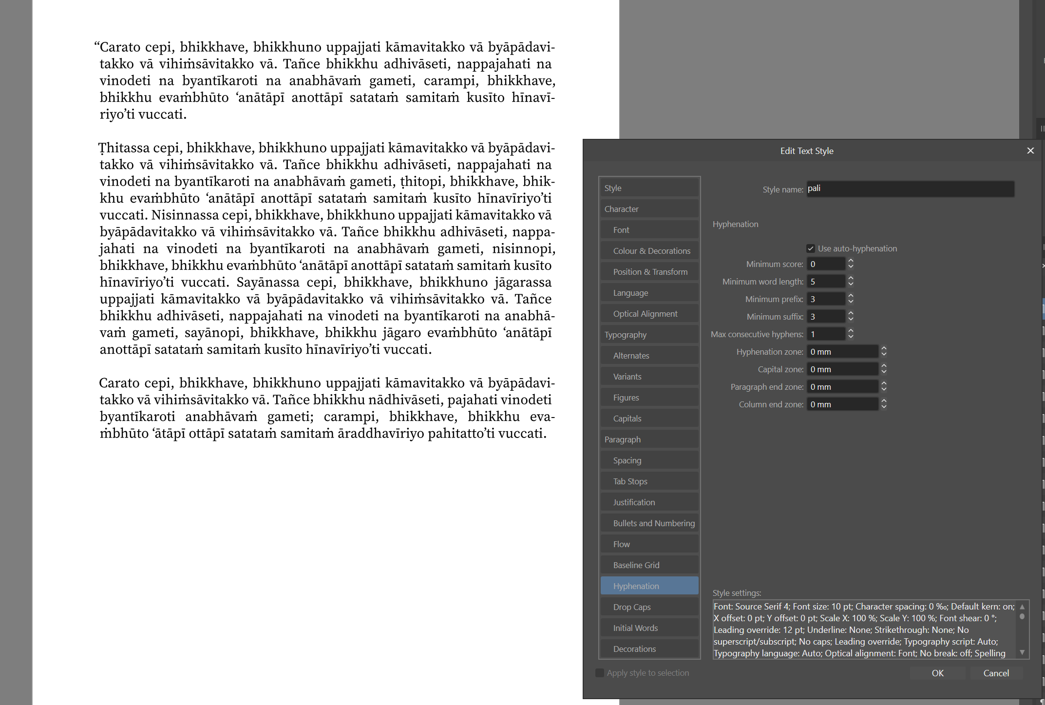
What I’ve shown there is just an initial test using defaults and full justification to show the spell checker and hyphenator working on pali. I am going a little off topic here, but you can do lots of adjustments to those style defaults very easily in the software - things like changing minimum length of prefix and suffix, and the length of word to split; you can also add what looks like microtyping (they call it optical adjustments) too, which is nice.
Here I am using Source Serif Pro font and I have increased minimum prefix and suffix to 3 and set maximum consecutive hyphenation to 1. I’ve also turned on default Optical Alignment.
I wonder if I could ask you to expand your thoughts on this?
Back to Spelling and Hyphenation…
I am using Source Serif 4 font for pali. That requires ṁ to be composed of and m followed by U+0307, which is a combining dot above. See here. Now this is easy to do in Affinity Publisher, but doing so does break the spell checker for words with ṁ in them.
So what I have done is do a global find and replace (using notepad++) of ṁ with the m followed by U+0307 that I made in AP. This fixes the spell checker, but I’m not sure if this breaks anything else in AP, as this is obviously two characters long rather than one.
Since it’s open source, have you considered trying to get it added to the font? Or just create the glyph yourself?
I kinda thought that was what Bhante Sujato was doing in that issue he raised Venerable, but I’m not sure now.
Do what? ![]()
![]()
![]()
ermm … I guess I could learn how to do this. I’ll put it on the list.
To be honest, it works really well on the web as (I think) the browser does all the heavy lifting. It’s just things like LaTeX and Affinity where there is trouble. Affinity does actually render an ṁ, but it just looks very poor as the dot sits below the mean line when the character is in italics.
So I used Font Forge (Portable) to add some glyph, possibly the ṁ, to Roboto Serif. Now, I was working with it as an old fashioned font, not variable weight or anything. It was a little frustrating since the paradigm of making fonts is so completely different from anything else. But I basically just found a glyph with the dot where I wanted it, copied just the dot, and pasted it to the new glyph. The basic letter has to be added in to the font in the right slot.
Of course since I only did it that one time I don’t think I even remembered the next day how I did it. ![]()
It’s actually the font I’m using on the SC-Light app. And I also took that font and stripped out all of the characters not being used just to make it extra slim. But that wouldn’t be an issue for the LaTeX projects.
2 Likes
Knock me down with a proverbial! I’ve just used an online font editor called glyphstudio and it took all of 10 minutes to get what I was after. Thanks for the ideas and encouragement once again bhante. You can in fact see a problem with using combining characters and hyphenation in the last screenshot that I gave on the final two lines of text - evaṁbhūto became eva-ṁbhūto instead of evaṁ-bhuto. Now all works correctly!
![]()
1 Like
LOL, sometimes it just takes a nudge. I think fonts seem complicated because they are complicated. They also seem sacred somehow. However, there are some things that we can probably sneak in and get away with.
Thanks for all your work.
2 Likes
I think the main problem is that the words are often quite long and so you might only get a few words to a line and then the justification has to make funny amounts of space between words to compensate. (TBQH I don’t like justified text in most languages for this reason).
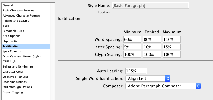
I was taught that the letters in a line of text should feel like the posts in a picket fence, and the spaces between the words are like the gates. The eye should be able to travel continuously across the fence line and the gates should just be enough to let people through. Imagine a fence with lots of different sized gates. Generally, I will left align text, open up the letter-spacing just a ‘tad’ in the paragraph justification settings and close up the words spacing a bit. I’m not sure where this is in Affinity Publisher as I haven’t got around to installing my copy. I’m still running an ancient version of InDesign.
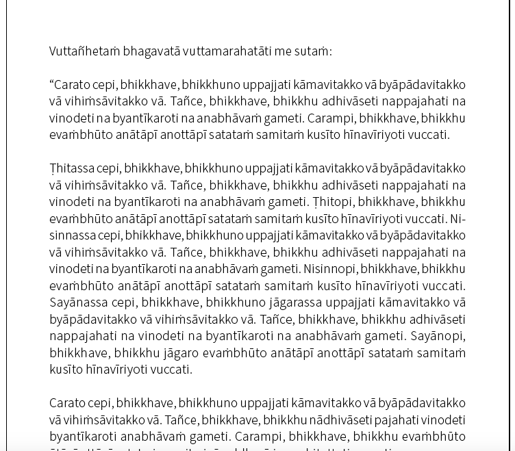
I was thinking a bit about this last night and looking at the few books in my kuti. Scanning down the gutter of the page on books I found to be well typeset you would see maybe 2 or 3 hyphens per page.
I’ve taken the same block of text to illustrate what I mean about getting nice amounts of space between words and not too many hyphens… I even left it justified! For some reason my Source Serif is missing glyphs so I’ve done it in Source Sans 11/14.
4 Likes
Oh Wow! This is excellent Venerable. It makes such a difference. Thank you so much for taking the time to explain. I’ve seen that dialogue in Affinity, but it looked scary ![]() Your explanation and example gives me an inroad into it.
Your explanation and example gives me an inroad into it.
Happy for you to message me if you need help.
I own a copy of all the Affinity apps (v 1) I just never got around to installing Publisher. And now they’re on to V2 :sigh:
1 Like