Most of the time a type face is designed to make reading comfortable. Well, some scientists at the Royal Melbourne Institute of Technology have created a font that makes reading uncomfortable: Sans Forgetica. The theory is that if the brain has to work extra hard to read the font, it will go deeper into memory.
I have often found that with a text like the Dhammapada, because I have read it so many times, I can glide over it without fully paying attention. So I created an ebook edition of Ven. Buddharakkhita’s wonderful Dhammapada here:
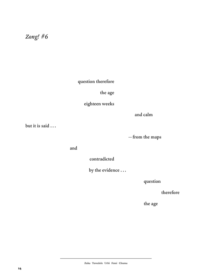
What do you think? Obviously hacks like this aren’t ideal. But it may be worth a try. Here is a sample of the text:
Recently, i saw something called “steading wheels” for adult bike riders. They are what in childhood i knew as “training wheels”.
If these devices get people exercising, reduce stress or risk of injury - lovely! If a font can help people read suttas and absorb them - beyond lovely imo. Personally, i like the font.
Neat! It kind of reminds me of those memes that demonstrate how the brain fills in gaps in text or otherwise manages to decipher confusing strings of symbols.
Memorable and challenging, but not merely through typeface trickery! The design is provoking us.
For more inspiration on what you can do beyond playing with font, I highly recommend the (free!) book Diagrammatic Writing by Johanna Drucker to anyone interested in the visual design of poetry and books.

 Recently, i saw something called “steading wheels” for adult bike riders. They are what in childhood i knew as “training wheels”.