There are small icons at the top of the suttas, for instance:
as shown in the image below, they include a small bookmark icon… but what do they mean? (Incidentally, it’s cool that they are ultimately implemented as SVGs!)
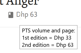
Yes, in certain cases only. Mostly there’s just one, but in a couple of cases the first edition was not done well and it was corrected later. Unfortunately references in such cases may be to either edition.
I don’t know if it’s the site or my machine, but even knowing there was hover text, it felt like it took a while to pop up.
If I’m not mistaken, moving forward the plan is to have the site more geared towards mobile, so hover doesn’t even work. But if it is still being designed for desktop, I would suggest adding the hover text to the icon as well. If it’s easy.
I’ve personally become a big fan of <details><summary> You can style the summary and expanded details however you like, and you get click-based open/close for free (no js) across browsers and mobile and the html is semantically correct / meaningful.
Yeah, me too, we use them a lot actually. On the staging site we have them for the share button on the suttaplexes, for info on text views, for showing extra editorial info, etc.
In this specific case, though, I think there’s enough room to just show the two sources.


