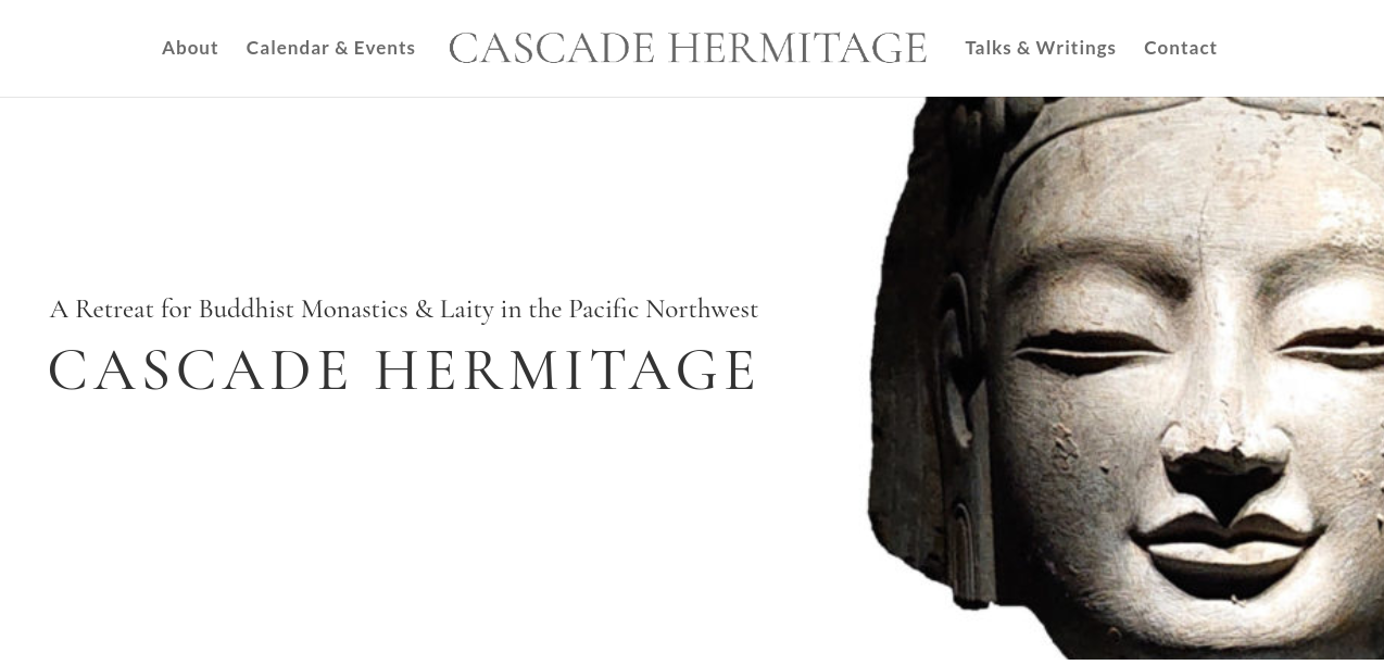
I’ve been so impressed with this community that I’d like to entrust the following task to all of you. After training in Thailand, Australia, and California for the past eight years of my ordination, I’m returning home to my native Washington to look into starting a monastery in Seattle, Washington and supporting my parents, both long-term practitioners, in their founding of an associated retreat center for bhikkhus and bhikkhunis in nearby Winthrop. Both the Seattle-based Clear Mountain Monastery Project and Winthrop-based Cascade Hermitage aspire to offer a Dhamma refuge and teachings free to all who come, supporting both my monastic brothers and sisters.
Though the websites for both projects are now live, neither currently have logos. It would be an honor to see what the generosity of my fellow practitioners might provide. If you are an artist or know one and feel inspired to help create a pair of logos for the centers, it would represent a great gift. I’ve included more detailed thoughts below for those interested. Feel free to post ideas and concepts as responses. Everything is welcome. Sadhu!
The above websites give some idea of the desired aesthetic. The main fonts - CINZEL and CORMORANT GARAMOND used in the titles convey an air of clarity, elegance, and boldness. While Clear Mountain Monastery Project, aligned with nearby Mount Rainier and a purely monastic project, maintains a bolder feel, Cascade Hermitage represents a softer and more receptive endeavor in that it is run by laity, resides in a valley, and will cater to monastics of many traditions as well as long-term practitioners. Logos may be related but should be fairly distinct, if possible.
For inspiration, the following are some of my favorite monastery logos:
Amaravati
Pacific Hermitage
Finally, the following was created as a concept design by Ajahn Kovilo, another monk planning on helping create Clear Mountain (C (moon), M (mountain), M (monastic huts)), get it?
To outsiders, the visual component of the Clear Mountain site comes across as dark in tone. This may be characteristic of the local climate, but it’s not advisable to transfer that mood into the site.
The Amaravati logo is drawn from the main building there, so without knowing the style of the planned buildings such a basis for design cannot be used, so the mountain will have to replace it:
Congratulations on your project, Bhante! Well done.
My only feedback for you is that perhaps referring to the retreat centre as a “sister retreat centre” might not be the best phrasing? It’s a bit pointlessly gendered and makes it sound like it’s a place only for women, or sounds perhaps slightly diminutive, if you know what I mean, as if sister is dependent or lesser? We probably wouldn’t call the monastery the “brother monastery” if we were at the retreat centre?
Perhaps something that doesn’t refer to gender would be more appropriate such as “affiliated” or “associated”?
Sadhu Bhante! Edited. I used “associated” in the site, but didn’t here. Thank you @paul1 - I also am interested in finding a brighter Buddha image under public domain, but wasn’t able to come across anything quite as beautiful yet. If others have public domain photos that would work for the header, I’m most open.
Not a bad idea, but the two Ajahns who draw (Ajahn Sucitto and Ajahn Thitadhammo) are a bit too senior for such requests. I may have to see what comes of this forum first. Thank you for the ideas!
Hi Venerable,
I was a graphic designer before I ordained and could have a look at this. However, I am well and truly booked up until after the Rains. If you’re interested, you know how to contact me.
Dear @Pasanna , thank you for the kind offer. I’m hoping to get something up before then, but if nothing surfaces by then, I may just reach out. Sadhu!
As someone who hails from Washington, known as The Evergreen State due to all the evergreen trees like the Douglas-fir, I think it would be nice to incorporate those in a logo.
Dear @anon56826743 , thank you so much for taking a whack at it. I like the Buddha as the central and simple feature (perhaps I like him more as the mountain metaphorically). Birken’s (above) really is the favorite logo I’ve seen. The curve of the Buddha contrasted against the straight lines radiating, its self-contained nature. I’m leaning towards not having much explicitly in terms of mountain or evergreen imagery, but just that of the sasana. The name is already so explicitly an image, it seems like over-playing our hand to draw it into the logo as well. Something unrelated to mountains is fine. Anumodana again, all.
@Radius - thank you so much for the effort. I quite like the circle and the radiating lines ala Birken’s logo. I might take out the mountains and valley imagery an focus on purely Buddhist symbols. Also, the two logos don’t have to be completely related; a bit of difference could be good as one is a purely monastic endeavor and one is a center run by laity, albeit for monastics.
I so appreciate you taking the time. Big fan of the simplicity of radiating lines.
Hey @Radius, is this just a thinly veiled excuse to bump @nisabhobhikkhu’s request back into view? Yes, yes it is indeed… Surely there are more Buddhist artists out there.
Here’s the design problem: if we have “the Buddha as the central and simple feature” and “the simplicity of radiating lines” then it’s basically going to be +/- the Birken logo. We could add more lines than Birken to adjust for inflation but outside that I’m coming up blank.
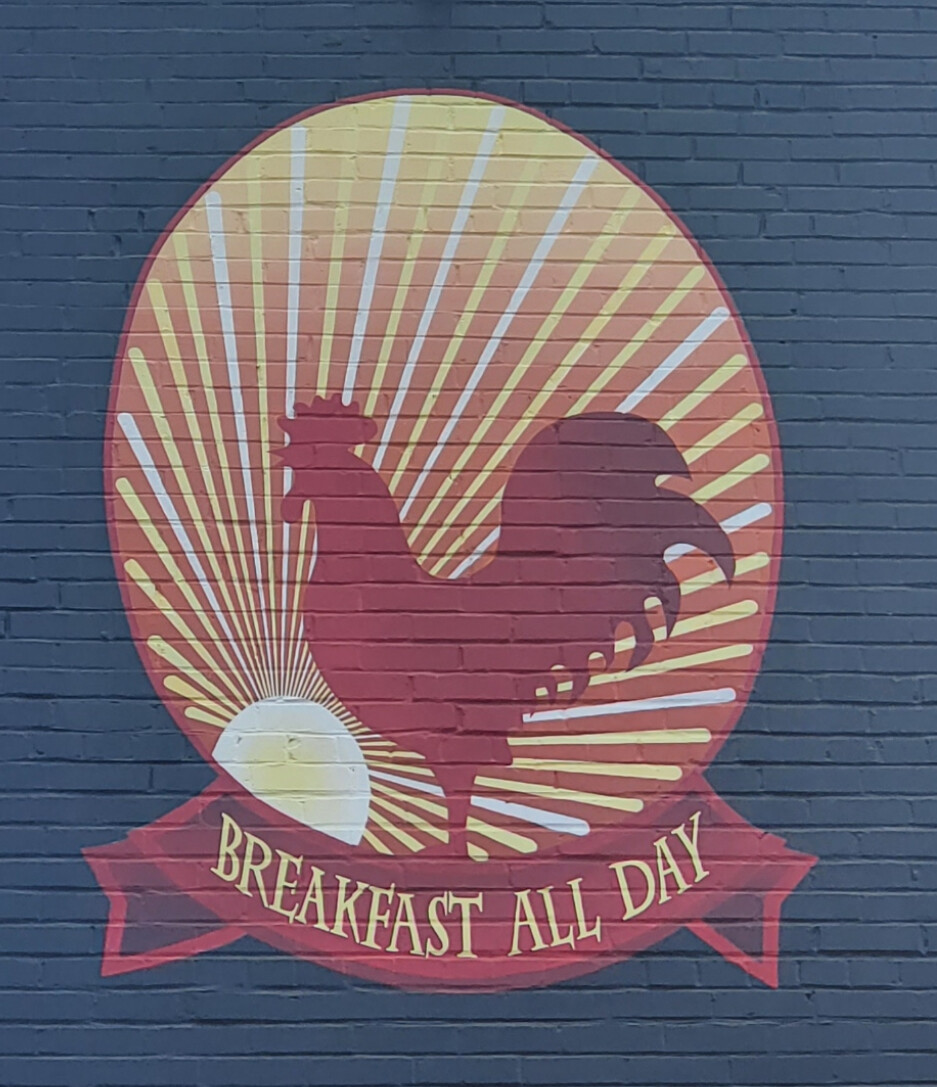
lol thanks @radius. I like the rooster! I agree with the problem of echoing the Birken logo. I’m not set on exact similarities like radiating lines, etc. I do like simplicity and Buddhist imagery, but this is such a generic statement it seems silly. I more was just hoping to see what those inspired in the visual realm might come up with, and tend to lean more towards Buddhist imagery in the logo than mountain imagery, but I’m open. Thanks for bumping the topic!