Up until now, we have always used CBETA as the primary source for our Chinese texts. One of the major technical problems in dealing with ancient Chinese texts is the huge number of characters, including thousands that are not used in modern Chinese. These are known as gaiji.
CBETA developed an XML specification for handling these, which looks like this:
共比丘尼<span class=\"gaiji\">鬪<!--gaiji,鬥,1[鬥@(豆*寸)],2鬪,3--> </span>諍時
Cute, right? So far my policy with gaiji has been to get a cup of coffee and hope it goes away. It’s been years of diligent effort, but hey, it looks like it’s finally paying off!
Unicode is expanding, and many of the gaiji formerly requiring special handling no longer do so. It seems, based on a recent chat with Lewis Lancaster, that the other digital Chinese Tripitaka, the SAT project, is now more advanced than CBETA in this regard. Their home page has a discussion of this issue.
http://21dzk.l.u-tokyo.ac.jp/SAT/index_en.html
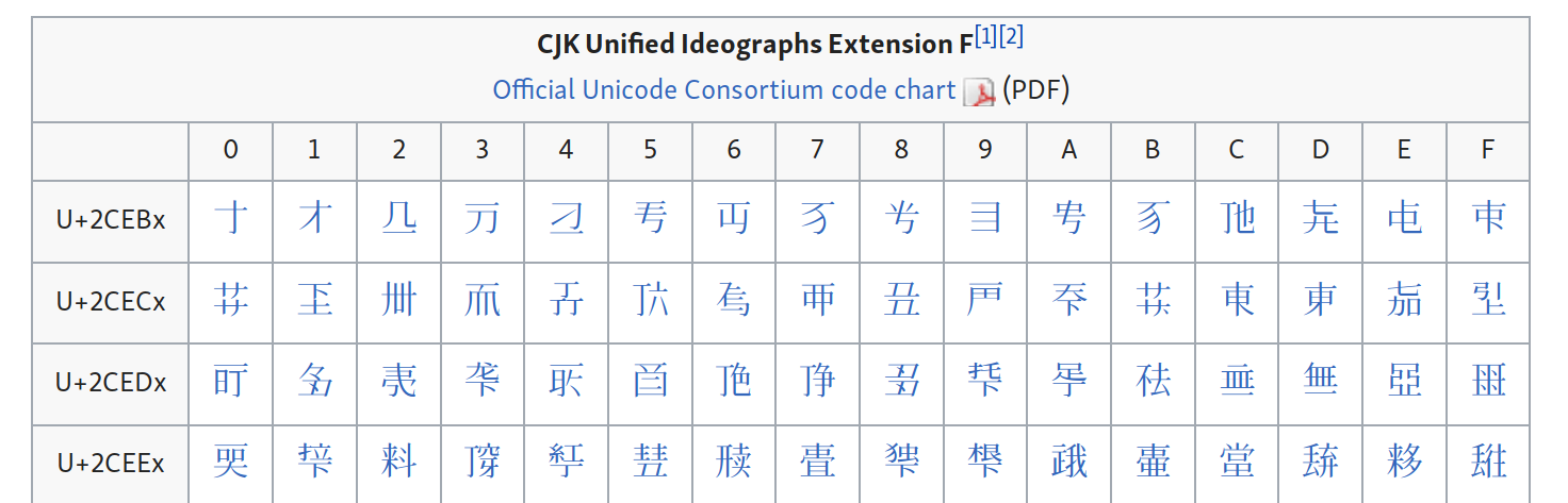
If you check the relevant Wikipedia article, you’ll see that SAT is in fact the largest single contributor to the most recent expansion of Unicode CJK coverage, aka “Extension F”:
I don’t know how far along this process is. Have they encoded all the necessary characters? Are there still more to be done? There’s a PDF explanation on the SAT site, so perhaps @vimalanyani, you can look at this and see what we can glean from it.
I’m not really sure what CBETA is doing about this, so perhaps we should find out. In any case, the Chinese files on SC are a few years old, so they don’t reflect any recent changes.
If, as it seems, SAT is now taking the lead in this field, perhaps we should switch to them as our source? Given that we are now beginning a new generation of translations on Pootle, should we use it as a testing ground for the new texts?
So here’s the glass half empty.
Just because somethings in Unicode, it doesn’t mean you can see it: you have to have a font with the actual characters. Go here to view the new characters:
You will, I suspect, see what I see: a page of empty boxes, or “tofu”, like this.

Now, I have the latest version of Noto CJK installed; the whole point of Noto is “no tofu”, but here we are.
Noto CJK is the font we use on SC for this, chosen for several reasons, but one of them being the extensive coverage. The number of glyphs covered is limited by the format of the font files: it is literally impossible to stick more glyphs in the file.
Nevertheless, it is far from complete: only about 30,000 of the 74,616 CJK unified ideographs defined in Unicode version 6.0 are covered by Noto fonts. Google are currently rolling out the Phase 3 extension, which will cover Plane 0 (BMP) CJK characters in Unicode 9.0, i.e. not all the archaic glyphs, and not the latest additions. They do ultimately plan to cover all of Unicode, but this will take time. To get all the glyphs working, they’ll have to split the font into multiple subsets. Or else, being Google, maybe they’ll just invent a new font file format.
Now, go here:
http://21dzk.l.u-tokyo.ac.jp/SAT/unicode/satunicode.html
This is the same list of glyphs as found on the above Wikipedia page. But hey! You can see them all. V. cool. (There’s some boxy shapes here; these aren’t tofu, they’re ideographic descriptors, that’s how they’re meant to look!) Wikipedia uses system fonts, so you just use what’s on your computer. SAT uses @font-face (like SC), so they send you the font over the wire.
SAT has designed its own font with these characters. What they’ve done is to expand the Hanazono Mincho fonts to include all the recently updated Unicode glyphs. That’s great work on their behalf, to make so many glyphs freely available so quickly! You can grab the latest versions here:
Throw them in your font folder, and the tofu on the Wikipedia page looks like this:
Yay!
Okay, so what should we do about it?
We should embrace the most recent Unicode spec, especially in a case like this where it is clearly superior. Going back over all our Chinese texts, however, would be a huge undertaking. Say, three months full time work. Maybe we could figure out a way to automate or partly automate it, but it won’t be easy. The problem is not in converting the HTML files per se, but because we frequently structure the texts quite differently, by sutta rather than folio. Anyway, I haven’t worked with the SAT source code, so maybe it’s possible. On initial inspection, though, their source code looks brutal: spans for literally every character, and no—repeat no—structural markup at all. Just a series of lines, with nothing to indicate title or anything. Yikes!
We could, however, start small, with the new translation of the Mahasanghika Vinaya by @vimalanyani on Pootle. It’s a fairly small text, with a well-known and predictable structure. Once it’s done, we can look at deploying it to SC.
We then have to figure out how to handle the fonts on SC. Basically, we’ll have to use Hanazono Mincho until and unless Noto expands to extension F, which will be years if ever. That’s fine, we can use Hanazono Mincho as a text font, and keep Noto for the UI. Anyway, it’s a bit of fiddling to sort that out, but it is some way down the track. The bottom line is, we can finally handle most (all?) archaic characters properly!

