Display strategies for new data tables

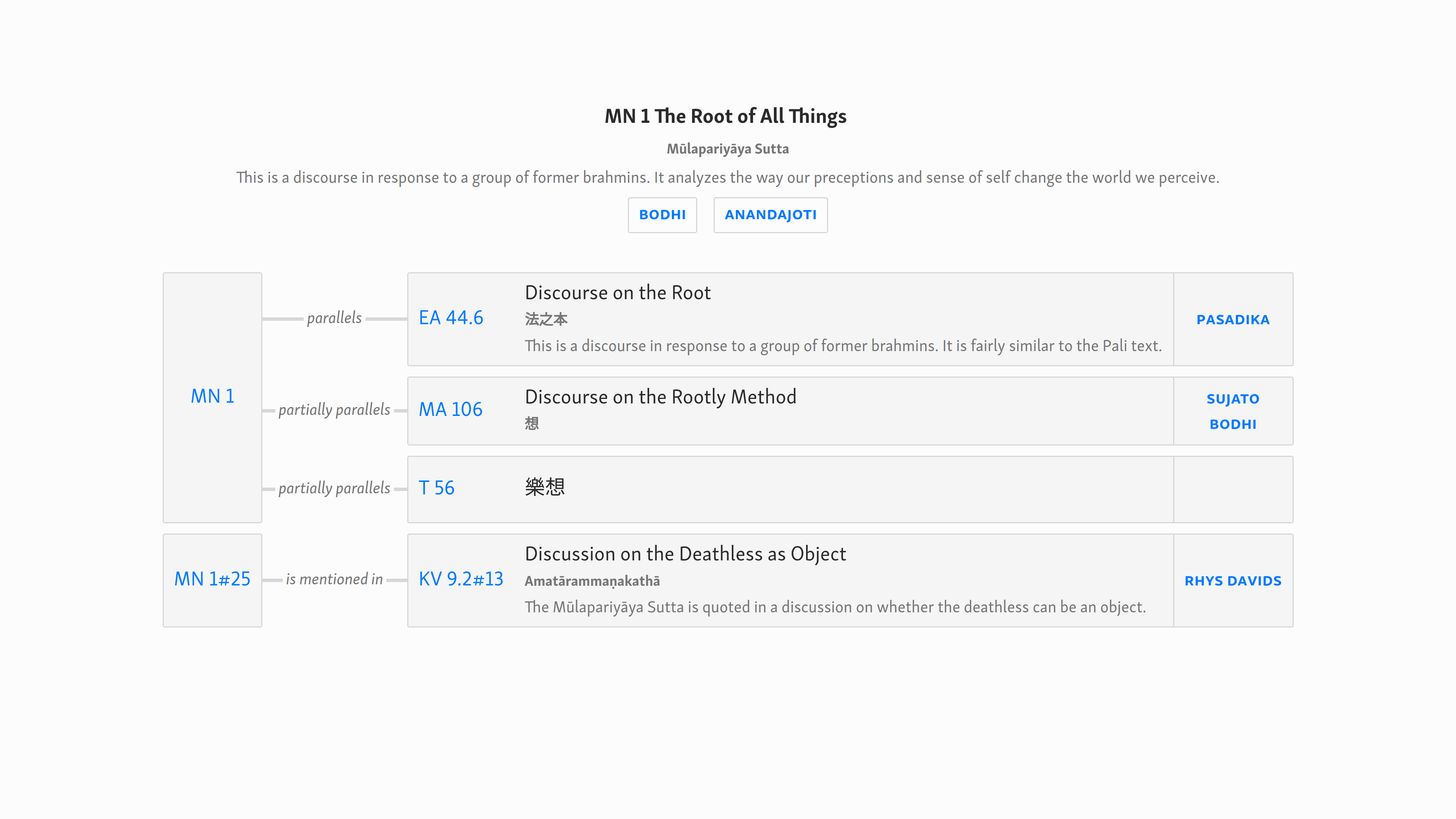
In SuttaCentral we currently have:

mn1	parallels	ea44.6
mn1	~parallels	ma106
mn1	~parallels	t56
mn1#25	is mentioned in	kv9.2#13

How might we display this in a fuller form? Rather than sticking too closely to the table view, we could move closer to an information design such as a flow chart, mind map, etc. Essentially, we are showing “things” and “relations between things”, so why not represent that visually? But we shouldn’t move too far in that direction, as we still want to keep the information vertically aligned and quickly scan-able, like a table. We can keep the information structured as a table and use a little CSS to highlight the connections.

Perhaps something like this.

And here’s the code: details_mockup.html.zip (1.5 KB)

(Note that I’ve changed this a few times, now the latest changes are included in this post.)

Some salient points in the design;

  • I’ve removed the “language” column.
  • The first column is the “root” text ID. Instead of having multiple entries, they are merged (using “rowspan”).
  • Each of the “things” is included in a box. The point of this is to establish visually that everything to the right of the second ID is referring to the same “thing”.
  • Compared with the current design, there’s a clearer visual hierarchy. Secondary information is smaller and greyed out.
  • The “alternative” reference details are moved from the ID column to the Vol/Page column, again to clarify the visual hierarchy.
  • The canonical IDs are emphasized by being in link color.
  • Italicize the “relation” text; this emphasizes that one “runs on to” the next, and it’s also a bit more compact.
  • Use a joiner to connect the boxes, as in flow charts, etc.
  • I’ve removed the <th> row altogether, I don’t think it’s necessary. Instead use title attributes to clarify, making them as explicit and clear as possible, especially for newbies.
  • This design uses Skolar Sans, which is probably better for the tables.
  • Some design cues have been taken from material design. Especially treating all the info on the secondary text as one set, analogous to the “cards” of material design. This can be followed more precisely by using shadows; but they’re tricky to handle in this context, so I stick with borders.

Overall I’m pretty happy with this, I think it’s clearer than the current design, it shows the relationships much more naturally.

1 Like

Now as to how this approach would work in the i18n version. i think it will be a good idea from here on out to develop the two views concurrently.

And the code: details_mockup_i18n.html.zip (1.9 KB)

Here are the main differences.

  • The vol/page info is removed.
  • Descriptions are added where available.
  • Main title is translated where available.
  • If translated title is present, root language title is demoted, but still present.
  • The language dropdown is removed. Instead, the names of all available translators in that language are present. These are presented with a distinct style.
  • The left side of the table, which shows the relations, is unchanged, and continues to give access to root texts.

Note, we should remember to use no break spaces for IDs, also for compound names like Rhy Davids.

And here is a stab at applying similar principles to an i18n mockup for a division page. Rough and incomplete, obviously, but the basic idea is there.

mn_mockup.html.zip (2.1 KB)

Mostly the principles are as formerly discussed in the localized version. No vol/page, remove parallels for the details page, include descriptions and make the translated title the primary one.

But what about the last item in the first row, “en 25˅”, does it not refer to MN1 rather than EA 44.6? And why does it say “25˅” here, but this is missing in the next three rows?

No, it’s referring to translations of EA 44.6. Translations of the main text are above the table.

This is the same as the existing site. It’s indicating that there are are multiple other translations. This would be clearer on a working version!

will it be displayed anywhere on SC within the context of sutta collections? as this is very useful info, which i not once made use of

a whole lot of texts on Buddhism use this system to reference suttas and SC for me so far has been the perfect means of locating them

The default view will remain the same, and how you or I use the site will be unaffected. Much as I yearn for the day when the use of vol/page numbers is eliminated in their entirety—not just in Buddhist texts, but literally in everything—that day is, alas, not this day.

Vol/page info will be removed in the localized version of the site, which will be an option optimized for those who just want to read suttas in their own language, and are not interested in such academic details.

1 Like

But there is only one translation of EA 44.6, not 25. Moreover, that translation is into Vietnamese, not into English. The 25 translations can only refer to the Pali. I don’t feel this is very clear from the table.

For MA 106 there is also only one translation into Vietnamese. The table seems to say it is into English. With T 56 I am not sure if there is any translation at all.

1 Like

It’s a mockup for developers. This is just dummy data, ignore it.

Looks very nice so far.

There are a few things though which I think should be changed. I think it should be clearer where links are actually going, my idea is is to actually put a little “pi” and “en” link under the acronym that links to the text and translations respectively. The acronym itself would then link to the details page.

This puts three things immediately accessible:

  1. I want to see the parallels of this sutta
  2. I want to refer to the root text
  3. I want to read the translation

I consider it a flaw in the current interface that the links to the parallel page doesn’t even exist on parallels pages, furthermore the acronym links to the root text, and on the far side of the table a language code links to the translation.

My idea then is to put all three links in close proximity so that it is possible to correctly choose between them.

There is also another consideration here, the acronym can only link to one place. On SuttaCentral there is only one details page for a sutta.

At present there is also only at most one root text for a sutta, however there is absolutely no reason why there couldn’t be more than one root text (i.e. from different traditions), if this eventuality ever comes to pass, then a root link which works the same as the translation link would be readily updatable to support a dropdown.

Anyway, staging is updated to implement most of the mockup from the first post. It mostly works but some parts are still mockups (like some of the links)

http://staging.suttacentral.net/ll/mn1

By the way, we might consider using “flexbox” layout as it would probably make the CSS significantly more maintainable and robust. It makes things like centering much more straightforward. Support is now perfect in all evergreen browsers and MS has disowned IE10 and older.

Okay, thanks so much that’s looking great. I agree with everything you say about functionality. In addition, one flaw of my previous approach was that there was no ready way of linking to the section of a translation, only to the full translation.

My only concern here is the “little”: it’s not very mobile friendly. But let’s see if we can make sure the targets are bigger.

agreed

yes.

Indeed, i hadn’t thought of that in terms of the interface, but there are several cases where multiple “root” texts would be useful. If someone ever publishes a decent version of the Sinhala pali edition, for example; or the edited and corrected versions of SA.

I had thought of this. there are one or two places where use of tables makes the CSS a hassle. But I haven’t worked with flexbox, so I couldn’t say. My only thought was that, since the data is, in essence, still a table, keeping the HTML in that form would make it more robust and transportable; even lacking CSS, it will still make sense. That wouldn’t be the case if it was a bunch of divs; but of course, there’s nothing stopping us using flexbox with tables.

One detail, though, i notice you’re using code based on my earlier drafts. When playing around, I just slapped classes on everything. But I cleaned it up and the current version is much cleaner.

And just on display issues, I mentioned briefly above that box-shadows don’t work in this context. This is because we have to apply shadows per-cell, but we can’t define them per-side, and because of rounding in different display sizes, screens, browsers, etc., the shadow will “leak” and form a random line in between table elements in some cases. For me, this is more apparent in Firefox. But basically it will be unpredictable, so it breaks this approach. Either we get rid of shadows and use borders (as I am doing currently) or we ditch the tables.

Leaving aside the technicalities, from a design point of view it makes more sense to use borders rather than shadows. In material design, the metaphor of “cards” is used for things that are independent; cards can be “shuffled”. But the point of our design is to indicate (relatively) fixed relationships between things. For this, it’s better to use a design that is “inked”, that sinks into the page, rather than something that floats above it.

Here’s a tidied up version of the design you suggested.

details_mockup_more.html.zip (1.5 KB)

Mainly I wanted to see how we could use the same basic layout and clarify the visual hierarchy. The important things here are:

  1. Consistent use of colors: black(ish) for main info:text ID and title. Link-blue for things that are links only, i.e. links to texts. And greyed-out for secondary info.
  2. Learn from material design: avoid excessive boxes and entities within “cards” or boxes. Use “flat buttons” instead.

Also relevant:

And here’s a stab at the same approach for the i18n version:

details_mockup_i18n_more.html.zip (1.8 KB)

This ditches the bright blue for links, it is looking too loud in this design. For “flat buttons” especially, it is useful to use all caps; the letters define their own block.

I haven’t bothered to do a mockup for the division pages, as the changes from the mockup above are obvious. Basically, for the i18n version just move do the left column as we’ve done here, and delete the “translations” column.

For the “expert” division pages, it should be similar, except we retain vol/page and parallels columns, and lose the translated title and description.

There is now an updated version on staging which uses the latest css, I also checked some of the longer/more complex pages like staging.suttacentral.net/dn2 and fixed problems, there might still be problems though, and some of the uids with bookmarks are really long

Nice! I’m really liking this direction. The main functionality seems to work great, I’ve tried dozens of pages and they all seem fine, although I haven’t tested the data as such.

it’s actually really cool to be able to switch between details pages, I can’t believe we haven’t done this before!

Here’s some details to have a look at:

  1. The new tables aren’t picking up “partially parallels”, but just represents them as ordinary parallels.
  2. As for the long bookmarks, in most cases the form these are in is just placeholder and should be changed. The most obvious cases are “t-linehead”, which should be removed, and “verse-num-sc” which should be replaced with “verse”. vagga-gatha-num should also be replaced, not sure what with.
  3. In some cases, the long bookmarks are due to the genuine complexity of the publishing history of the original material. I’m thinking of the Skt Mu-Sarv Vinaya, for which we have say : Skt Mu Kd 17 #sbvi128-#sbvi136. Such cases should be retained.
  4. One detail that just came up with Ayya Vimala. When looking at the new display, it’s not immediately obvious what the difference is between the “whole text parallels”, which appear at the top, and the verse, etc. parallels, i.e. the ones with bookmarks, which appear underneath. perhaps we should have some way of labelling them, but if so, what? We have to avoid confusion with the concept of “partial parallel” …
  5. For some reason I’m not seeing the text button for certain texts. On SuttaCentral for example, neithe Dhp nor Divy show any texts.
  6. Clicking on the text link for bookmarked texts should go to the bookmarked URL, instead they just go to the generic URL.
  7. I assume you know, but anyway the translation dropdown isn’t working; and also, the title attribute for it is wrong.
  8. The CSS for the “connector” breaks on “is mentioned in” in some tables and scale sizes. It also breaks at narrow page sizes. The connector obviously needs adjustment, perhaps you have some idea for a more robust approach here.
  9. SuttaCentral is an interesting case: as a “range”, it doesn’t have a title.
  10. I’m thinking we should adjust the display of the bookmarks. Treat the hashed portion like the secondary text, (font-size: 0.8rem; color: #767676), and not have a space before the hash. Oh, and use en-dashes!
  11. It’s also time we can do something similar with the alternative titles we find In Pali, perhaps elsewhere. Instead of Vekhanassa [Vekhanasa] we should have something like Vekhanassa <span class="alt-title" style="font-size: 0.8rem; color: #767676; display:block" title="Alternative title">Vekhanasa</span>
  12. Meanwhile, the vertical alignment needs attention. I’m not sure of the most elegant way to do this in CSS. But typographically speaking:
  • In the main “related” section, the top line should all sit on the same baseline (i.e. .root-id, the title (which BTW should have a class, I guess), and the vol/page.)
  • The line-height for the tables should be reduced to 1.25. This keeps the info connected, so that whitespace is separating things.
  1. The target region for .root-id shouldn’t fill the horizontal space. It should be a button. This can be achieved using display:table-cell, although this further borks the vertical alignment. Nevertheless, we should find a CSS solution for this than add more divs. I’ve made a hacky version that works okay in most places, but it breaks in some contexts and is not the best solution.
  2. Load this bad boy up: SuttaCentral I’ll have a coffee and get back when it renders. Display per verse instead. (Full div optionally?) This applies to all the Dhammapadas. While we’re on the topic, we should probably use “Pali Dhammapada” as the dhp title. the ID can stay the same, as it is commonly used.
  3. Having said which, the performance generally is great. On pingdom, I’m getting load times under 500ms in the US.
  4. getting even pettier: you’ve simplified the borders, but that creates a “notch” where the rounded corners meet. We need to use the more complex form.
  5. I’ve more and more come to see that we need a divider between ID and title in captions and headings. And, contra my previous opinions, this should be a colon. Luckily it’s easy to add with an :after.
  6. In cases where there is no text, we currently display the “button”, with a title saying “no text available”. Would it not be better to just not have the button?
  7. Some pages return a 500 error: SuttaCentral

Anyway, here’s the CSS overrides that mostly do what I want. Again, this just a demo, I’m sure there are more elegant solutions.

relationships_table_overrides.css.zip (634 Bytes)

1 Like

Something for @blake and @vimala to consider. See http://staging.suttacentral.net/ll/sn15.10

Now, SN 15.10 is listed, correctly, and parallel to Iti 24. They are in fact identical, with some minor changes in the prose section.

We also have SN 15.10#6 as parallel with Iti 24#5. This is also correct, but not necessary, as we already have the whole sutta listed as a full parallel. It begs the question, why is this verse individually identified, while the remaining verses in this sutta are not?

Now, presumably, this is because this verse is part of a set of Dhammapada parallels. Again, this is correct, and in parallels for Dhp#191, it should be listed.

Listing it under SN 15.10 twice is not wrong, but it is a distraction. It’s not the cleanest way of presenting this information. Perhaps we could handle this in display logic: if something is listed as a parallel of the whole text, then filter out additional mentions of it as parallel of a section of the text.

The corresponding json entries are:

“parallels”: [“sn15.10”, “ea-2.30”, “sa-2.340”, “sa-3.11”, “sa947”, “t765.2”, “iti24”, “~kv1.1#158”]

and

“parallels”: [“dhp#191”, “divy#101.021”, “iti24#5”, “sn15.10#6”, “t210.22#vagga-gatha-num-sc22.17”, “t212.28#vagga-gatha-num-sc28.31”, “t213.27#vagga-gatha-num-sc27.28”, “thag21.1#verse-num-sc1269”, “thig7.2#5”, “uv27#27.34”],
“mentions”: [“dhp#191”, “ne37#156”]

I agree that some display logic would be the easiest way to deal with such cases.

But it makes me wonder if the verse dhp#191 also has a parallel in the other full parallels of sn15.10 like ea-2.30, sa-2.340, etc.

It probably does, hopefully we can have a Chinese speaker look at such cases in the future.

The only danger of using display logic to take out such entries is with the partials. This should only be done when it is a full parallel.
In the JSON file, there are some specific and some less specific entries of the same thing. Ideally we would like to become more specific with the partials but this will have to develop over time. For instance, you can have two entries:

A is partial to B

and

A#1-#3 is full parallel to B#4-#9

All this has to be carefully looked at before omitting anything; next to the mentioned paragraphs, there might be more sections in A and B that are partial to each other.

We’ve discussed this before, but I still find myself tripping over terminology!

I had a (rare) moment of clarity. Yes! Exciting isn’t it? I realized that the problem with nomenclature, which had been lurking vaguely in the back on my mind, was not just in the naming of “partials”, but also in the naming of “fulls”. We need to clarify both halves, as it were.

From here on, I vow to use the following:

Partial parallels: the old category, consists of:

  1. Resembling parallels: Texts that have aspects in common, where these cannot be further specified by IDs; eg MN 10 and MN 119.
  2. Sectional parallels: Where a “section” of one text can be specified as parallel with a “section” of another. A “section” is anything definable by ID’s, up to and including the whole text.

When a partial parallel is specified by IDs and becomes a sectional parallel, it is then usually a type of full parallel. Of course, it’s possible to have texts that are “resembling sectional parallels”!

Ideally we can eliminate the old “partial” category completely.

In addition, we need to distinguish between:

  1. Full parallels: Texts that have much in common, such that they appear to be different versions of the same “thing”.
  2. Whole parallels: A parallel that relates to the “whole” of a text, rather than one section of it. To this we might add:
  3. Ranging parallels: Where a parallel applies across two or more texts.

Thus “full/resembling” is one pair, based on the closeness of the relationship, and “section/whole/ranging” is another set, based on the extent of the related passage.

Okay, so now we can name the two different sections of the details pages; that is, the first part, with “whole” parallels, and the second, with “sectional” (i.e. bookmarked) parallels.

We could use a <th> to define: “Parallels of the whole text” and “Parallels of a section of the text”.

Note that the application of “ranging” parallels is the bug I noted earlier, where, when such parallels are the root text, our details page lacks a caption.

Sure, but the problem remains that there are a lot of parallels now marked as resembling (with a “~” in the json data), while they should be more specifically marked with ids as sectional parallels.

1 Like