Joking! Yesterday I was reading a thread on the crazy demands that bosses make and thought I’d try it out!

 SuttaCentral
Joking! Yesterday I was reading a thread on the crazy demands that bosses make and thought I’d try it out!
To be honest, it is probably just as easy for @Blake to just draw the right number out of the html text when it is needed so no separate lists like these are necessary. It is just a very straightforward bit of python code to do that.
What about cases where we are not in a text? I’m thinking of the Dictionaries, for example. It would be great to linkify all the v/p references there. Would it not be simplest to use a json file for this?
It’s usually not a good idea to have the same data in two different places.
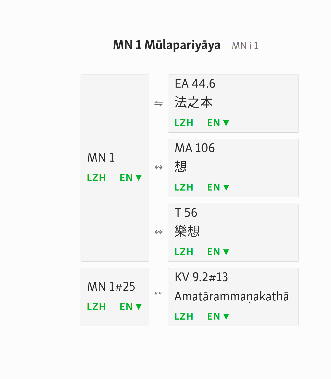
Right now only the PTS numbers of the start of the sutta are mentioned in sutta.csv and this is what shows up in the Vol/Page references in the sutta list of that Nikaya. Inside the text we have all the numbers for instance in MN1 we have <a class="pts" id="pts1.1"> to <a class="pts" id="pts1.6">.
These numbers I retrieved in a csv list (can easily be converted to JSON) and matched them up with the corresponding SC paragraph numbers. However, there are far more SC paragraph numbers in between and that makes those a more precise reference for use with parallels.
Blake is currently working to change the whole system to JSON so also sutta.csv will have to be converted into the new system.
When you have a page that lists parallels, you are not in the text either.
My take was primarily the parallels pages, but yes, Dictionaries would also be good to have linkified. So Blake can either use my list or use a small python script to search for the respective number in the text. The first option is probably a bit quicker loading, but the second safer if our own numbering system changes, even slightly.
When I started working on the parallels, I found that a lot of the cross references did not work any more because our own numbering systems have evolved over time. At least with the pts numbers you know they won’t change: they keep being linked to the same text.
On the other hand, the parallels.json file now uses the sc paragraph numbers for link-ids because these are more precise. So if things change, so should the parallel’s notation.
So just some thoughts on this. Blake can see what he feels is the most appropriate method.
Okay, sure, well let’s wait and see what Blake comes up with.
Ultimately I’d like to move to a complete separation of data and text, using standoff properties; but we’re not there yet.
You’d still need some marker in the text to show where a certain pts or sc number should go.
That’s the beauty of standoff properties. You keep the text purely as plain text, and everything else is separate.
See the files I recently shared. The data is preserved in a separate json file, which has essentially three kinds of information for any given piece of markup:
Using just these three pieces of information it’s possible to replicate without loss anything that can be done in traditional hierarchical markup like XML/HTML. It’s also possible to do many things that they can’t do, one of which is exactly the problem we’re facing here: overlapping hierarchies.
“Possible” is of course a theoretical term. The tools aren’t mature enough to achieve this yet. You need, at a minimum, an editor that will reliably push any changes to the source text into all relevant standoff files. To guard against corruption, run everything through Git.
But this is what Yap is working on (full time!) Ultimately we’d like to work towards making SC texts interoperable with CBETA, which isn’t possible as long as we have a different hierarchy (i.e. we use suttas, they use volume/juan/page).
I have an even more radical idea: assign every character in the texts a blockchain ID. That way any changes to the texts are public, permanent, and incorruptible.
Sure, but if you use a layered approach, you need to have some way of being able to link the layers together. If you just have a text and a file with pts numbers, you still need to have a system to make sure you know where in the text the pts numbers belong because pts numbers don’t have the same logic (vol/page). You can give each sentence (or even character) an id, but you still need to have a file that tells you which pts number goes with which sentence id.
In theory we could already do that now: i.e. just leave the sc numbers in the html text and then use an external file that tells you what pts, ms and other numbers should go with which sc number.
Attached a new version of the lists (pts list now also has sc-verse numbers in it).ptstaishonumbers.zip (567.4 KB)
This is precisely the problem that standoff properties solve. You don’t need IDs, you just need the offset and range to tell you where things belong.
The only extra thing you need is something to tell you where it all starts, ie. coordinating the overall text. But that can be as simple as including them in the same folder (as is done in the samples Yap shared).
You can, but it wouldn’t be lossless, as the granularity isn’t fine enough. You’d only get an approximation, because some of the v/p numbers appear in the middle of a paragraph.
Totally off topic, but actually as of this year, checking whether the photo is of a bird can also take a couple of hours. Apparently the Google Cloud Vision API can even give you the breed of a dog in a picture.
They also have face detection on FB
I’ve been messing around for a bit creating another mockup. This one is done with bootstrap, just to get an idea but the same is possible with css (other than tables) but I just have to figure out how. I just like the whole idea of the grid-system. It makes life very easy. The css of the attached is a bit of a mess and the design is by no means ideal, but have a look.
parallels_mockup.zip (1.9 KB)
Ayya, this looks fine, but I should warn you: the whole approach is a non-starter. These are tables, and we will use table markup to express them. This is one of the fundamental principles on which I built SC: always use valid, semantic markup.
Tables are much more difficult to deal with when you want something to be responsive.
But fine, I will adapt your table-based mockup with the ideas for the responsiveness that I showed here as well as another connector.
Well, maybe, although I don’t think it’s quite as simple as that. Any approach has complications.
Following our discussion from this morning, here is another mockup.
I have added a responsive container around the table. I will also have a look at how to implement this with Polymer instead but that will take some time. But for now, I just want to have your feedback on the responsive behavior you are looking for.
Right now what happens is:
When you reduce the table, it scales itself depending on the content (remember that we have many different pages with different content that need to scale differently).
I went from a mobile-first view. What exactly does a mobile viewer need to see or be able to access at the very minimum? So at least the root text UID and links to the various translations as well as the related UID with links to the various translations of that one, as well as the relationship between them. This is all that is visible on the mobile screen, but with a scroll-bar to access further info, namely the name of the related sutta.
Then going up to larger screens, it first removes the related languages-dropdowns and puts them in a column at the end. Then going up further, it adds the volume/page column.
This system has the advantage that it maintains the responsiveness of grids but with a table. Trying to make a table responsive with just css is rather difficult, especially because we are dealing with many different pages with different content.
details_mockup_bs.html.zip (1.8 KB)
Hi Ayya,
Okay, thanks. I had a bit of a play around with it. I like the idea of stacking the text selectors vertically. How about we take that further and stack everything vertically for mobiles?
I played around with the “connector” a little bit, and tried replacing it with icons at smaller sizes. But then, it just seemed better anyway, I never liked the text in the connector, it is too much. How about we just get rid of it altogether and just have icons.
I refactored the HTML and CSS a little, and eliminated the need for external dependencies. Now it is fully responsive with just two simple media queries.
The full width is thus:
At the first break point, we eliminate the vol/page: (td:nth-last-of-type(2){display: none}
At the second break point, we stack everything vertically (.related{display:block}), and reduce padding a little.
A few notes:
whitespace:nowrap.What do you think?
I also thought about using symbols instead of words, but we have many different ones and without a legend it will not be clear what is what.
We now have:
And when we split up “partially parallel” into “resembling parallels” and “sectional parallels”, you get even more choices to add. And you also mentioned you want to distinguish between “full parallels”, “whole parallels” and “ranging parallels”. Without a legend it will be difficult.
I also had the idea of adding the title below the uid for mobile devices but sometimes titles are very long and adding an extra line to each one might become a very long table in some cases. But in principle I agree.
And this is where I really don’t agree. First of all, this is only external for the sake of the mockup. You can make it internal and we will do that anyway when we start using Polymer. Why not use the possibilities it has.
Moreover, the need is still there. This mockup might look good when you resize your window. It will work on tablets and desktops but not on phones.
On a real phone, with thousands of different pages with all different column sizes due to different length uid and titles, it will become unresponsive. You need the scroll bar at the bottom in case things are too big for the small screen, or people will have to start zooming in.
This is true. Why don’t we explore it a little and see if we come up with something satisfactory? Otherwise we can revert to using text. I’ll make a new thread and we can work on this there.
As for dependencies, I took them out because I don’t know what they do, and I don’t want them to change things in unpredictable ways. Can you explain for me what they actually do? If you want to use them, fine, as you say it is just a mockup stage. But I prefer to only use things that I understand.
Looks fine to me! Yours on left, mine on right, with identical browser settings:
? This should display by default. If there is any problem, specify: x-overflow: scroll
I made a couple of minor tweaks, removing the body font at 1.6, on SC it is default, i.e. 1em. For very long titles, soft hyphens are the solution, but these don’t work if there is white-space:nowrap, so either limit that to ID columns, or use no-break space for IDs. This version will work for extremely long titles (with soft hyphens) down to ridiculously narrow screen sizes.
details_mockup_bs_3.html.zip (1.9 KB)