The next version of SC, like the current version, uses Skolar as the main Roman font (as well as devanagari, Cyrillic, and Greek), and Noto for other scripts.
The site is based on material design, which normally uses Roboto for the main font and Noto for the remainder. These were designed to go together, and the vertical metrics of Roboto and Noto match. So you can pretty much drop either one in the design and it will work fine.
However, Skolar is not matching in the same way, so we should consider how to treat it. To keep it simple, I’ll only consider Skolar Sans, which is of course designed to match well with Skolar Serif.
Note that non-Roman fonts often require slightly different scaling, which I have not taken into account here. The purpose here is simply to establish a baseline for best matching of Skolar and Noto.
Generally speaking, Skolar Sans is not dissimilar to Roboto and Noto; all are somewhat humanist sans, although Skolar is notably more so, i.e. it has more script-like features. Here’s an image comparing the three fonts at the same point size.

As you’d expect, Noto and Roboto are very similar, but Skolar is significantly smaller in overall scale.
It’s not possible to match different fonts completely, as they all use different proportions. Generally speaking, Skolar has a smaller x-height, with higher caps height, and even higher ascenders and descenders.
The x-height is probably the most important metric; Skolar must be scaled to 115%:

It’s not possible to match both caps height and ascenders/descenders exactly, but a scale of 105% is a compromise between the two. Note that the capital H is Skolar is lower than the H in Noto, but the l is higher, and the y is lower.

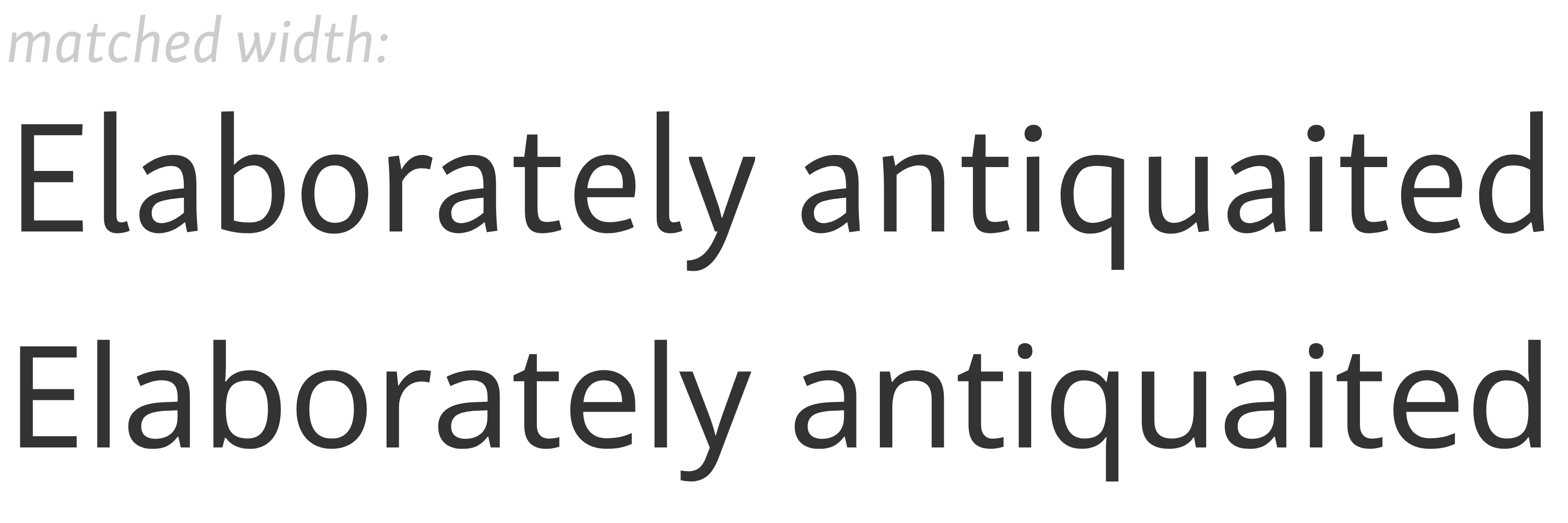
To match the width, scale Skolar at 113%:
In fact this seems like a good overall scale. It gets the width right, the x-height almost right, and it eases the mismatch with the ascenders. Here they are at the same scale, but overlayed:

Not only are the scales matching pretty well, but the weight of the fonts is a good match at this size.
So I suggest we use the baseline ratio of 113/100 for Skolar/Noto.

