I think it’s a great idea to make visuals for these concepts because they are quite abstract, especially for kids. Big sadhu for your efforts!
I’m not sure that I’m in any way qualified to comment on your work. But since you asked, here are some thoughts:
I think your designs are still a little too “rational”. If you want to make this work for kids, you need to touch them emotionally, and it’ll be much easier for them to remember the different stages… And you need to make the stages look more clearly distinct.
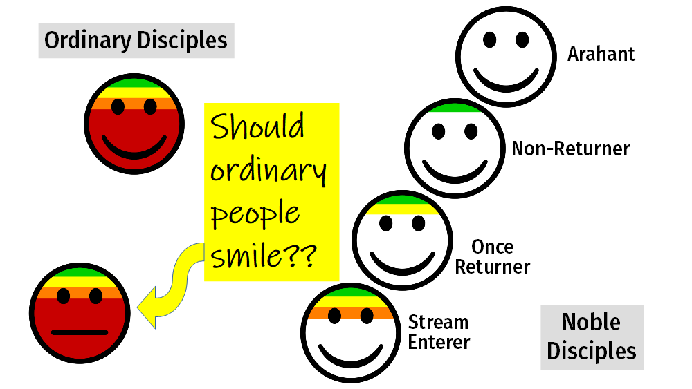
You could draw something that’s cute, shows feelings, has some interesting accessories, etc. For example, all the smileys have the same facial expression now which makes it hard to differentiate them, or to see a progression.
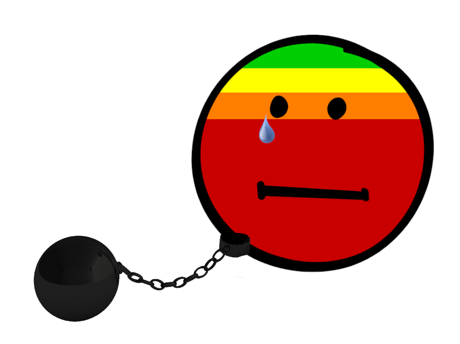
If it was a doodle, the ordinary person, still fettered, would look something like this:

And an arahant might be like this:

So, if you want to go for smileys, you could use different ones. For example, have a smiley that’s handcuffed, or gagged, or blindfolded for the ordinary person, as they are still trapped in samsara. Or at the very least, add a tear drop. If you don’t want to change the smiley itself, put flames, snakes, brambles, handcuffs, chains, or any other symbols in the background. Use a starry-eyed, heart-eyed, or dhamma-wheel-eyed smiley for the stream-enterer, because they have just newly fallen in love with dhamma / opened the dhamma eye. Or add stars, clouds, wings, butterflies, lights, or similar things in the background. And maybe use a smiley with a halo for the saintly arahant. Or a smiley with a crown (dhamma queen / king) …
If for example you used smileys such as the ones below for the four noble stages, people could see a progression towards more peaceful states at one glance:


One or two distinct features, facial expressions, or accessories per stage are enough. It’s best not to overload the graphics. There’s quite a lot of information already.
Also, you could experiment with slightly different colors. A progression from red to green is great and gets the message across, but the colors you have now seem a little too “functional” and serious. Slightly more pastel colors could look more fun and less intimidating.
Just a few thoughts… Hope it’s somewhat helpful.