Here i am making an initial proposal for a new view for the SC parallels data. If it seems like a good idea, I’ll refine it here first, then make it a formal proposal on Github.
Rationale
Sometimes it’s handy to see information about parallels in one view. The old SC layout allowed for more of a quick overview of parallels, albeit mixed up with other data such as vol/page, translations, etc. I propose we make a special view for parallels. This will be in part similar to the old SC view, although purely presenting parallels.
Implementation
The new view will be implemented as a variation on the “collection view”. Up till now we have called this the “suttaplex list”, but since it will no longer be just suttaplexes, we should probably change it. In any case, this is the primary view that is opened when you click on something in the sidebar.
It may be the case that a higher level view is desirable. For example, we could visualize the parallels for the whole of the four nikayas. This would, however, raise a set of difficult new problems, so let us leave it for now.
Currently we have a standard and compact view. These are toggled via a switch in the toolbar menu. According to my “Adaptive Tab Bar everywhere” proposal, we would add an ATB to the collection view, enabling the switch between normal and compact; as it is a local change the switch should be local.
We can then add a third option, “parallels view”. These would be “radio buttons”, looking something like this:
◉ Standard view
○ Compact view
○ Parallels view
By adding the parallels view to the collections views, we minimize the work to be done: the navigation and data are already there, we just change the view. Note that the richness of the current navigation fully applies, so you can select by full collection, vagga, etc.
Content
The parallels view consists of three parts: statistical summary, visualization, and list of parallels.
Statistical summary
This is a brief overview of main statistics for the selected collection. A user should at a glance get an idea of the parallels for this collection. Thus there should not be too much detail.
The basic view would look something like this. (Dummy data!)
Summary of parallels for DN
- Number of parallels: 1037
- Number of suttas with parallel: 34/34 (100%)
- Parallels by language:
- Chinese: 978 (96%),
- Sanskrit: 87 (4%),
- Tibetan: 67 (4%).
- Parallels by type:
- Full: 800 (87%)
- Resembling: 123 (12%)
- Sectional: 26 (6%)
- Mention: 7 (1%)
Visualization
Here we can provide a graph or visualization of some kind to represent the parallels.
I propose a bar graph, with narrow columns (remembering there may be many suttas in a collection). Extra data could be available as a tooltip on the bars. Something roughly along these lines.
The horizontal axis is the sutta number, the vertical axis is the number of parallels, the colors are the different parallel types.
For extra coolness, we might make it also an arc diagram, with arcs to represent parallels within a collection. Not exactly like this, but you get the idea:
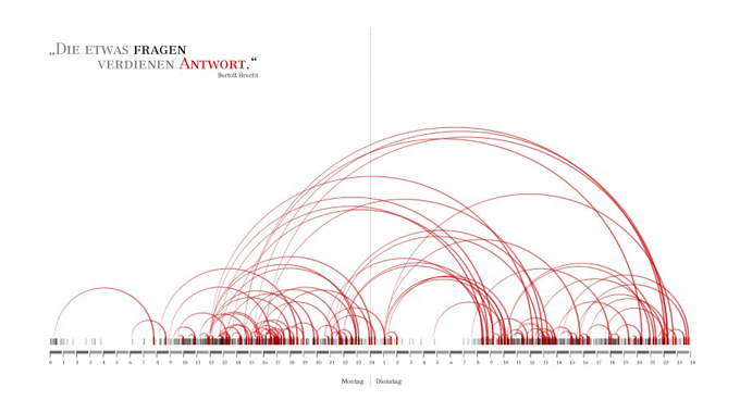
Other kinds of visualization may be possible, let’s see!
One thing to bear in mind is that the data on large collections gets pretty big, and the visualization could use as much space as possible. Thus the whole thing should be designed as dynamic vector graphics. We should give the option to display at full screen.
Parallels table
This is a simple table of the parallels, not dissimilar to a simplified view of legacy SC.
- Table includes sutta IDs only.
- Two columns: left is the main sutta ID, right is a comma separated list of parallels IDs.
- Types of parallels are color-coded with the same colors as the bar graph.
- Each ID links to the relevant suttaplex, i.e.
<a href="/dn1">DN 1</a> - Structural elements such as vaggas etc. are represented as a row in the table; this will help to break them up visually.
Something like this (color-coding not shown).

