When you open the reader view of a sutta in safari on iOS, it keeps trying to load subsequent sutras.
Just in case you’re not familiar with reader, it has a feature where it concatenates multi page articles. So however you’ve set up the HTML structure, it thinks the sutta is part of a multi page article.
I haven’t seen this occur on any other websites. I usually use reader view when I’m reading articles. I think it’s because of the sequential nature of the suttas that it’s coming up here.
Reader view is a feature in safari both for iOS and on Mac. To open reader view, you tap the button I’ve drawn an arrow to in the following screenshot:
It basically makes poorly formatted websites look a lot better. But I will say suttacentral actually looks quite good on an iPhone. I just like the text to be a little bigger and reader view easily lets you change the font size.
One other thing it does is concatenate multi page articles into one long article. One reason some sites do this in the first place is because they get more ad revenue because you have to load the page again to read the next section. So reader view somehow gets around this and sticks them back together. So somehow it’s interpreting individual suttas as part of a multi page article and it tries to load all subsequent suttas in that nikaya.
This seems to be related to how Safari implements the reader function: I can reproduce the behaviour described in this thread on an iPhone 6s running iOS 10.0.1 with Safari only. With Firefox 5.3 on the same phone, the reader mode works as it should, loading just a single page…
Cool, thank you both. I’ve asked about this on StackExchange, but nothing useful so far:
It seems this is the cause of the issue for us is:
This is a widespread issue with pinch-to-zoom on touchscreens; it simply scales the screen rather than reflowing text. I’m sure there are technical reasons for this but it is pretty annoying. It is implemented differently in different browsers.
First question, is it possible on Safari to zoom the screen without using touchscreen pinch? I.e., using the UI like on a laptop or desktop? It seems that these two kinds of zoom are quite separate, and the “standard” zoom reflows text just fine.
Second question, are there any sites that have what is for you a comfortable font size for reading on iPhone? For example, the Guardian has a large font size by default:
There is a way to increase font size, but it does it system wide.
As far as I know, there isn’t a standard way to increase font sizes for a page like the ctrl-+ action on a desktop computer. But even if you do that on a pc, sometimes it’ll change the width of the text. I think this can be different for different sites.
I really like the readability of the guardian text.
After comparing the three sites, I think there’s another reason I prefer reader. To me, the text of suttacentral feels too dense. I think the space between the lines of text might be smaller than other sites.
Here’s a comparison so you can judge for yourself. The sites I compared are 1) sutta central standard, 2) sutta central in reader view, 3) the guardian standard, 4) this discussion board (I find it more enjoyable to read than the main site). Here’s the screenshots I combined from my iPhone 5s:
Well, now you’ve done it. There are many sins that are forgivable, but I’m afraid, my friend, impugning a gentleman’s typography is not among them.
Excessive line-height is a wart in modern typography, especially on the web, but even in print. The ideal line height provides enough space to differentiate each line, while retaining an overall “grey” color for the text block. When the line height is excessive, each line is too distinct, creating a “stripy” effect on the page. This is bad: good typography strives to remove every possible source of contrast and difference within the text, as these create subliminal distractions for the eye, making reading less immersive.
In the samples you gave above, I would say the Reader version is clearly excessive, while the rest are okay. The SC one is best, though! For mobiles, we set the line height at 1.4; the Guardian and Discourse examples are 1.5, which is also what we use on the desktop version of SC. We compacted the mobile version slightly to make better use of the limited space; though if I were to start again, I would probably make the normal site use 1.4 as well (sorry!). (In fact, I see a slightly different version of Discourse, which I use for playing with tweaks to the site; in my version, the line height here is 1.4.)
A better solution for this, perhaps, would be to replace the serif version of Skolar, our main font, with the sans-serif on mobile. This will lend it a lighter color, and will also be a little more compact.
Although for me, the main reason for using the reader function is to ‘de-clutter’ poorly designed websites (which is unnecessary with SC since its design is very clear and sleek), another reason, alas, is 'ageing’/ With multifocal glasses, flexibly increasing font-size on a smartphone or tablet for reading-intensive sites by using the reader function, is much preferred to messing up the system-wide font settings which will make some Apps rather clumsy to use…
For sure, readers should definitely be able to adjust the font size. But the problem here is the pinch-to-scale logic used by most browsers, which unfortunately doesn’t allow it. I haven’t been able to find any solutions for this. But if there are any sites that do work well for you in this regard, please let us know and we can check out what they do.
Meanwhile, I am not sure of a solution. Not having access to a mobile I can’t test anything properly here. But perhaps we could introduce a font size button (like in the good old days)?
On many desktop OS (Win, mac, ubuntu, Debian) and most browsers an oldfashioned keyboard shortcut like <ctrl+> / will imho work well enough with SC as it is.
If on iOS only Apple’s Safari is problematic, so be it - all the more reason to switch to alternative apps. With Firefox, the reader function gives full control over font size (up to ridiculous) and even contrast reversal etc. and works nicely with SC .
Ok, I’m going to completely reverse my position here and go a little overboard at the same time.
I tested the site using different line height. I actually DO prefer a smaller one than 1.5. I really like it with a line height around 1.1-1.2. I also find it looks good with a massive line height like 1.9. At those lines heights, I find looking at a line, I’m somehow more able to see nearby lines in my peripheral vision. And it’s also easier to quickly scan up or down over many lines at a time. With a height around 1.4-1.5, these are somehow more difficult for me.
You can fiddle with this too. In case you don’t already know this, I’ll put the steps here for Safari and Chrome.
In safari, go to settings, advanced, and check the box beside “show develop menu in menu bar”. Then right click anywhere on the web page and select “show page source”. Select the “Resources” tab in there, find the file called “core-2c02e8e3.css”. Select the text in there, hit ctrl-f and search for:
"@media screen and (min-width:480px) {"
Just below that will the css line height rule that controls the main text on the page. You should be able to change it, and the whole page will respond in real time.
For Chrome also, click anywhere on the web page, select “View page source”. In the lower half of that pane, under the “styles” tab, the relevant line should be right near the top. Change it there and the whole page will change. Make sure the tag is selected in the upper half of the pane. Otherwise it won’t show the css rule we want.
Thanks for info. Unless something comes up, I guess we have to set this one aside. Perhaps they’ll fix the problem on an upgrade; setting a sane limit for collation seems like a pretty basic idea.
These are pretty extreme settings that you’re advocating. Line-height, like the other basic measures in typography, is based on principles that have been settled for 500 years (or more) and used in millions of documents since then.
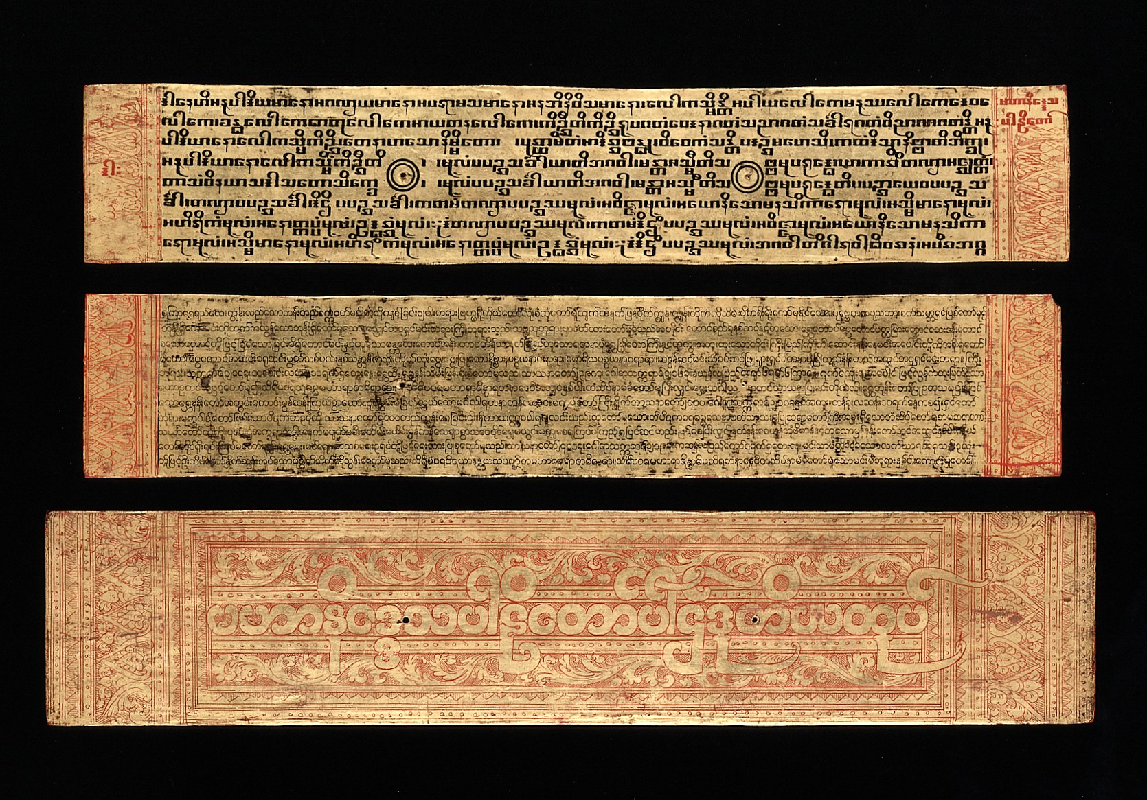
To me it’s quite a fascinating thing really. It’s not even just in western typography, but in every writing system there tends to be similar basic measures: the size of characters, the length of a line, the space between lines, and so on. Here’s an example of a sutra from Burma:
Don’t take this the wrong way, but I wonder if you maybe have a visual perception issue? I know that people with, say, dyslexia, can have quite unexpected responses to things that seem like non-issues to most people. I’m quite color-blind, so I can never trust my own color perception. Could it be that the way you see things on the screen is different to how I perceive them?
I’m looking at Safari on an iPad iOS 5.1.1.
I can confirm that the reader-view does what @dancarter says (i.e. load multiple pages).
This is a pretty old iPad and it has several other problems as well with loading SC. The top menu does not work either, but the sidebar works.
One other thing I noticed is that the next/prev buttons at the bottom of the sutta are not there, which is very annoying.
There also does not seem to be another way to zoom than touchscreen-pinch and that indeed scales the screen and it does not reflow the text. However, the reader-view in Safari has a button to increase or decrease font-size (similar to ebook-readers) that DOES reflow the text.
Firefox did not want to install on this old iPad.
Considering all the bugs that are showing up on iPads lately, I repeat my question to @sujato: do we not need our team to have a reasonable new iPad to be able to test these things extensively? You might not like iPads but many people use them so we need to cater for them as well.
I’m leaving the States in a few weeks and will leave this old iPad with it’s owner. It seems to me that it is too old to test things properly anyway.
I don’t think it’s an efficient approach. For the cost of an iPad and iPhone we can pay a developer full time for a week to fix bugs for us. Any hardware cost will have to be ongoing, every year once more. And Apple has its own development quirks and issues, font rendering is its own thing, and so on, so all this needs to be researched and learned, and that too is an ongoing cost for us in terms of our precious time.
Much better, I think, to have an on-tap dev to fix Apple issues for us as they come up. Which we had with Dave, but last time I heard he’d got a full time job. I’ll contact him and see if he has any free time.


 /
/ With multifocal glasses, flexibly increasing font-size on a smartphone or tablet for reading-intensive sites by using the reader function, is much preferred to messing up the system-wide font settings which will make some Apps rather clumsy to use…
 .
.