SC site navigation

Apologies in advance if the following points were already mentioned. This is about SC and the navigation panel on the left.

  • On the homepage where we see on the left “Sutta”, “Vinaya”, “Abhidhamma” I suggest to make the words themselves clickable, not just the tiny arrow on the right of the words
  • The same on the level below, i.e. “Long”, “Middle”, etc.
  • I guess the team has discussed it already, but I personally find “Linked” and “Numbered” strange after being used to “Samyutta” and “Anguttara”. Yes, it’s a translation, but for beginners “Linked” will be as mysterious as “Samyutta” - maybe the Pali in brackets? I know it gives the Pali the preference over the Sanskrit of the Agamas - but to my liking “Vinaya” was left untranslated as well as “Abhidhamma” (and you rightly didn’t see a need to write “Abhidharma” as well)
  • On the sub-sub-level it would be nice to see numbers. While the Anguttara and Digha-groups are numbered, i.e. “1-13”, “14-23”… the Majjhima-groups are not, i.e. it just says “Mūlapaṇṇāsa” instead of “1-50 Mūlapaṇṇāsa”. Especially for non-experts I think it will be easier to navigate.
  • The same for the Samyutta, ie. “1-11 Sagāthā Vaggasaṃyutta” instead of just “Sagāthā Vaggasaṃyutta” etc.
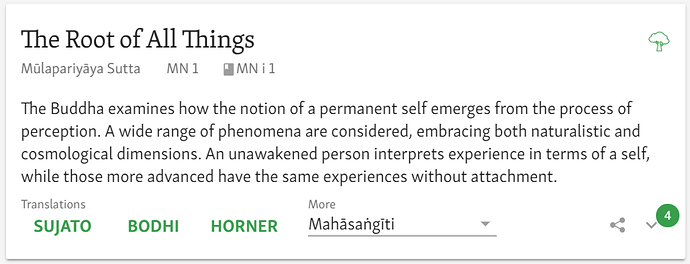
  • Lastly I still find the detail view of the suttas confusing. For example:

The are quite many infos to digest here. Again and again I find myself searching for the sutta number. For me it would be a help to see “MN 1. The Root of All Things” rather than the tiny “MN 1” underneath.

I find “Translations” okay, even though I’d prefer “English Translations” but I understand that saving words and space is good.

However I don’t like much the “More” and would prefer “Other languages”. And when I click “more” I am repeatedly confused to see first the names of the translators and not the language. After all the normal user is not primarily interested in Bh. Mettiko’s interpretation but in a German translation. Especially when I’m looking for the Pali and don’t know the term/edition “Mahasangiti” I get confused.

On the right the “share” symbol is by now established and okay, the number though is not self-explaining, especially when I’m specifically interested in parallels. So I would wish to see the word “parallels” there.

I know that design questions are a matter of personal taste, but maybe some of the points above are generally helpful to navigate the site more smoothly. Thanks
2 Likes

Hi Gabriel, thanks for the detailed feedback. Let me comment point by point.

This would be inconsistent. In the lower menu items, clicking the words opens the list of sutta cards, not the next level of the menu.

The problem is that these are generic categories that encompass a number of texts. It is not just the Anguttara Nikaya, etc.

This would take up too much horizontal space.

This is in fact consistent. The principle is that the number used for the sutta appears at the level closest to where the number actually applies; and the same kinds of numbers are not repeated at different levels. Thus a “sutta” number, as in MN and DN, appears at the vagga level, as this is closest to the level of the “sutta”. They are not repeated at the “pannasa” level. In AN and SN, the numbers appear at the level of the nipata and the samyutta respectively, which is where they belong.

Sutta numbers easily get complicated, and adding more numbers than necessary adds confusion.

If you know the sutta number, why not just write it in the URL? :wink:

For you, as an expert user. The design is meant to emphasize information for non-specialists. A non-specialist can read a title and summary of a sutta, but for them a number means nothing. An expert should write the ID number in the URL.

Maybe. But honestly, it sounds like bike-shedding to me.

Design rule number 1: someone will always prefer something else.

I understand the issue, but the language is in the icon, and when you hover over it, it explains what it is. It seems fine to me.

Why is it like this? Well, there isn’t enough space for everything, so you have to make choices. Here is our situation: we have translations into certain languages by certain people. In our old design, we were criticized for having just the language and not showing the translator. Now we can’t indicate just the language, because we have multiple translations per language. So we have to show the translator name, it is the only way to disambiguate the translations. There’s not enough room to have both the language and the translator. So we have the language in an icon.

The only thing I want to change about this is that I think the icon should be clearer. We’ll see if we can adjust the design.

This issue will, in any case, be largely ameliorated when we implement site localization. Then the translations in your language will be presented as buttons, like the English translations are now.

What number is? You hover over it and it says, “This text has 26 parallels.” That’s the explanation.


Sorry to shoot down your suggestions! :blush: I’m not just being stubborn: we have been over all these issues again and again. In design, the temptation is always to add things, and in IT, it is easy to just keep having more and more things. But every thing comes with a cost.

One of the best observations about UI that I’ve heard comes from Jeff Atwood, who was one of the people behind Discourse. He said there’s no such thing as an intuitive interface. After all, toddlers these days don’t even know how to use a picture book: they try to scroll it or expand the images like a touchscreen. Even the most simple and basic of interfaces, the printed page, has to be learned.

An interface therefore shouldn’t strive to be intuitive, but learnable. You click around on things, try this and that, and figure out how things work. So it’s important to keep things consistent, to reuse common design patterns, and to think it through from the perspective of reinforcing exploratory behaviour. You should get a consistent and useful response when you do something.

I’m really proud of the work that went into doing the sutta cards. It is a huge part of our UI, and solves an immense range of complex problems in a simple way. Maybe at some point we’ll revisit the design and think it through again, but for now, we have a whole lot of other things on our plates!

3 Likes

Thanks for the comments bhante, but still as a user I disagree on some points and hope the team considers them when it discusses the UI in the future:

As a user I don’t think about if the programmers have a consistency of clickable words in mind. I see the word “sutta” and want to click “Sutta”, not a triangle next to it.

As you said, the site is for beginners. I don’t see how any beginner (or upper intermediate) would know what “Mūlapaṇṇāsa”, “Majjhimapaṇṇāsa” or “Uparipaṇṇāsa” means. I learned the teachings not with the PTS editions but on online sources and except for very few suttas I don’t know the sutta names at all but consistently use the numbers.

I actually do, but sometimes I ‘have to’ use the UI for other translations etc. Also e.g. for AN 2 replacing the URL doesn’t work. And then I stumble again…

I imagine that people used to say that at Yahoo when Google came out :wink:

But overall of course I like the new site and just wanted to contribute

4 Likes

This is actually a cultural thing. Traditionally, texts are referenced as “Majjhima Nikaya, Mulapannasa, Opamma Vagga, Kakacupama Sutta”. Not very efficient, perhaps, but you see this kind of referencing used a lot in popular Dhamma books in Sri Lanka, for example, and I imagine in Myanmar too. So yes, people will be looking for texts via the pannasa.

No worries, I appreciate the care. We do listen to all feedback, and sometimes it might even make a difference!

1 Like

How about a styled radio-button at the top of the left nav bar area with three language options, not exactly but close to; “the way SC does it now”, “Original/Traditional”, and “Local”, so the user could easily switch between translated and untranslated titles?

This discussion is out of date. But it partly informed our new approach to navigation, which dispenses with the sidebar altogether.

And actually your suggestion nicely illustrates why a sidebar is the wrong choice for us. To make the navigation work, we have to load up the sidebar with more and more complex information. Each idea is fine of itself, but at the end of the day, it’s just too much.

It took me a long time to figure this out, but sidebars only work well when you have clearly defined content that is easily recognized by any user. Think of, say, the basic categories in a file browser: desktop, Documents, Music, etc. But our content is simply not like that. It’s hard to identify any item, and that difficulty is irreducible because it’s not due to any one thing.

  • Lots of weird languages
  • Titles are unfamiliar and often uninformative
  • root titles, however, are sometimes better known than translations
  • Many people aren’t familiar even with the basic concepts.
  • Titles are frequently duplicated
  • Or else even the root titles vary between editions
  • References are frequently not by title at all.

And so on. Any one of these problems is solvable, more or less, but it just keeps piling up.

At some point, you have to say, no, a sidebar isn’t for us. Instead, we are shifting to a card-based navigation system. That allows us to include rich information at every step of the navigation.

5 Likes

:thinking: I always knew it as, “Listen to your users”

2 Likes

Well, if you listen to people you realize that they all have different opinions, hence the First Rule! :pray:

2 Likes