Seeking feedback on new sutta website

I’m interested in getting feedback on a new sutta website project. It is completely not connected with suttacentral, although many of the translations will rely on Bhante Sujato’s work.

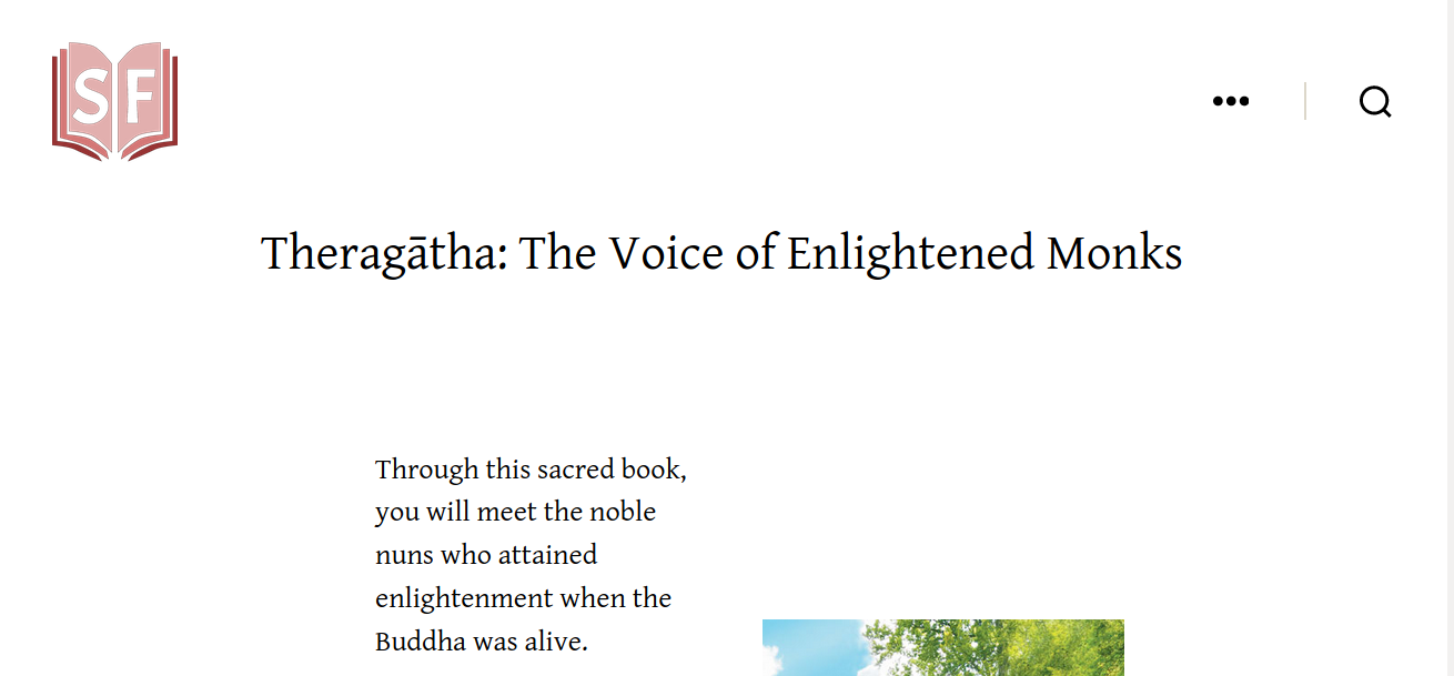
For now the content is a bit limited. There are complete translations of Dhp, Itv, Vv, Pv, Thag, and Thig. So I’m not really looking for feedback on what is and isn’t included. Eventually the missing bits will be filled in. For now, because of what is there, topics related to karma and rebirth are heavily represented.

There is also still a bug with the previous/next links at the bottom of individual sutta pages. Working on it!

So why a new website for suttas? Great question. The two main motivations are 1) to have translations that are as simple as possible, so much so that they are accessible to young people as well as non-native English speakers. And 2) to present translations in line with those done by Ven. Kiribathgoda Gnanananda Thera. Because there are already other complete translations that adhere very closely to the Pali, the translations on this site have the opportunity to be a bit more simple and straightforward.

For technical terms and objects that may not be familiar to non-Asian readers (think flora and fauna) there are popups throughout the text. I hope that in the future this will be a toggle-able feature.

Another motivation is the ability of people to discover content easily. For now this is happening predominantly through a tagging system. As more content is added, there will be more curated recommendations at the end of the text similar to what can be found at Dhammatalks.org and AccesstoInsight.org. As well, we plan on having topic “series” that could guide the reader through important concepts in the suttas. Again, this will happen as more content is added.

I’ve tried to design things with a “mobile first” principle, knowing that a majority of readers are going to be on hand held devices.

If you find problems on specific pages, please try and give the url/address for the page.

All suggestions are welcome, although I’m mostly looking for feedback on usability. You are also welcome to give feedback on the translations themselves.

SuttaFriends.org

Thanks!

17 Likes

This is so impressive.

Sadhu! Sadhu! Sadhu!

May this gift of Dhamma be used by many people to much benefit :pray: :pray: :pray:

5 Likes

It’s been the work of many many people who have helped over a long time with many different aspects. I’m leading the website side of things, but the translations have mainly been lead by others. Countless others, actually.

Please take some time to enjoy. I kind of glossed over it, but as far as I know this is the first time the Vimana Vatthu and Peta Vatthu have been put up on the web in their entirety.

7 Likes

Congratulations on the launch! So exciting that the Pv and Vv are finally available online in English! Surely this merit will lead to all kinds of treasures :crown: for you and everyone involved! :grin::pray: Sādhu!

My thoughts on usability as I poked around:

  • I love the simple and helpful language of the site. For example: “If you are looking for a sutta with a single number in the citation, click here.” :clap: Awesome
  • The glossary popups are just great. I especially love that they are fast. Just wish they were a little easier to close. On my phone the “x” is a bit small and hard to hit.
  • At the end of DN32 it’s a bit unclear why DN31 is “next” (:arrow_right:) and Pv 4.14 is “previous” (:arrow_left:)
  • Search is cool and works well overall, so congratulations! But it could use a little polish: clicking the :mag: should focus the textbox immediately, the loading state indicator was a bit slow, the search term isn’t displayed in the results page textbox, it’s unclear what “oldest” and “newest” mean in the context of suttas (perhaps you could add “Date added” to the sutta permalink page to make this clearer?), the blue arrow on the right of the result is confusing (in that it seems clickable or perhaps means the entire <li> row is clickable, when in fact only the grey (!) page titles are), searching for “cat” by relevance gives the Caturanavajja Sutta and four other results before DN28, “DN28” doesn’t find DN28 at all… etc etc … Search is hard :joy:
  • I’m unsure why the MN suttas are listed in the order they are
  • The chanting audio worked well on my device.

Overall an excellent new addition to the family! Congratulations again on the public launch!

9 Likes

Thanks for all the specific feedback! I don’t really want to say that it’s launched. At least not till I fix:

Yes, I said in the initial post that that part is broken. :sob:

What if you just tap outside of the green box? That should close it. It’s not entirely intuitive since when you touch the screen to scroll the box does not close (maybe that’s a feature, not a bug? Don’t know.)

Right. That should be fixed now. This is one area where wordpress and my hopes and dreams collide. I don’t really want this thread to turn into wordpress bashing, but sort order is one of those areas that core wordpress doesn’t do well. I’m working with a plugin developer to get this sorted, so to speak.

Yes, the search does seem to have some less than ideal formatting on mobile. It’s an external service, as so many of the search things are. I’ll take a look specifically at the issues you raised.

Thanks for pointing this out. You’re right, it has no relevance. Gone.

For me it does, but I’ll keep an eye out for it.

Well, in any printed location (meaning books, etc) the citation is written as DN 28. And that does find it. If you are really averse to the space, you can just put dn28 (or DN28) after suttafriends.org/ and Bob’s your uncle. Of course it should turn up the sutta either way. Once we have more content and experience, we’ll probably reevaluate the search service that we use. At some point you have to settle for “not horrible.”

Well, yes. But the result you want is there. I believe the way relevance calculated is by starting with text in the title. So that is likely why. And it’s not a bad concept. Four down doesn’t seem so bad, but first would be good. But there is a limit to algorithms. FWIW, if you put cat in quotes, it comes up first. Alternatively you could have used the simile index, but that’s more clicks. At least it came before the five cat’s eye results. :heart_eyes_cat:

Oh, yes. Number one search pet peeve. Sorry about that.

3 Likes

This is a great approach. Vocabulary in translations can be daunting.

I used Readability Scoring System to gain an understanding of the reading level, which I believe matches your target. :dart: :tada: :smile:

5 Likes

browsing thru , do notice the background color , not very soothing to eyes maybe just me .
“browse by book” , for Majjhima Nikāya (light brown vs red) , Sutta Nipāta (light pink vs red) , Itivuttaka (pink vs red) appears straining the eyes .

Wonderful ! Sadhu x3 !

3 Likes

Great idea, Snowbird! :+1:

Just noticed that on the Thag page the header section with all the books, indexes, etc. to select from is lacking.

I like the big font and the idea to have different approaches to structuring the content—by topic, people, book, etc. It’s not easy to group a vast collection of texts like the Buddhist canon in a meaningful way without overwhelming the reader.

It’s also a good idea to give a few examples of a category so that those who don’t want to be overwhelmed have a small choice to select from. The downside of this is of course that offering selections will always have a bias, in one way or another. But still—if you group a list of 67 items in alphabetical order only the most dedicated readers (or those looking for something specific) will ever look beyond the first 7 items. So you have the bias of the alphabet… :woman_shrugging:

3 Likes

Thanks for the feedback! I’m still deciding on the background colours for the suttas. My idea was that it would be a subtle way to remind people where they were in the canon. Similar to the physical experience of reading a book. But probably if I keep it, I"ll need to make it a setting people can turn on and off.

I think you are talking about the link colour on top of the different background colours? It’s funny, just yesterday I was looking at the site after my screen had gone into deep “night mode” with the orange colour shift and it did indeed look bad.

Thanks for the feedback!

1 Like

Hmm. So that link section only appears at the top of the book page on a large screen, and when I check it is there. I decided to not show it at the top of mobile screens because it takes up so much space. Were you viewing on two different devices?

Indeed. And I think if we were doing comprehensive tagging where every single sutta with a certain topic was tagged, people might be surprised at the prominence of certain topics. For example we see aniccā, dukkha, anāttā hardly at all when compared to, say, results of good and bad action.

Thanks for the feedback.

3 Likes

No, I’ve been viewing on my laptop only, i.e. a large screen.

To me, the Thig and all other book pages look like this:

and only the Thag looks like this:

1 Like

Brilliant. This was in the back of my mind as a problem. So when you are looking at the Thig, you are looking at the real index page. But what you are seeing for the Thag is actually the print book page. This is certainly confusing since I do include the index at the bottom of the book page. It seemed like a good idea at first. Now I see the limitation. I’ll work on that.

The real Thag index is here: https://suttafriends.org/theragatha/

1 Like

:joy: Ah!

The thing is, when clicking on a link in this row:

Bildschirmfoto vom 2020-05-18 11-27-19

I’d expect to come to the same sort of page each time. The Thag is just the only case where this expectation is not met. Which to my mind is confusing. And I wouldn’t quite know how to access the “real” Thag index.

3 Likes

A reasonable expectation! This is an error on my part. I always use the menu, so I never noticed. It should be correct now.
Also, I’ve re-done the Thag book page so it doesn’t act like an index page: https://suttafriends.org/book/theragath-the-voice-of-enlightened-monks/

At the moment, the (print) book pages will link back to the online version. On the index pages there is no direct link to the book version, although at the bottom of each sutta there is a link to the book page. It’s not prominent which is by design.

Thanks so much for your follow up.

2 Likes

I have played around with these a little bit. As I understand it, having just some Pali names in the text can throw off the calculator. Not to mention Buddhist hybrid English. :slight_smile:

Thanks for taking a look!

3 Likes

So, I knew that the coloured backgrounds would not be popular. I’ve changed it so the headers and part of the footers carry the colour. What do you think?

Hi snowbird , for me (red vs black) straining .

Could you explain a bit more? The red are the links only. Over the years lots of sites have given up the (rather ugly) convention of link underlining in favour of using a colour.

Are you saying that it’s painful to see the red text on the screen? Obviously black on white is best for reading text. But links have to be indicated some way. And since we are using the dotted underlines for popup words, we can’t really use traditional underlines.

Since the actual suttas are black on white, is the red really a problem? I appreciate your feedback. I hope to eventually have more display options available to the user as a traditional ebook reader might.

You might want to see if your browser has a reading mode that strips off all formatting. I think Chrome has that.