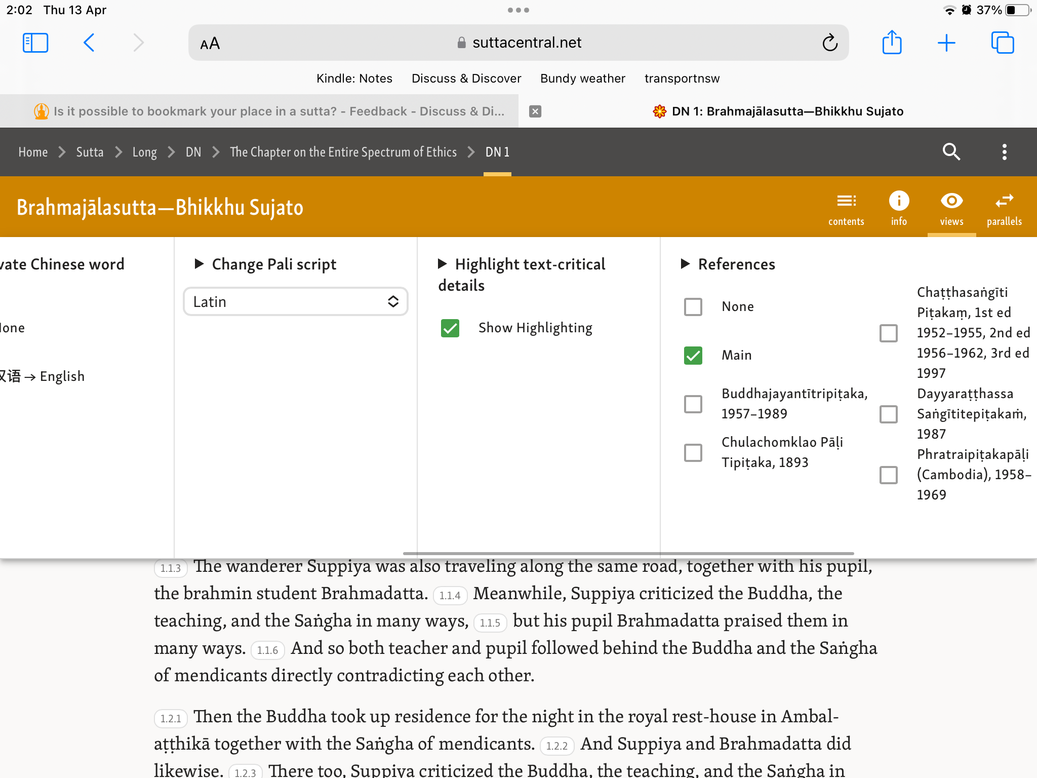
I can’t find “References”. This is what I see under “Views”:

Strange. There should be a horizontal scroll bar:

What is your browser?
What happens when you zoom out?

I’m wondering why there’s no horizontal scroll bar? Is it really not there at all, or does it appear on hover? That’s what mine does on Firefox.
We should probably put something there to indicate that it can be horizontally scrolled. I’m wondering if there is a common UI indicator for that?
1 Like
I went back and had a second look.
There is a horizontal scrollbar at the bottom of the Views menu.
I didn’t notice it the first time around:

1 Like
I’ve sometimes seen a grey overlay thing partially covering the right side used to indicate “there’s more over here” by forcing you to scroll the rightmost section to the center to fully see/use it (thereby revealing it can be scrolled and that there are more sections beyond it). When you scroll a similar overlay appears on the left and the right overlay disappears when you’ve scrolled all the way to the right. Often these overlays are clickable and perform some scrolling when clicked.
I still don’t see it.
Yeah. It’s called a scroll bar. ![]() Sorry. Couldn’t resist.
Sorry. Couldn’t resist.
I hate these “hover to make them appear” scroll bars for this very reason. As such a critical part of the user interface it should not ever be hidden, imho. If there is some way to override that behaviour, I think that should be the first option. I think there may be browser specific css so you could fix the width/colours of the scroll bar. That’s the most sensible thing.
@Jhana4 Are you using a Mac or Linux machine? I rarely see this on Windows.
Much more explicit is some kind of > button that appears until you have scrolled all the way. Clicking on it would scroll for you.
I’ll also throw it out there that I think it would be much, much better if all of these settings were compressed into a single screen. Forcing people to scroll invites problems like this. Especially since horizontal scrolling is much less common. ETA: Yes, when I look at this again I’m puzzled why all of those radio button sections aren’t dropdowns. That would save a lot of space. I’d also love to see only the top segment schemes appear with an accordion to show the rest. If a scheme is unique to a small number of texts then there is no point showing it to everyone by default.
It would require a bit of js, but it should be possible to make it so that if there were option areas off screen that a resting place was forced half way through the middle of the next one. With carousel displays like this that’s a fairly common pattern.
3 Likes
@Snowbird I use Linux. The scroll bar did appear in a timely way, it was just so thin I didn’t notice it.
In the most recent iOS webkit there is no scroll bar… until you start swiping/scrolling. Then a very thin one appears

3 Likes
Yes, also with their phones. I don’t understand this obsession with thinness over usability.
2 Likes
I’m guessing that they assume that people assume that all web pages should be scrolled down. So it really only becomes a problem with the much less common horizontal scroll.
But, yeah. Hate it.
4 Likes
A large “>” or other type of arrow would work.
Other alternatives would be a thicker scrollbar or a brightly colored scrollbar that would stand out.
Thanks everyone for the input.
Personally I like thin/disappearing scroll bars, but only because I know that is what they are doing and can invoked them when I need.
As I’ve said many times, I think it’s a bad idea to replicate in the application functionality that already exists in the browser / OS. But I’ll have a look around and see if there’s anything.
Radio buttons are a better UI especially for a11y and on mobile, as there is a single click, nothing hidden, and no moving parts.
Having said which, maybe some controls could be done like that, let me see.
1 Like
In that case, I’d suggest doing some kind of flexbox so that the settings overflowed vertically instead of horizontally. Maybe it’s just me but that feels like expected behaviour.
Once you start having to add arrows and things to direct people it’s probably time to reassess the design.
And I do want to say that I know you have put a huge amount of thought into the interface and I don’t want to be dismissive of that.
3 Likes