The overall typography of the text pages can remain as is. See below for more on the typography
We don’t need to display the hierarchy in supertitles as currently, as they merely represent the same hierarchy that is present in the nav drawer. Instead, display the root language title above the translated title.
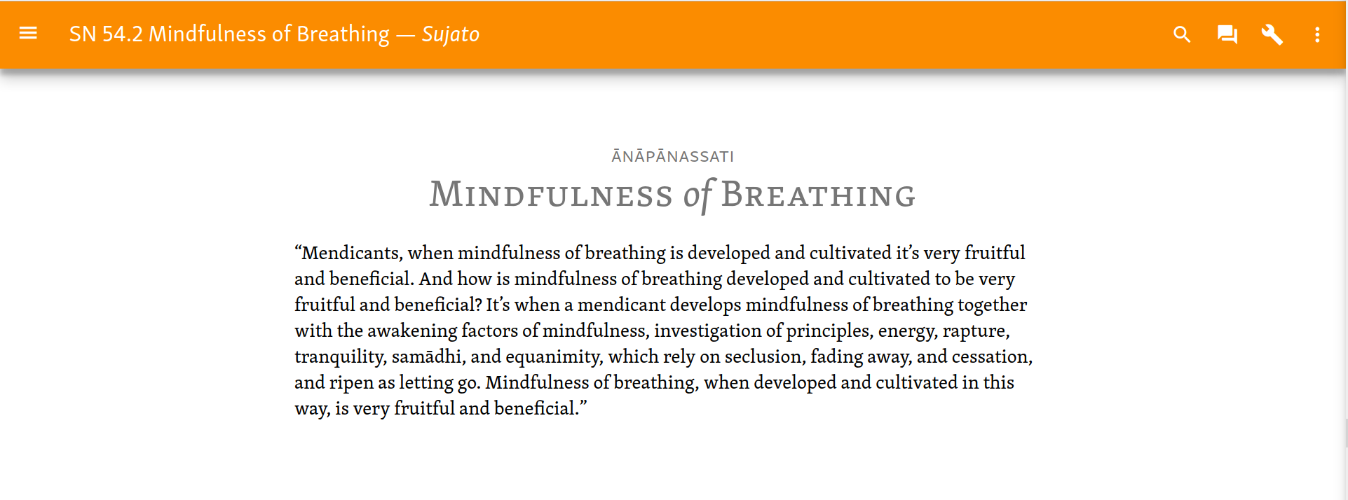
In addition, we can remove the ID numbers from Sutta Titles, thus keeping it cleaner. The Sutta ID, Title, and Translator can be displayed in the Toolbar.
In some cases there is no title. If the title is empty, use the ID instead.
We can implement prev/next links at the foot of the page, as used on the MD spec site.
Here is a standard text view.
- Translator is separated with em-dash, and italicized (like a signature). Obviously this doesn’t apply to root texts.
- Heading includes original language and translated title.
- There is quite a lot of variability here, so we need to test this.
- Use gold for the header: it is a reward!
- Maybe we can add an italics flourish to little words in titles: of, and, a, to … Low priority.
Text & Translation
Using the text view selector we can see text and translation line by line:

Or in columns. Widen the container for wide screens.

Note that in both these, the root text is in sans. This echoes the heading, where the root title is sans, the main title serif.
These can be produced with a few lines of CSS.
/* line by line view*/ .root-text, .translated-text { display: block; } .root-text { margin-top: 1.4em; } .translated-text { font-family: "Skolar PE"; } */ column view */ .root-text, .translated-text { display: table-cell; padding-top: 1.4em; width: 20em; } .root-text { padding-right: 0.7em; } .translated-text { padding-left: 0.7em; font-family: "Skolar PE" } .text-node { display: table-row; } */ <span class="text-node"><span-class="root-text">“Ānāpānassati,-bhikkhave,-bhāvitā-bahulīkatā-mahapphalā-hoti-mahānisaṃsā.</span>----<span-class="translated-text">“Mendicants, when mindfulness of breathing is developed and cultivated it’s very fruitful and beneficial.</span></span>
Another option, not shown, would be to show the root text as a tooltip.
Textual information
Currently the vol/page info is optionally displayed in the right margin. I cannot find any MD patterns that fit this. Unless anyone has a better idea, keep as is.
Variant readings, etc., are displayed with color variation. Again, keep as is.
Texts with sections
Quite a few longer texts are subdivided into sections. Show these in the nav drawer.
Note
An alternative pattern, found commonly on MD sites, is to include the inner navigation on the text page itself as a ToC. But this won’t work for us. Either the ToC is inline with the main content (as on the main MD spec site), which doesn’t work when there are many sections, as we sometimes have; or it is in a second column, which then has to be adjusted for mobiles, either put inline, or in the nav drawer.
The section view will display a numbered list of sections, which replaces the standard nav hierarchy. To return to the standard nav hierarchy, we use what MD rather confusingly calls the “up button” (which is in fact an arrow pointing left.)

Since these sections are numbered, there is no need to further indicate the hierarchy level.