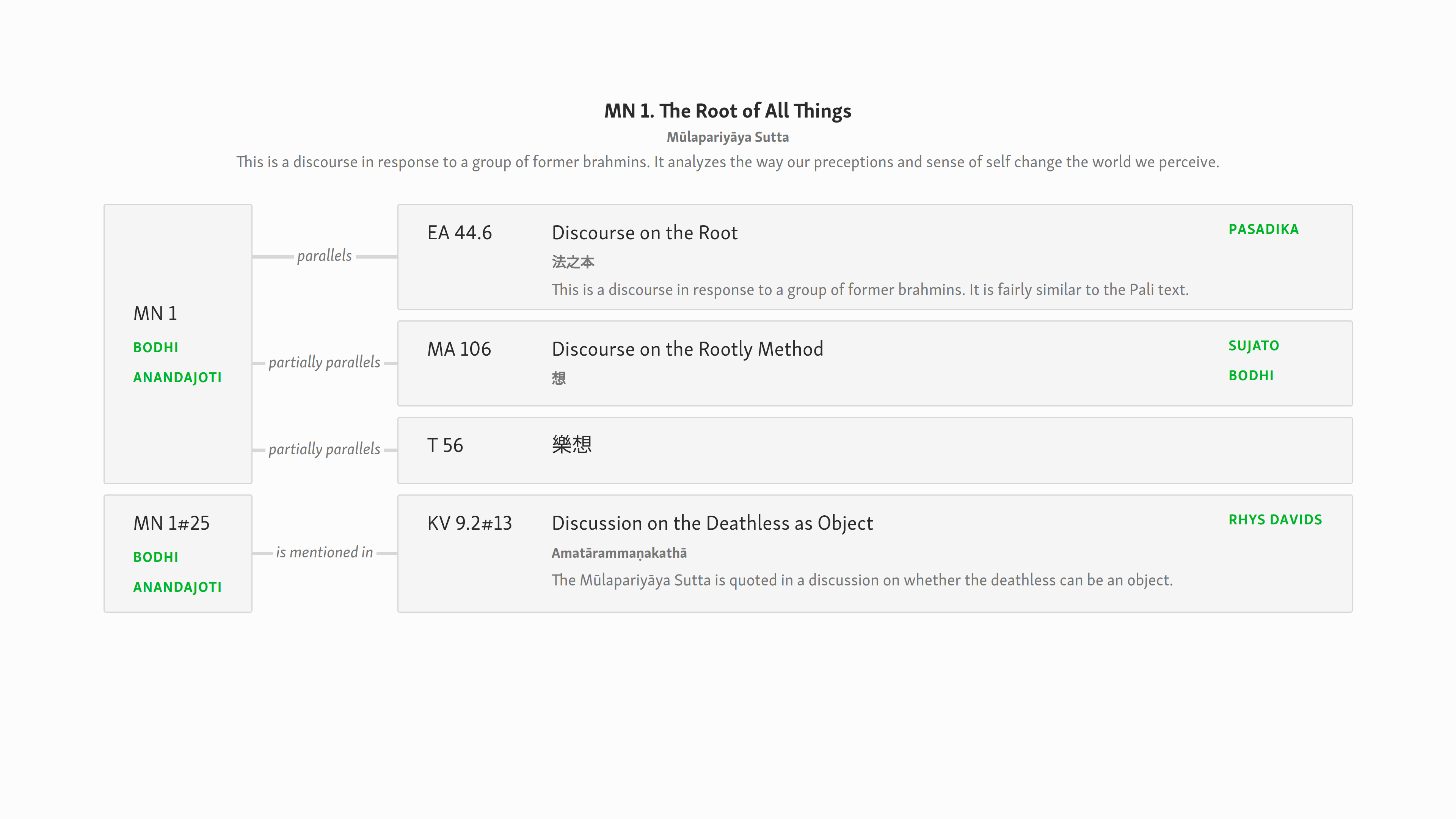
After taking a break for a day or two, I came back to this design, and something about it bothered me. i realized that, when scanning complex pages especially, the structure was not clear enough, especially in the first column. Here is a mockup that addresses this issue by removing the texts to the far right, similar to how they are today, but retaining the new functionality.

details_mockup_1line.html.zip (1.6 KB)
Here is the i18n version of the same concept.
details_mockup_i18n_1line.html.zip (1.8 KB)
It seems to me that in this form I can scan the IDs and titles much more nicely, without having to filter out the “text buttons”. In addition, they waste less vertical white space. @blake, @vimala, any thoughts?