I’m interested to collect people’s favorite fonts that display all the Pali glyphs in the Roman alphabet. I’ve made it in the wiki category so if people like they can edit this post in addition to leaving comments/discussion. [Mods please move if this is not appropriate.
Pali Fonts for the Roman alphabet.
A Pāli font should include all of the following letters
Ā ā Ī ī Ū ū Ṅ ṅ Ṭ ṭ Ḍ ḍ Ṇ ṇ Ñ ñ ḷ ṁ
Please create a section for fonts that offer these letters
NOTE: Google Fonts may be out of date. Search for the original authors if needed.
 EB Garamond
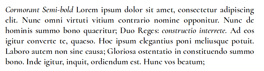
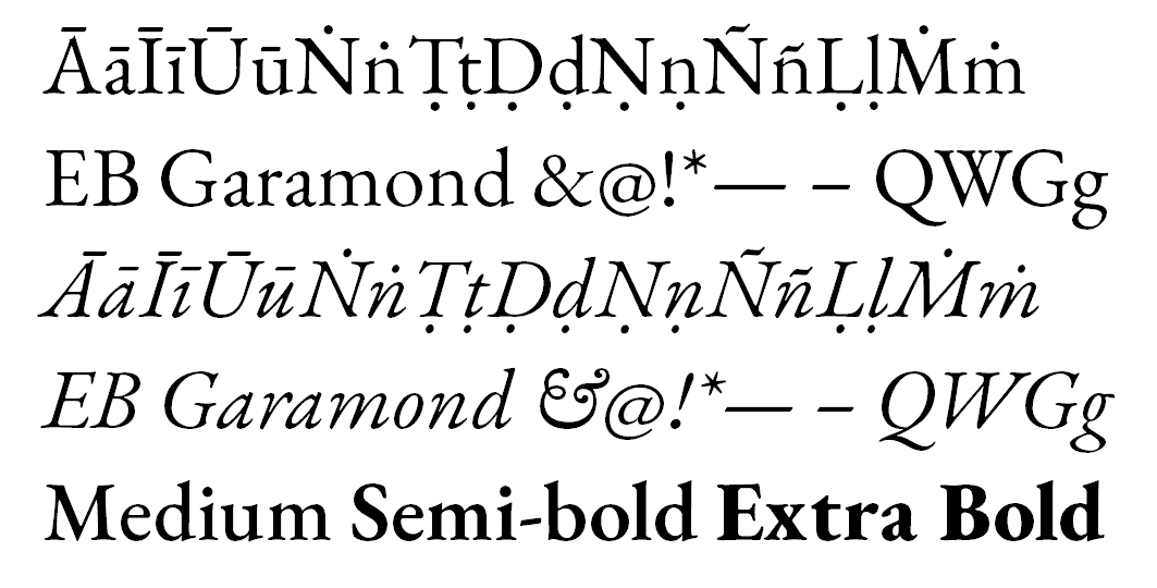
Recommended by Bhante @sujato
Source Pro family

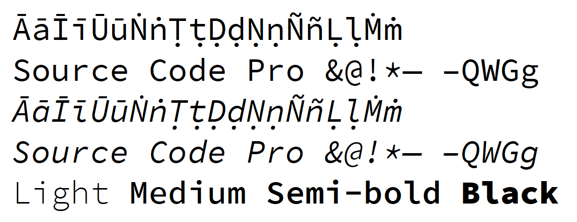


On Github Sanserif | Code(Mono) | Serif
Recommended by Bhante @sujato ( also on Typekit.com, typographica.org)
Heuristica


Cormorant
On Google Fonts | Official page | Github


Faces
- Cormorant
- Cormorant Garamond
- Cormorant Infant
- Cormorant Small Caps
- Cormorant Upright
- Cormorant Unicase
Free
Gentium
Google Fonts has two versions of Gentium
Free
Official Website
According to Google Fonts
The Gentium Basic font family is based on the original Gentium design, but with additional weights. The family comes with a complete regular, bold, italic and bold italic set of fonts.
The supported character set, however, is much smaller than for the main Gentium Plus fonts. These “Basic” fonts support only the Basic Latin and Latin-1 Supplement Unicode ranges, plus a selection of the more commonly used extended Latin characters, with miscellaneous diacritical marks, symbols and punctuation. In particular, these fonts do not support full extended Latin IPA, complete support for Central European languages, Greek and Cyrillic. Please see the Gentium project homepage for more details.
The Gentium Book Basic family is very similar but has a slightly darker weight.
Fira

A nice feature of Fira is that it comes in three widths and 9 weights.

However, the Mono face does not include Pali letters.
Originally commissioned for Mozilla, it is now its own project. New development is on a branch called FiraGo
Arima Koshi & Madurai
By ndiscover.com
8 weights. Free. Available as a Google Font, but there it is missing the ṁ


 …) with arbitrary diacritics (~, ^, ’,
  …) to produce sensible glyphs (ñ, ô, ć,
  …) — a hard task! NFC requires having a huge table of precomposed glyphs.