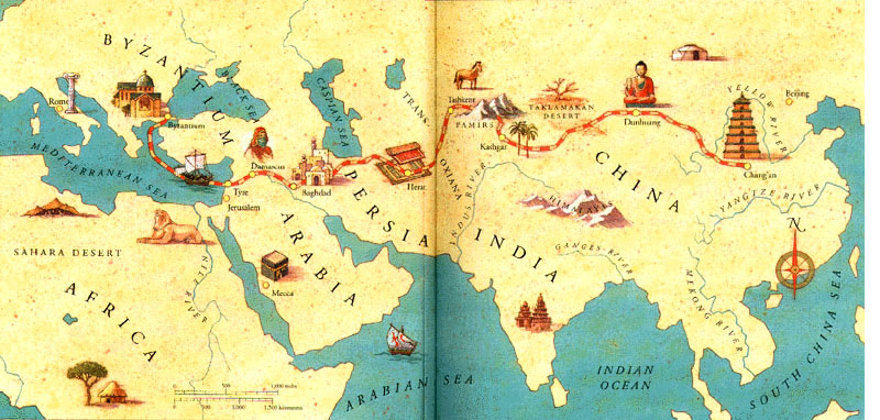
I’m looking for a nice map, which could be used in our SuttaCentral book series. There’s a good one here, but it’s a few centuries later:
I’m looking for something with a but of style. Hand drawn, black and white line drawing (no shading or greyscale), some flair to it. A bit Tolkein-ish in that way! It’d have to be high resolution and free to use. Anyway, feel free to post whatever maps you may have!
The one on Reading Faithfully is pretty close, but I was hoping for more … style?
I could draw a fancified Fantasy version of the RF one with some input about the changes you‘d like to see. Particularly, where on the subtle-gaudy spectrum do you want it?
(Just to add: More specifically,
do you want places added or taken away, and do you have a certain transliteration preference? If any of these, do you have a less stylish but more accurate map I can work off?
what about fonts? Should it be Antiqua or handwriting, and if the latter, what style?
what dimensions will the book have?
can your printing process handle hatchmark shading?)
Obviously these have more details than we will have, but the level of detail depends on the physical size.
The basic constraint is that we are targeting a page size of 6inX9in. This means that the map will have to fit:
portrait on one page, i.e. 6 inches wide, minus margins so say 4 inches wide. Not huge!
landscape on one page, so we can make it 9 inches wide, but you have to turn the book on its side
or over two pages, which I would love, but we have to figure out what to do with the gutter.
The text uses Arno Pro, so let’s stick with that if it is a font (we can supply a version that has all the diacrticals). But personally I’d like something hand written! I don’t know the styles, but maybe give a few samples?
The idea is that we will make a PDF available and it can be used by various printers. So basically the more robust the better. We should assume that it will be printed in various places by folks with crappy gear. In my experience, even basic greyscale is often poorly handled. I’m not sure about hatchmark shading, but I’d suggest keeping to pure black on white lines as much as possible.
It’s not yet available, but we are working hard and it is almost ready.
That also looks like it‘s covering a larger area than the RF map. Or maybe I‘m looking at it wrong.
4 inches in portrait mode would be super small, I think it would be preferable to have to turn the book and get a larger map in exchange. Many Fantasy books do that as well. If the map‘s in the front or back of the book, and the binding‘s clean, I don‘t think the gutter should be a concern. Then again, unclean binding often happens, and I don‘t know how much control you really have over that.
So assuming you take the landscape option, and we have margins for the height as well, would it be 4x7in?
I don‘t even have the gear to do it on the computer, so it‘s all ink! Legibility should come first, so I‘m leaning toward Antiqua for place names, maybe somewhat ornate handwriting for the kingdoms. Here‘s a (very) rough and incomplete example sketch in which I misspelled Gaya and Magadha and forgot the diacritics
I’ll double-check next time, sorry about that. Speaking purely stylistically, though, maybe the handwriting‘s too much.
We could also do some history-ish script, like the Carolingian-adjacent style of LOTR, but as there‘s no original Pali script, that would probably be a stretch (with a somewhat Orientalist flavor).
Hatch mark shading is just black lines, that‘s the sweet thing about it. No greyscale needed.
Well, for example, we could do the standard Fantasy map thing of having the „continent‘s“ name Jambudipa on the thematically appropriate equivalent of an ornamental scroll, i.e. a palm leaf manuscript, and decorate it with a few rose apple tree blossoms in the background. That would be pretty fun, but also kitschy, in a 19th century kinda way. I wouldn‘t go so far as to put squirrels and deer on the map, as this might quickly get confusing with the limited size and B+W concept, but if we wanted a 10, that would probably be the way
Reminds me of a picturebook I read as a kid. It was about a stuffed rabbit going missing and sending letters from all over the world. There were actual letters in envelopes and all, and it also had this map.
Just as points of reference, Arno is an Italian Renaissance style. You might also want to check out the Brahmi that’s used in the Ashokan pillars. Not to copy of course, just as points of reference.
Brahmi is the original Pali script (or as close as we can get.)
I was thinking some yakkhas and nagas? Maybe a deva in the sky?
Yes, this is definitely the best one I’ve seen. It’s elegant without being too fussy or kitschy. But it covers a somewhat wider area than early Buddhism. One thing they do sneakily well is arrange it so that there isn’t too much of interest in the gutter.
Yes, that’s the size of the text block.
Can we try out the two-page option, and see if we can design it so that the important parts miss the middle?
I think something about the projection makes it look squarer than it needs to be. Anyway, I think we can probably arrange the main sites around the gutter just fine, what do you think?
I could do a Brahmi styled Latin script. Would be fun!
Any thoughts on the handwriting style in the sketch and possible ornaments?
Generally, I‘m still trying to gauge the level of subtlety vs. LOTR we‘re going for. One or two pictures of maps in an appropriate style would help tremendously.
Wait, that‘s a joke, right?
Yes, that shouldn‘t be a problem. So since there‘s no margins on the inner sides, that would make it 10x7in?
Since we’re following in the footsteps of Tolkien, let me know if you need constructed Buddhist language to go with that map. Avid, life-long conlanger [someone who uses linguistics to construct languages] here
(I used to want to channel the desire to continue with the hobby into something Buddhism related and thought about making a language for journaling in my monk’s life. But ah the hours wasted being immersed in a linguistic maze, and I realized I should just learn Pāḷi! )
Oh man, this is actually a thing lol. With better knowledge of how OIA/Vedic dialects developed into the Prakrits and a survey of the regional characteristics it would be doable Bryan Levman actually did something similar (but I personally tend to lean towards Stefan Karpik’s response that his ‘proto-Pāḷi’ reconstructions are unlikely to be realistic or actual proto-Pāḷi).
Would love to, but I‘m not sure where to put them. Is there a historical map of 500BCE India with clearly delineated forests?
Got it!
The Brahmi styled Latin script would probably be too far out, and we should use a hand-lettered rendering of Arno instead, but I‘ll upload some samples anyway.
I‘ll keep that in mind as I whip up a first sketch.
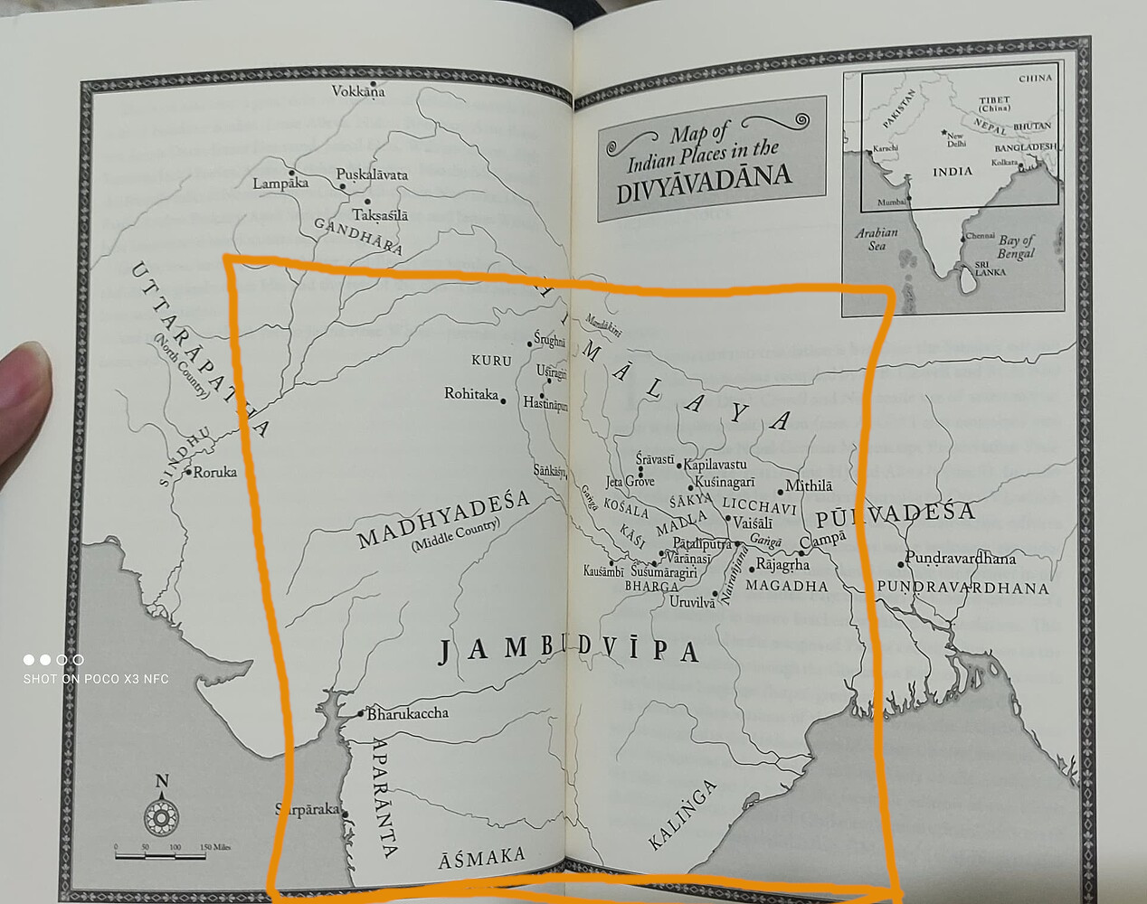
Edit: Actually, I wanna check back before starting. Below is a segment in 10x7 format I chose from the Indian map on buddhamap.org based on the region you indicated. The green line and dots are the Parayanavagga journey, and I’ve indicated the gutter.
For details and legibility, the smaller the map segment, the better. To that end, I want to take out a chunk from the north (and, to keep format, east and west would also lose some ground). I just don’t know how much of the north can be taken away without losing any places relevant to your book. Could you mark it in the picture?
Wghat they have as North Kuru is probably further than we need, we should go about as far as what they have as south Kuru.
There is not, but basically anywhere outside of inhabited areas was jungle. I think adding some jungle and so on would be a good reminder of what it was like.
There are a few forests mentioned in the suttas, but we don’t really know their extent.


