American book sizes! 6x9 is one of the standard sizes offered by Lulu, and I like it because it conforms to a 2x3 ratio, and the simple numbers makes the maths easy for my lil’ brain.
No worries, old-fashioned is good.
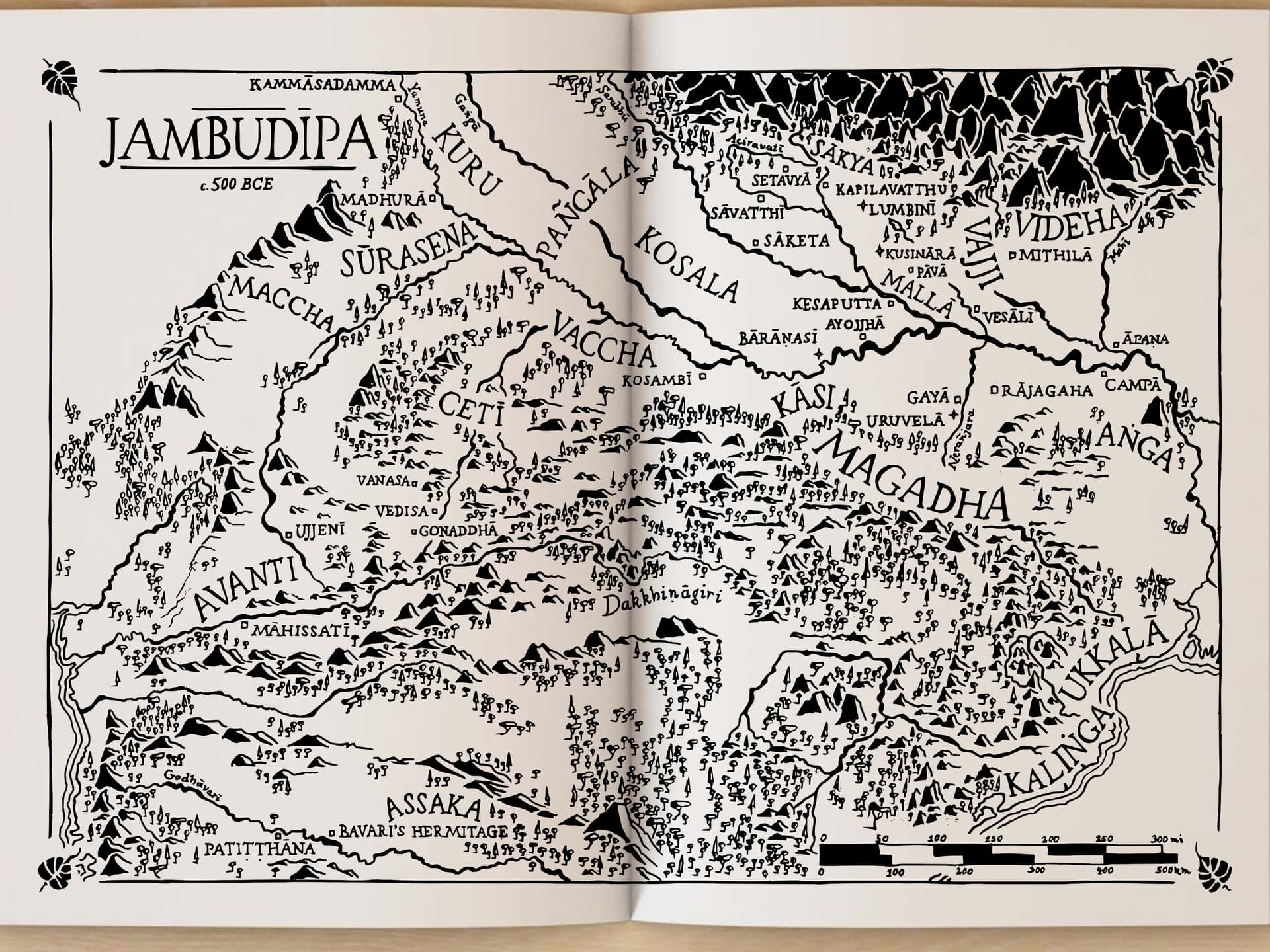
I’ve been sitting with the map these last few days, and just two small things come to mind.
For Vajjī, revert to Vajji, again so sorry about these diacritical changes, it’s really hard to figure out what the “right” version is.
A more general thing, maybe just be a bit careful to leave an extra mm or so space around some of the names? Look at things like the P in Patitthana or the C in Pancala, or the final A in Magadha, I feel like the lettering is a little bit crowded by the geography.
No worries about those! The relocation of most country names, though, (i.e. having to re-letter them entirely) that got to me just a little bit
Had the same thought. That could go a long way toward visual clarity, creating a good amount of white space around the „important“ parts that the eye is immediately drawn to.
Oh yeah, forgot to mention, I‘ve got some papers due which I can barely cram in before going monastery scouting for a week. Drawing will likely resume after March 17.
In the UK we’re a bit hybrid. For example, the roadsigns are in miles for distance and speed, but I personally use km when I’m walking (or more likely getting lost) in the countryside. I use inches for my height, but kg for my weight. This might be different for younger people.
It‘s PoliSci. I went in looking to get some theoretical foundation and future vision for my leftist libertarian sensibilities, but instead realized that we‘re absolutely screwed. Which is why I quit politics and started scouting for a monastery to ordain
Alright, I‘m back! (If you‘re wondering, it was great. Had some nice conversations and met people with an impressive je ne sais quois about them. Keeping eight precepts and being somewhat secluded, with people who preferred silence over idle talk, far from being hard as I thought initially, was more like exiting a crowded room full of people screaming at each other. Now my inner voices were the only ones screaming, usually at a lower volume, too, and it was such a relief… immediately made my practice like a gazillion times better Probably not the place I‘ll ordain, but the monastic life in general seems pretty awesome.)
Anyway. Finishing touches, reverting the diacritic mark on Vajji, clearing space around the lettering, coming up. Anything else before the ink hits the paper?
I hereby relinquish possession of this work by releasing it under a CC0 license
Some stuff might look a bit funky because of Inkscape’s bitmap tracing (and my somewhat shaky hands ), which is, on the whole, pretty good, but needs a bit of tweaking. If you notice anything too off, I can re-tweak it.
This is a PNG of the vector I’ve made. Discourse won’t take either SVG or ZIP files, though Anywhere else I can upload it?
But a little request, if it doesn’t require too much of your time – could we have a map without geographical features? No mountains? No forests? Rivers are good, but mountains and forests are really in my way of finding things.
Please forgive a simple old lady who prefers a simple thing.