In the MD spec so far, I have followed up on @blake’s suggestion to use a nav drawer for the primary navigation, and drawn up a MD spec, which @vimala has begun to implement. But there are some problems with the spec, and here i would like to make this clear and propose a solution.
Note: This post was a proposal, which has now been accepted by the team and included in the main MD spec, which is the definitive version, this one is deprecated.
###The problem
In the nav drawer in the current MD spec we have something like:
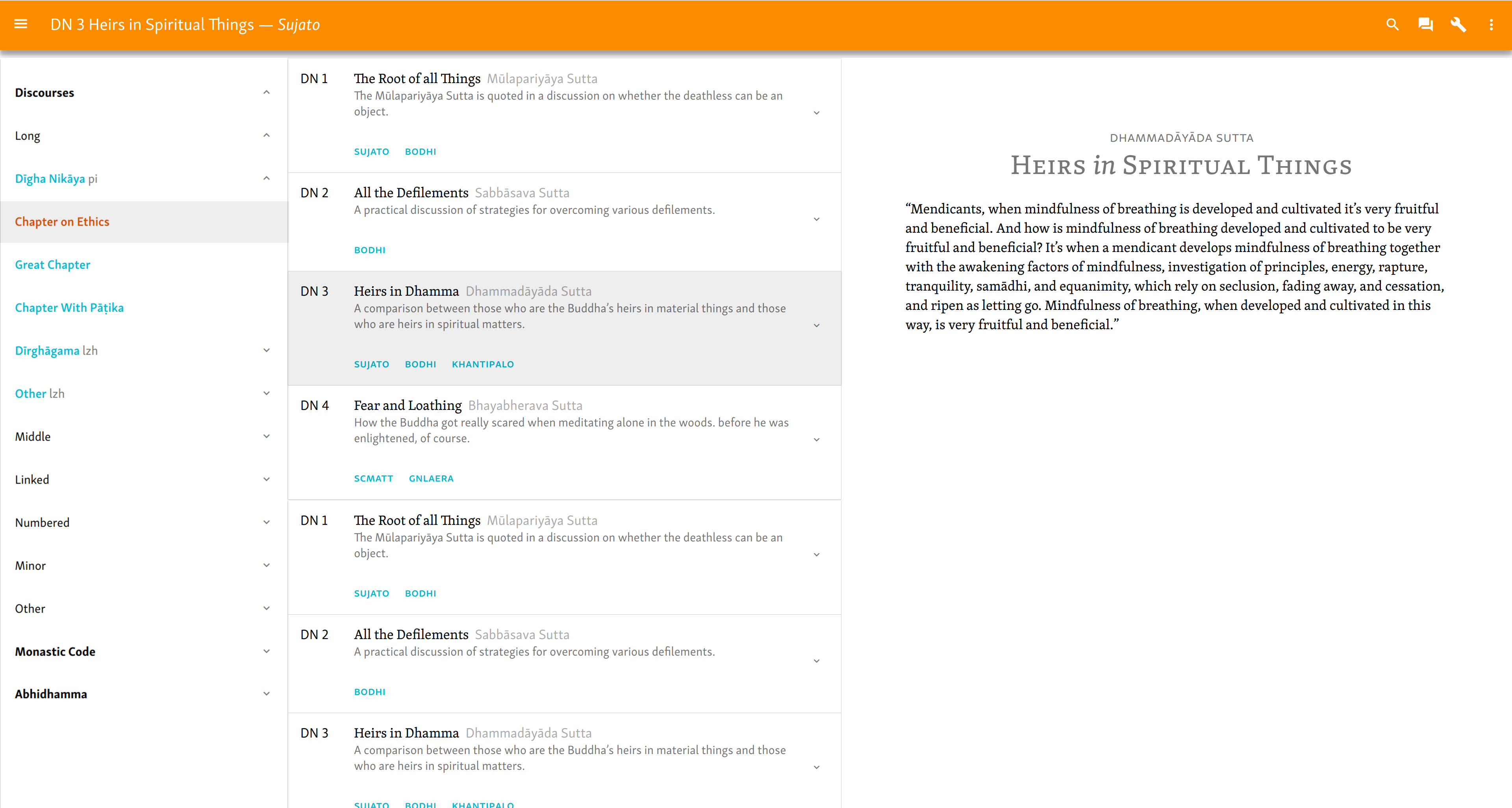
- DN 1 The Supreme Net of Views
While in the division view we have something like:
- DN 1 The Supreme Net of Views Brahmajala Sutta
A description of the 62 kinds of silly ways to organize a sutta site.
PALI SUJATO BODHI
In other words, the information in the nav drawer is nothing more than a summary of the division view; or, to say the same thing from the other way around, the division view is an expansion of the nav drawer.
Now, this is not normal. Normally, clicking on an item in the nav drawer doesn’t take you to an expanded view of that same item, but to the actual content, in this case, the text.
There are a number of problems with this proposal, but it seems to me the critical one is this: if we just list the translated sutta titles in the nav drawer, where do you go if you click that? To “the sutta”? Sure, but if there are multiple translations, which one? What, exactly, is a sutta here?
This problem is solved in the division view. The solution there is that the title itself does not take you to the sutta; this is because the title is an abstract representation of the “thing”, which is found in multiple versions. So we bring the “things” to the fore, and select the text or translation via buttons. This is appropriate, as it explicitly labels each actual thing as a text or translation. Moreover, since the overall purpose of the site is to get the user to the texts, it is appropriate that this function be emphasized, not hidden behind an ambiguous title link.
This line of reasoning made clear to me something that had not been clear before:
- Everything in the hierarchy above a sutta is a simple item, whereas a sutta is a cluster of items.
This is why it’s appropriate to represent a division, a vagga, etc. as a simple item in a nav drawer. There is nothing more to them, they don’t represent anything more complex than a node in navigation. But a “sutta” represents original text, translation(s), description, parallels, and so on. That’s why they are best represented as complex list items, and it has always been a struggle to incorporate them in the nav drawer.
###The solution
The implication of this is that we should remove the individual suttas from the nav drawer. This avoids the problem of duplicating information, simplifies the nav drawer, reduces the hierarchy depth, and solves the problem of what happens when you click an item.
Let’s work through the implications of this approach.
We end up with three kinds of thing, which we can conceptualize as three columns:
| Nav Drawer | Sutta list |  Text  |
| ----       | ----       |  ----  |
| ----       | ----       |  ----  |
| ----       | ----       |  ----  |
The nav drawer includes the hierarchy down as far as the vagga. The “sutta list” includes the list of suttas and parallels. I use this rather than “division”, as the view is not restricted to division-level. The text includes the text and/or translation.
Functionally, this would work thus. First you navigate to the appropriate level of the hierarchy. You click on a division, pannasa, nipata, samyutta, or vagga, etc., and the relevant list of suttas is called up. You can then scroll to the relevant sutta, view the parallels if you like, or select the text.
How might this be implemented? Let me consider mobile first.
We would probably want to retain the Sutta list as a distinct page. This has the disadvantage that you cannot navigate directly from sutta to sutta, but have to go to an intermediate sutta list page. Having said which, this difference is probably more theoretical than practical.
[details=Another way]Use a nested nav drawer, as described in “Texts with sections” in my initial spec. This nav pattern is extensively used on the android dev site.
- Advantages: go anywhere from anywhere; keep greater consistency between desktop and mobile versions.
- Risk overburdening the nav drawer again; lose some space for parallels tables.[/details]
For wider screens, MD allows, for desktop only, a “cascading nav drawer”. Clicking on an item in the nav drawer opens a second panel, expanding the nav drawer horizontally. On a wide screen, this could be displayed at the same z-index as the nav drawer and the text, i.e. they all literally sit side by side as three columns. Here’s a rough mockup of that.
In somewhat narrower screens, such as tablets, the nav drawer and sutta list might be an overlay on the text.

However, this view would not work at all on mobile. So to keep development simple we should probably begin by developing for mobile, using a separate page for the sutta list view. At least we can be sure that this will work anywhere. We might consider implementing it as a cascading nav drawer later, if it seems useful.
[details=Deprecated]On the old SC, we have three basic layers of navigation:
- the top menu
- the (sub)-division pages
- the details pages, i.e. parallels and references
In the initial MD spec I reduced this to two:
- the nav drawer (which includes what is in the top menu and partially the (sub)divisions.
- (sub)division view (which includes the remainder of the (sub)division data and the details
It occurs to me that this is still messy, and we might further reduce it to one: eliminate the division pages altogether and only have a nav drawer. Let’s call it a meganav.
So my idea is that all the “tabular” info goes in the meganav drawer, and only the texts are in the main page.
What would this be like? Let’s consider the ideal situation, working with a nice wide screen. If you look at how a typical MD page is laid out, the nav drawer is fairly narrow, but the main content is quite wide, as it is not just a single column of text. MD heavily emphasizes use of illustrations and so on, so there is plenty of room to develop a generous page width, without excessive line length. For us, though, working solely with a single column of text, we can have no more than a suitable line length, and everything else is white space. Anyway, the point is, there’s plenty of room to allow for a wider nav drawer than specified in MD.
So the meganav drawer can include all the info which is, in the initial MD spec, found in the division view, which, as a reminder, is this:

When reading a sutta, this view can be open all the time. So you can go to anywhere, see the descriptions, open the details view, all in the “meganav drawer”, while the text page remains open.
Now, this has more information in it than a regular nav drawer. We know why that is so: to aid the reader. Of course, it is always possible to put away the meganav drawer and read the sutta in peace. But if you want it there, it is very powerful.
As discussed in the initial spec, it should be possible to filter the info in this view to some degree. The vol/page info is hidden by default, and the descriptions are shown. I have suggested that these be adjustable by the user.
Another possibility, perhaps to be used alongside that, is to automatically adjust the content for the screen size. In particular, for mobile users we might, say, lose the Pali titles or the descriptions by default, and allow the user to toggle them in. Anyway, these are details.
Now, there is clearly an issue with space here, especially for mobiles. This is an issue with the ordinary nav drawer anyway, as fitting the long titles and deeply nested hierarchies becomes quite a juggling act.
However, and this is the critical thing: it doesn’t make much difference on mobile whether you use a division page or a nav drawer. The MD specs say that a nav drawer on mobile should open to the right, leaving a space equivalent to the action bar, i.e. 56px. Here’s what that looks like.

So if we display our full information on a “division” page, we only gain a small amount of width as compared to a nav drawer. Either way, we will have to balance out the best way to include information.
Continuing this thread of thought, suppose we were to agree that the above meganav overburdens the nav drawer. How then do we address the issues raised above, especially the problem of how to choose a sutta, i.e. what happens when you click on a title of a sutta in the nav drawer?[/details]
