Here I will develop a MD spec for SC, examining each aspect of SC and describing how best it may be expressed in the MD idiom.
When building the app, we should use the simplest default MD approach wherever possible. We should take care to study and understand the MD approach, and implement it carefully. All aspects, such as spacing, metrics, shadows, animation, and so on, play their part. Reading the spec is an object lesson in a careful, well-considered approach to design.
The essential reference is:
Views
So far we have proceeded under the understanding that we would have distinct views for the i18n and the expert views. But I now think this is unnecessary, especially since we are no longer changing the URLs. Rather, we can choose a set of standard defaults, and allow the user to toggle other preferences.
This would include:
- Show/hide:
- nav drawer (on by default on wide screens, off on text pages)
- Text info (off by default)
- Select a language. This would set the UI for that language, and show the titles, descriptions, and translations in that language. If unclicked:
- UI and descriptions in English
- Titles in root language
- Translations selected via dropdown (as currently).
Navigation
Hierarchy
The navigation in SC is essentially hierarchical. The hierarchy is to a certain extent determined, since it represents the traditional way of organizing texts, especially in Pali. However this is complicated by the fact that we include multiple text sources, which are not part of a systematic hierarchy. Moreover, many of these text sources themselves do not have a coherent inner hierarchy. This is because, like say SA 1, the hierarchy is muddled in the Chinese edition, or because, like most of the Sanskrit texts, we merely have isolated texts, not whole collections. Thus we must extend the traditional hierarchy.
One problem we have to solve is to ensure the visibility of the non-Pali texts. In the two-dimensional old menu, you can see the Chinese and other texts. Even if you never click on them, you know they are there, and can recognize that they have similar names to the Pali. How might we avoid losing this in a one-dimensional nav drawer?
So here’s a thought. What say we dispense with language as a category for navigation? After all, it’s mostly relevant for experts who read the texts in the original languages. Focusing on the i18n aspect for now, it is of secondary interest to a user what the source language of a translation happened to be. After all, we might have exactly the same text translated from different sources. It’s also intimidating: if you don’t know Chinese, why would you click a link that says “Chinese”? So let’s organize the texts semantically, with language info de-emphasized.
In terms of the overall navigation hierarchy, there are many elements, such as nikaya, pannasa, nipata, samyutta, vagga, and so on. Each of these is simple, and constitutes a potential node in the navigation.
The suttaplex
At the bottom of this tree is a “sutta”. (Note that for the purposes of this document, I use “sutta” to refer to any text, including suttas, Vinaya, division-length texts, etc.). A sutta as represented on SC is irreducibly complex; in other words, it is a cluster of associated data. Typically, the data associated with a sutta consists of:
- original text
- multiple translations
- parallels data
- ID
- description
- reference info, i.e. vol/page, etc.
Just because I love jargon, I’m going to refer to this as a “suttaplex”. Nifty, right? Note that the “suttaplex” is all the info for one sutta, a “suttaplex list” is a list of suttaplexes.
The critical thing to remember is this:
- Everything in the hierarchy above the suttaplex is simple, whereas a suttaplex is complex.
This understanding shapes the overall direction of the navigation and structure of the app.
We end up with three kinds of thing. These correspond to MD components thus:
- Hierarchy = Nav drawer
- List of suttaplexes = List
- Text pages
We can conceptualize this as three columns:
| Nav Drawer | Suttaplex list | Text       |
| ----       | ----           | ----       |
| ----       | ----           | ----       |
| ----       | ----           | ----       |
The nav drawer includes the hierarchy down as far as the vagga. The suttaplex list includes the list of suttaplexes. This replaces the “(sub)division” and “details” views in the old site. The text includes the text and/or translation.
Let’s look at each of these elements individually, then consider how they work together.
Nav Drawer
In MD the main navigation in a hierarchical site—as per the MD spec site itself—is handled in the sidebar, i.e. nav drawer.
- A nav drawer is a limited form of list, in that it only allows an item, and optionally an icon and expander. Thus it is not suitable for the suttaplexes.
- The nav drawer can be either extended or retracted by default, according to what is appropriate. But note that on mobile, it must be retracted by default.
Deep nesting
Typically MD has two levels in the nav drawer. The level is indicated with an indent. This is problematic for us, as we have many nesting levels, and long titles. We have have to see whether indenting will work in practice for us.
Deep nesting is discussed in the MD specs here:
If you have a deep navigational hierarchy, you may expand that hierarchy within the navigation drawer. Upon selecting a level, the level of navigation below is revealed. Selecting a collapsed section expands that level in-line, hiding all levels outside of it.
The essential functionality of the nav drawer is that usually each item must contain two clickable fields:
- To select corresponding list of suttaplexes, click the item text
- To expand the list, click an expander icon (this does not apply to the bottom-most level)
Here is a mockup of the nav drawer.

- Note that the hierarchical level is indicated by the expanders. While this might not be as obvious or intuitive as indents, the information is there.
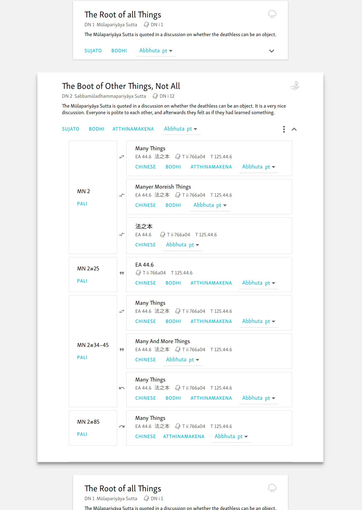
Suttaplex list
Suttaplex lists include everything that was formerly found in Tabular pages, including division, subdivision, and details. I.e. everything apart from the texts, home, search, and static pages.
 Our suttaplex list is not identical with any of the stock MD components. It is similar to a “list”, in the the items are arranged in a fixed vertical order. But they have richer content than a list, and in that respect are similar to a “card”.
Here is a mockup of a suttaplex list.

- Title in Translated language is treated as the “title” of a card, in the large size (24px)
- The next line is like the “subtitle” of a card, greyed and smaller (14px). This contains “nerdy details”, eg ID, original language title, and volume/page info.
- If there is no translated title, it defaults to the original language.
- If there is no title, there is just the ID
- Descriptions, where present, are secondary text. They should generally take up no more than two lines.
- The expander on the right shows the parallels for that sutta. (see below).
- Perhaps we could use a MD badge on the expander to indicate the number of parallels. Low priority.
- Select translations using MD flat buttons
- Translator’s names are shown for the selected language.
- In addition, show a dropdown menu with all translations to the right of the translator’s names. This will serve as fallback where there are no translations in that language. This is similar to the old site, except we should show the translator’s names. (Due to the complexity of the data, these are only called on demand.) Eg:
- Sujato en
- Bodhi en
- Keci fr
- In DN and MN (and maybe other places), we can add a “difficulty” icon in the form of a sapling, potted plant, and tree. This guides a new reader. Title attributes explain the meaning. Low priority.
Parallels & references AKA details
We don’t need to go to a new page to display details. Rather, the data is collapsed by default, to allow scanning of the suttaplex list, and the parallels for a specific suttaplex are opened via the expander.
There are several ways of doing this in MD.
The slickest way is to use what MD calls “parent to child” transition:
The surface that the user touches should lift up and expand into place from its origin. This expansion and motion highlights movement away from the parent towards a destination (a child element) in a natural movement using the material motion curve.
This would be the same as opening an email in Inbox.
Here is a Polymer element for this:
However, this approach only works in one-column designs, where there is a margin for the child element to expand into. If this is not appropriate, we can use a simpler expandable element, which is called an “expansion panel”:
Here are some Polymer examples:
Here is a mockup, showing the parent-to-child transition. The expansion panel would look similar, except the transformations are less drastic: it doesn’t move “towards” you, so there is no increase in size or shadow depth. Also it remains connected with the previous and subsequent items.
- I have not found any of the stock MD design patterns that closely mimics our “parallels”.
- Spacing is reduced, especially padding above the action row.
- There could be down arrow in each parallel that, as with the unexpanded version, takes you to the Suttaplex for that sutta. Like the expander, it lives in the action row. However, rather than expanding in situ, it opens the relevant URL (see below, “Suttaplex URL”). So we use a different arrow to indicate a different kind of motion. Low priority. In fact, so low I have removed it for now.
- The up indicator closes the details view.
- Show links for original texts as well as translations here. The logic is that someone interested in the parallels is more likely to be interested in the original texts.
- At the top right of the opened details view there is a small “vertical menu” icon. Let us refer to this menu as the “Suttaplex menu”. This reveals any minor options, including:
- Permalink to Suttaplex URL: this is a simple URL with just the ID, as in the old “details” view. It opens to a page with just the relevant suttaplex, expanded by default. In this view, the position in the hierarchy is indicated via the nav drawer, which is opened and highlighted in the relevant vagga.
- “Cite” button—same as current “cite” function for details. Low priority.
- “Copy table”—copy the parallels data that suttaplex as a plain HTML table, omitting translations, etc. Low priority.
- Use MD subheading size, i.e. 16px, for titles in expanded view. Same for the ID in the left column.
- Note that descriptions should be shown for the root text alone, not the parallels. This is because in the majority of cases the parallels are basically the same (duh!).
Some remarks on copy table
Regarding “Copy Table”, we have previously discussed whether to use HTML tables for this data. My main concern is that the data be stable and reusable. To show what I mean, here is a straight copy of the table data into a word processor. I did it the crudest way possible, just highlighting the table and pasting straight into LibreOffice:

As you can see, it’s not too bad. The data and parallel relations are all preserved.
On the other hand, perhaps using tables will not be ideal from a Polymer point of view: I don’t know.
Anyway, what I am thinking is that from the menu, just as we now provide a “Cite” button that allows the data to be reused and pasted as text, how about we have a “copy table” button? This would supply a strictly bare HTML table, with no buttons, links, classes, or whatever, just the raw data. Then it can be used on other sites, posted into a blog, thrown into a Word doc, a powerpoint, or whatever. (Could we maybe have a similar function on Text pages for “Copy Text”? That would copy just the vanilla HTML, no variants, classes, metadata, etc.)
Perhaps this will be useful.
Icons for indicating relations
We use MD icons to indicate various relations between the parallels. So far as possible, these should indicate the kind of relation visually, as well as being harmonious with the intended meaning of these icons
 Swap horizontal: full parallel. This indicates identity, the two items can be “swapped”.
 Compare: resembling parallel. The relation is not as close as identity, but they are “comparable”.
 Quote: mentions. One text is “quoted” in another.
 Cached: retelling. A story or event is “backed up in cache” or “recycled” by being retold in another place.
Both mentions and retellings are reversable, as they indicate a directional relationship. To avoid overburdening the icons with meaning, keep the icons simple and further define the relation as necessary in the title attribute, to display on hover. Note that in a retelling it is sometimes possible to indicate a direction (“this event is retold in …”) but often this is not the case, so we use a bidirectional icon.
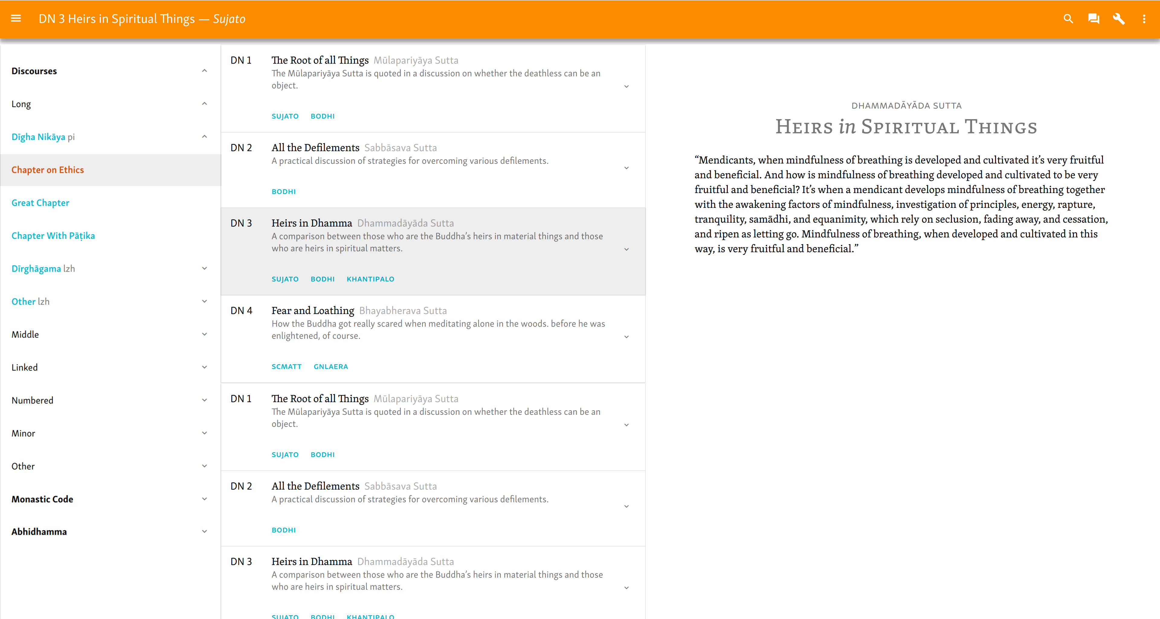
Text pages
The overall typography of the text pages can remain as is. See below for more on the typography
We don’t need to display the hierarchy in supertitles as currently, as they merely represent the same hierarchy that is present in the nav drawer. Instead, display the root language title above the translated title.
In addition, we can remove the ID numbers from Sutta Titles, thus keeping it cleaner. The Sutta ID, Title, and Translator can be displayed in the Toolbar.
In some cases there is no title. If the title is empty, use the ID instead.
We can implement prev/next links at the foot of the page, as used on the MD spec site. Low priority.
Here is a standard text view.
- Translator is separated with em-dash, and italicized (like a signature). Obviously this doesn’t apply to root texts.
- Heading includes original language and translated title.
- There is quite a lot of variability here, so we need to test this.
- Use gold for the header: it is a reward!
- Maybe we can add an italics flourish to little words in titles: of, and, a, to … Low priority.
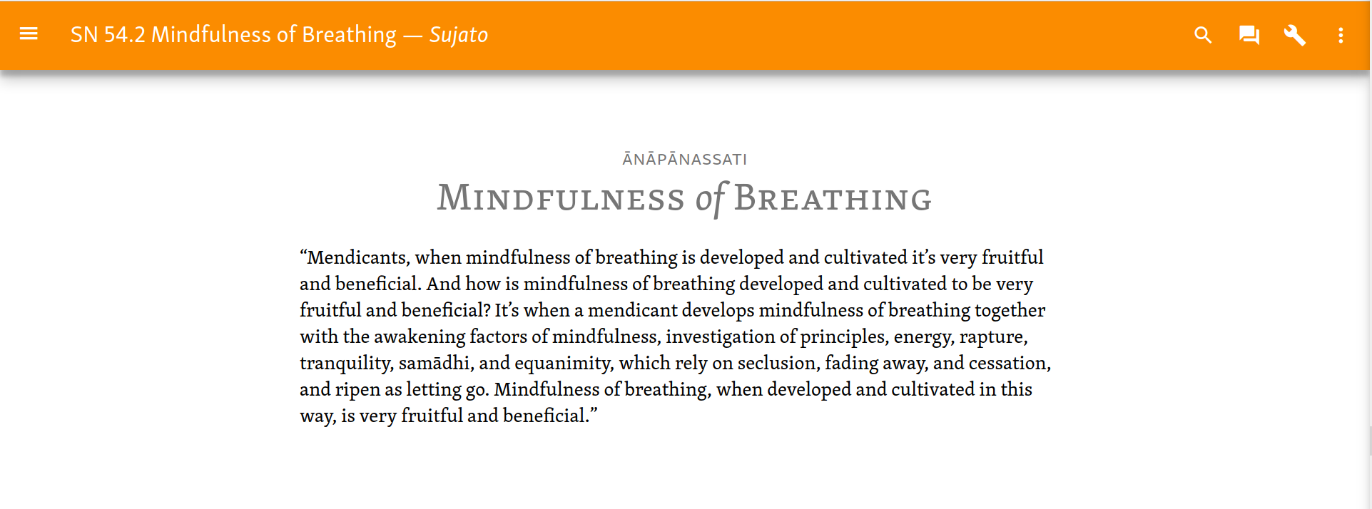
Text & Translation
Using the text view selector we can see text and translation line by line:

Or in columns. Widen the container for wide screens.

Note that in both these, the root text is in sans. This echoes the heading, where the root title is sans, the main title serif.
These can be produced with a few lines of CSS.
/* line by line view*/ .root-text, .translated-text { display: block; } .root-text { margin-top: 1.4em; } .translated-text { font-family: "Skolar PE"; } */ column view */ .root-text, .translated-text { display: table-cell; padding-top: 1.4em; width: 20em; } .root-text { padding-right: 0.7em; } .translated-text { padding-left: 0.7em; font-family: "Skolar PE" } .text-node { display: table-row; } */ <span class="text-node"><span-class="root-text">“Ānāpānassati,-bhikkhave,-bhāvitā-bahulīkatā-mahapphalā-hoti-mahānisaṃsā.</span>----<span-class="translated-text">“Mendicants, when mindfulness of breathing is developed and cultivated it’s very fruitful and beneficial.</span></span>
Another option, not shown, would be to show the root text as a tooltip.
Textual information
Currently the vol/page info is optionally displayed in the right margin. I cannot find any MD patterns that fit this. Unless anyone has a better idea, keep as is.
Variant readings, etc., are displayed with color variation. Again, keep as is.
Texts with sections
Quite a few longer texts are subdivided into sections. Show these in the nav drawer.
Note
An alternative pattern, found commonly on MD sites, is to include the inner navigation on the text page itself as a ToC. But this won’t work for us. Either the ToC is inline with the main content (as on the main MD spec site), which doesn’t work when there are many sections, as we sometimes have; or it is in a second column, which then has to be adjusted for mobiles, either put inline, or in the nav drawer.
The section view will display a numbered list of sections, which replaces the standard nav hierarchy. To return to the standard nav hierarchy, we use what MD rather confusingly calls the “up button” (which is in fact an arrow pointing left.)

Since these sections are numbered, there is no need to further indicate the hierarchy level.
Navigation flow
So now we have looked at the three essential elements of the site content, let’s consider how they fit together.
Functionally, this would work thus. First you navigate to the appropriate level of the hierarchy in the nav drawer. You click on a division, pannasa, nipata, samyutta, or vagga, etc., and the relevant suttaplex list is called up. You can then scroll to the relevant sutta, view the parallels if you like, or select the text.
How should this be implemented?
Mobile
The Suttaplex list should be on its own page. This is essential in order to make full use of the screen width. This has the disadvantage that you cannot navigate directly from sutta to sutta, but have to go to an intermediate sutta list page. Having said which, this difference is probably more theoretical than practical.
Wider screens
For wider screens, MD allows, for desktop only, a “cascading nav drawer”. Clicking on an item in the nav drawer opens a second panel, expanding the nav drawer horizontally. On a wide screen, this could be displayed at the same z-index as the nav drawer and the text, i.e. they all literally sit side by side as three columns. I don’t think a cascading nav drawer as such is quite right, since what is expanded is a complex list, not a set list of items. Still, it is not too dissimilar.
Here’s a mockup of that.
In somewhat narrower screens, such as tablets, the nav drawer and sutta list might be an overlay on the text.

However, this view would not work at all on mobile. So to keep development simple we should probably begin by developing for mobile, using a separate page for the sutta list view. At least we can be sure that this will work anywhere. We might consider implementing it as a cascading view later, if it seems useful.
Tool bar
The top header AKA Title bar AKA “Tool bar”.
The Toolbar keeps similar behavior to the current design. I.e. it is narrow, retracts on scroll-down, and reappears on scroll-up. This is the default behavior of the Polymer app layout:
The essential elements are, from left to right:
- Hamburger for nav drawer
- Adaptable title
- Search
- Forum
- Tools/settings
- Vertical menu
≡ Middle Discourses 🔍 🗪 ⚙ ⋮
Tools and chat are context dependent.
Color
Toolbar background color should change according to context. Rather than the pastel yellow we use currently, we should use a bold color as usual for MD. We can define distinct colors for:
- Home page
- Suttaplex lists
- Text pages
- Search results
- Static pages
Let me discuss each item in turn.
≡ Main site navigation
Opens the nav drawer.
This one is cute:
Adaptable title
MD typically eschews the traditional “Home” icon. Instead, “Home” appears at the top when the nav drawer is opened. This is seen both in Inbox and the MD specs site.
Meanwhile, the Toolbar displays a context-dependent title.
- On suttaplex lists, this would replace the “caption” on the division pages of the old site.
- On text pages, we can have the Sutta title and translator.
- On search pages, the search term (?)
 Search
For apps where search is not the main purpose, such as SC, MD specs say display just the icon by default, and expands on click.
Use expandable search
There are a number of different styles of search fields in MD apps. I dislike extreme search fields, where clicking on the icon radically changes the view (like, say, https://www.wired.com/). Better to modestly expand from the current position, as for example, https://material.io.
According to the spec, search results should be presented as cards. Use similar typography as the Lists in the division view. The difference is that, whereas a list is of sequential items, and hence flows without break, search results present unrelated items, so they are separated, i.e. each one is a “card”. Note: I’m not really convinced about this. Google itself usually uses lists for search results, and cards seem a bit too much.
Use MD Tabs for the various search options.
Use a distinct header color. Green means “Go!”
🗪 Forum
Connection with Discourse is similar to use of social media widgets, etc. Display this everywhere, and add badges indicating the number of conversations where relevant.
On click, it should open a dropdown menu listing the conversations, as in the current design. If there are no conversations, have a dialogue saying what Discourse is, and inviting them to join.
Use MD list
 Tools
Tools
Use MD dialogue
Dialogs inform users about a specific task and may contain critical information, require decisions, or involve multiple tasks.
Dialogues can include a greater variety and complexity of interactions as opposed to Menus.
The Tools dialogue would be context specific, and would only appear on Text pages. By appearing only then, it calls attention to itself.
It would include:
 Textual Information
 Lookup dictionary
 Script switcher
- Text & Translation view selector (not yet implemented)
- ⇄ Parallels and References
- Metadata
Generally speaking, when choosing from a set of options, it is best to use a dropdown menu. This is especially the case if there are many options, and in cases where the number of options can vary or grow over time.
Here is a discussion of each element.
Textual Information
Toggle with a switch
Lookup Dictionary
Lookup Dictionary occurs on Pali and Chinese pages only.
Use a dropdown
Rather than having separate “select” and “activate”, as currently, include “none” as one of the options.

Script Switcher
The script switcher allows to select one from a group. It occurs on Pali texts only.
Use a dropdown.
Text/Translation view selector
The Text/Translation view selector allows the user to compare the translation with the original text in a variety of ways. Each of this has its own use case.
 Columns are good on a wide screen.
 Line by line is for narrow screens.
 Popup is good for occasional checking if using a mouse.
Use a radio button group.
Parallels and References
Open “suttaplex URL” in new tab.
Metadata
Metadata displays the information as in the current metadata tab.
Toggle view with an expander.
In addition to the info currently available, extract data from github, such as contributors, last modified, etc.
⋮ Toolbar Menu
Menus in MD display a list of choices, with one choice per line. They are not used for primary navigation. Represent with a three vertical dot icon (AKA vertical ellipsis) at the far right of the Toolbar.
Whereas the Tools is for the text pages only, the Toolbar Menu applies site-wide. Here we include:
 Change site language
 Donations
 Downloads
 Acknowledgements
- Methodology
- Abbreviations (include “Numbering”)
- Bibliography
- Free, Open, Safe
- About SuttaCentral
Change site language
This switches the UI, etc., i.e. it applies the i18n.
Use a dropdown menu. Also see:
No Help
Help = 
Among the many, many disadvantages of help pages:
- Who uses them?
- When was the last time you ever used a Help page on a website? Was it in a year that started with a “2”?
- According to Google Analytics, the current Help page accounts for 0.01% of our page views, with a bounce rate of 100%.
- Hard to update
- Each time the site changes we have to check it. Our current Help hasn’t been updated for years, and I am sure it has lots and lots of wrong things. Who cares? Not me!
- It’s almost impossible to anticipate answers to specific problems with a general solution.
- Someone goes on to the site who knows nothing about computers. Like, literally, say a Burmese monk who has just got their first Android phone and has never used the internet before. “Click” on a “link” or “use search” or “open sidebar” are just meaningless to them.
- Someone else comes on who wants to know how to extract JSON data via our REST API.
Let Help die already. Use Discourse instead.
Donations
Use a Stripe form:
Downloads, Acknowledgements, Methodology, Abbreviations, Bibliography, About
These all lead to static pages. We can review them, but otherwise they stay much the same.
Free, Open, Safe
Here we can include:
- Copyright policy
- open source policy, link to Github
- security, privacy policy
This page is expanded from the current Copyright page, and gives an overall view of the ethics and legalisms of our site. If we call it “copyright”, it sounds like we are making copyright claims, rather than relinquishing them, so let’s call it the opposite.
We can explain the copyright situation as currently. In addition, promote the open source nature of our work, encourage people to fork the repo, etc. And we can make an assurance that there is no advertising, tracking, etc. on the site.
Home Page
On the Home page, use an extended Toolbar, which contracts on scroll down, as, say here:
We could include various elements, but for now I have included a “Quote” card and a brief Introduction. Other possibilities might include:
- Index
- Video intro/explainer
- What’s new
- Info about books, or other SC things
- display latest discussions from discourse
Screenshots of the Home page are included in the section on Navigation. Here is a discussion of the elements.
Home box
The top of the nav drawer has a box with the site title and icon. It is styled similarly to the current SC header, but with a brighter yellow.
Nav list
Pretty much according to MD spec, with adjustments as discussed under navigation.
Nav footer
MD suggests using the bottom of the footer for basic functional links, such as typically go in a page footer. Here we have just one link, which leads to the About page. Note: I have changed my thinking on this, so the mockups are out of date. But I think we should just put this stuff all in the Toolbar menu., q.v.
Tooltips
We use tooltips for various things:
- variant readings
- dictionary lookup
- notes in tabular pages
- extra bibliographical info in tabular pages
The role of tooltips is fairly minor in MD, and they are not supposed to use styled text. Oh, well, let’s be rebels.
We can use MD tooltips in the variants and dictionary lookup, there seems no other way of doing this.
As for the use in tabular pages, we can probably improve this.
For the extra bibliographic detail, this applies to vol/page info, so only shows when that is selected. We recently implemented a … to indicate that the text can be expanded. Why not, rather than a tooltip, use “show details on click”, something like:
Vaidya 1958a: 260–263; Speyer 1970b: 197–206
VAIDYA, P. L. 1958a. Avadāna-śataka (Buddhist Sanskrit Texts No. 19). Darbhanga: Mithila Institute. / SPEYER, J. S. 1970ab (1906). Avadānaśataka: A Century of Edifying Tales Belonging to the Hīnayāna, vols 1 & 2 (Bibliotheca Buddhica III). Osnabrück: Biblio Verlag.
As far as the notes go, in fact they mostly include info for specifying the exact parallels. In other words, they belong in our parallels data. We should check this, add any needed data to the parallels, and see if we can eliminate this category altogether.
Typography
Typography is one area where I don’t like MD all that much. There is too much space around headers and the like; the default font size is too small; and the line height too large. Anyway, we can use their proportions for UI, but as far as the text goes, we keep what we have, more or less. Obviously we will make sure they harmonize.
-
While MD guidelines say to use 13sp as the base body size for Desktop, this is too small. Use the Device size of 14sp. (Currently we use system default, which is usually 16px.)
-
If using MD body text specs, choose the maximum font size with the minimum line-height, usually 14sp with 20sp line-height.
We should stick with Skolar rather than Roboto; both SC and MD use Noto as fallback. However, we should use the sans pretty much everywhere except for the text pages, where we use serif. Note that when we first built SC, the sans was not available.
MD has a rather eccentric use of font weights. Normally you’d have 400 (regular) and 800 (bold). A semi would be 600. But they use a 500 weight (Medium). This gives a subtle shift in certain cases. We can do this with Skolar if we like, though not with Noto where that is used. Probably it is not necessary.
Skolar serif is a little heavier than the sans, so it can be used to provide a subtle emphasis, similar to the Medium weight. However, the main use of the serif is to indicate the text, as opposed to the UI, data, etc.
In flat buttons, use all caps bold.
We should take care to implement the i18n guidelines.
Data and Intentionality
Data should be prefetched thoughtfully. We should not hit the user with large and unexpected downloads, however we can prefetch certain data when it:
- is not too much
- will help the user
The data for the nav drawer can be prefetched when arriving at the Home page, or on any other page.
- Load all, or just the suttas?
When opening a division view, should we;
- Load at the time?
- Prefetch the descriptions, etc?
- When do we fetch the parallels data?
Ideally we would prefetch all the data usable in the Tabular pages, leaving out only the text pages and static pages. But we have to see whether that is feasible.
Generally speaking, texts should not be prefetched. The data is too great, and the predictability too low, for this to be useful. But for full offline use, we give the user the choice to download all texts in languages of their choice. The dialogue for this should be:
- Download texts to use offline →
- Interface English 🞃
- Texts English 🞃 (Approximately 100 MB)
- Once selected, give option for other languages.
- Include original texts? Y/N (Approximately 210 MB)
- Time
- Download now

- Download when connected to wi-fi
- Download now
Colors
Use MD colors, with Amber 500 as the prime color.
As a background, when designing the original site, I chose to use the basic color a shade of gold or yellow. Gold is the definitive Buddhist color. It is heavily emphasized in the Suttas, as the color of the Buddha’s skin, as well as countless similes. In Buddhist traditions, gold is used to represent the glory and value of the Dhamma. Further, as the color of the rising sun, it represents awakening and higher consciousness.
Note
Little known piece of history. When I first built the site, I wanted to use a vivid gold. However, the World Tipitaka site, which hosted our Pali texts at the time, also used this color. I didn’t want to make it look like we were imitating them, so went with a softer pastel.
In contrast with the bright and vivid colors and decoration used in traditional Buddhism, most modern Buddhist design is plain and drab. While we obviously don’t want to make the site look busy, unexpected and bold use of color engages interest and delight.
The color of the headers indicates a journey. The Home page has the primary color, amber/gold. This is reflected in the nav drawer, which echoes the same color. Tabular and search results pages use different colors—red and green, respectively—and when arriving at the Text pages, the primary color appears again: the journey is complete.
Use Cyan for the accent color.
Icons
We should find an experienced designer to create a main site icon according to the MD guidelines.
Consider using the Brahmi lotus character as the basis for the main site icon. It is more elegant and distinctive than the wheel, and links with the specific Buddhist innovation of written texts.
For the general site usage, we should use MD icons where possible.
Here I will maintain a list of the specific icons, with the MD names and SC usage. Most of these are found above. If they clash, these are correct.
Toolbar
 Menu — main site menu
 Search
 Clear — clear search
 Forum — link to discourse
 More vert — minor menus
 Settings — Tools and settings for text pages
Toolbar minor menu
 Language — select site language
Pray — donations. Not found in MD icons.
 File download — downloads
 People — acknowledgments
Settings dialogue
 Info outline — Metadata
 Visibility — Textual Information
 Swap horiz — Parallels and References
Comment — view dictionary lookup
Text and translation
Reorder — line by line
 View Column — columns
Comment — popup
Navigation
 Expand more — open expanders
 Expand less — close expanders
 Arrow down — from Details view, go to Details for another sutta
 Arrow back — From text with sections, go back to main nav tree
 Help
Help
 Close — close dialogues, etc.
Details
Relations
Swap horiz — full parallel.
Compare — resembling
Format quote — mention
Cached — retelling
Details minor menu
 Content copy — copy table to clipboard
 Share — copy link to specific Details
Format quote — cite
Text pages
 Book — view text page
Share — copy link to segment
Not all of these are ideal, however we should just use the MD ones for convenience to start with and can modify later if needed.
Regarding Cite and Mention, the “format quote” icon is not really semantic. Sometimes this kind of icon is used:

https://opencontext.org/about/
https://www.123rf.com/photo_3994
Resources
Random fun stuff
Check this out:
http://polymerel.github.io/d3-layout-tree/components/d3-layout-tree/#d3-layout-tree
It’s not entirely functional, but it’s a cool idea. It lets you visualize the relations between things. Maybe we could implement something like this as a fun way to visualize the texts? But it belongs on its own page, not in the nav drawer.

")

