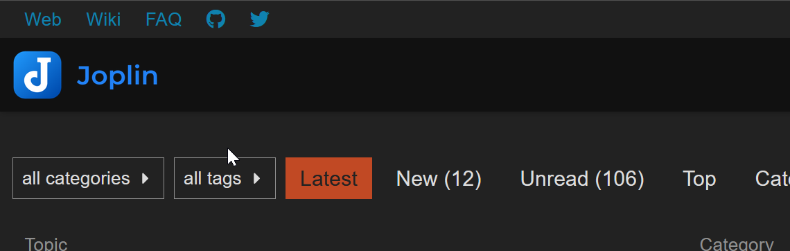
What I understand to be the internet standard is that clicking on the logo in the top left corner of the page should take you to the home page of the website you are currently on. I find the current layout so disruptive that I have removed the topmost part using Stylus™. Otherwise I am accidentally leaving the forum and going to a completely different (but of course wonderful) website.
I would propose making the header like this forum:
In this case the “Web” link takes you to their main website. Clicking on the Joplin logo takes you to the home page of the current website you are on, the forum.
This layout has the added advantage that it includes links to the wiki category as well as the FAQ category. And it also has a direct link to their github repository, which is something I feel is long needed on suttacentral.
Thoughts?
For anyone else with the same problem I have (and maybe that is no one) the following css will remove the header that takes you to suttacentral.net:
a#sc-backlink {
    display:none;
}
The other benefit of this if you are on a smaller screen is that it frees up wasted space (imho).
I have this problem when accessing the site on my Android phone, and I have skinny fingers too! Add to that mini panic attacks when doing mod work because I keep browsing off D&D and going to SC . If this could be improved Bhante Sujato…
I wonder if simply inverting “SuttaCentral” and “Discuss and Discover” might help? Then it would still be possible to get to the suttas but the topmost link would behave as expected?
Personally, I dont think so. Having a large logo link in a website header that goes to a (~totally) different website makes no sense to me.
I’d prefer an explicit text link like in the Joplin example.
Another aspect of the the ux problem is that when looking at an individual post, clicking on the lotus logo takes you to the forum home page. But then if you click the logo again it takes you to a (~) different website. That is really odd. Discourse has similar “same target/different outcome” problems elsewhere, but none that take you to a different site.
can we add the suttacentral link to the menu list that appears when you click the “three lines” between the magnifying glass and your gravatar? That would mimic the link to the discussion forum that appears towards the end of the menu list on the suttacentral site. that way the standard method of getting from one to the other would be the same on both, and not be crowding the forum in its mobile form.
The most confusing part is that once I’ve scrolled down a bit, then the new and colourful (red, ochre white) SC logo appears next to the topic title and clicking the colourful logo goes to the D&D homepage, whereas the white SC logo goes to SC
Also, not to pile on (I just love talking about design stuff like this ), but the color contrast of white on the --header_background value (#eee8aa) is pretty low. I could imagine either using a dark text color or perhaps a text shadow.
(That said, it’s an image, because Discourse seems to expect an image as the logo… I have the same problem on my own Discourse instance. To be sure, it looks the content of the logo is Skolar which is already on the page, so it seems like a text version would work just as well if Discourse could be made to obey…)
But this is all a digression from the topic at hand
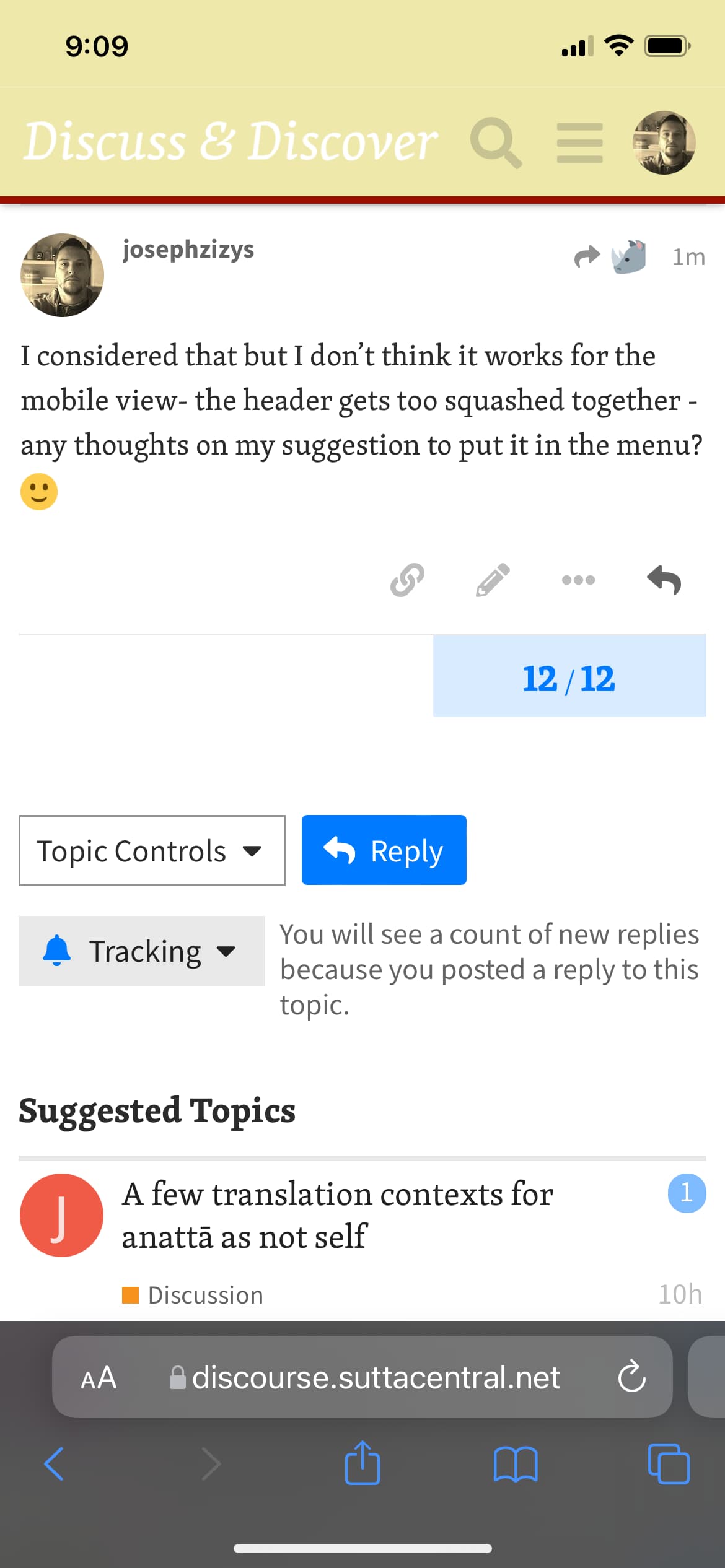
I considered that but I don’t think it works for the mobile view- the header gets too squashed together - any thoughts on my suggestion to put it in the menu?