The Suttas often speak of the beauty of the Buddha’s voice. It was sweet like a cuckoo, clear, well-articulated, neither too loud nor too soft. It was not just the content of his speech, but the manner of it that was persuasive.
Just as spoken words can have qualities that are either attractive or repulsive, so too do written words. And just as the manner of presentation of spoken words affects how they are received, so too with the written word. The craft of setting beautiful written text is called typography.
Typography has a long history, which has evolved a ‘canon’ of rules that embody the best practices of presenting the written word. These style guides are not merely arbitrary. They arise from long cultural experience of what makes a text easy and enjoyable to read.
Similar principles have been followed in typography both East and West. See, for example, this inscription from King Ashoka, one of the earliest examples of Indian writing.

Without knowing anything about it, it is easily recognizable as writing. The lines are regular, with similar sized characters, and spaced so that the characters are clearly distinct, but not so far apart that they lose a sense of organic connection.
But as an early example, it is somewhat rough around the edges. The lines aren’t straight, and the characters not perfectly formed. Here is a later, more sophisticated piece of Buddhist typography, from 18th century Burma.
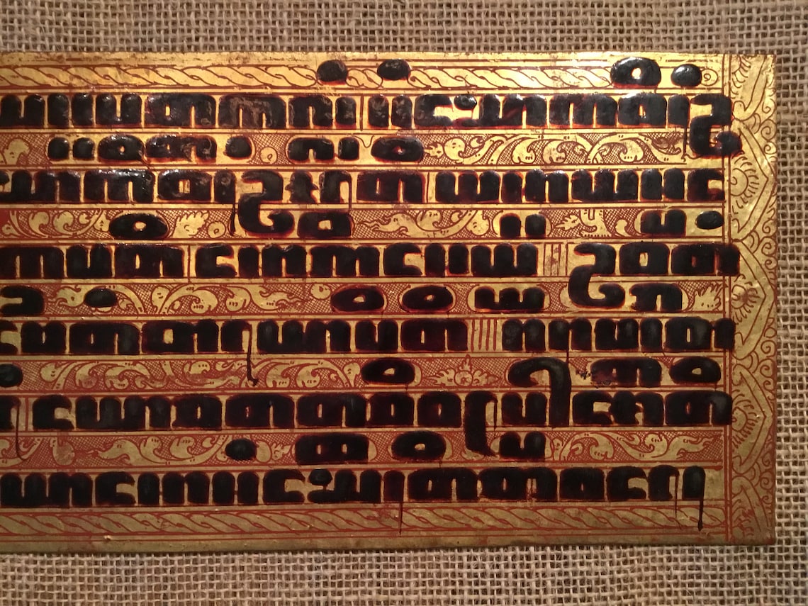
Here the typographic art has been raised to perfection. There is an unmistakable sense of care and precision about the piece; the harmony between the form and the content; the shapes of the letters, the integration of the decoration; the use of space; and so on.
This is what happens when care is taken to produce good typography. It’s not the expensive materials and decorations that matter, it’s the attention to detail.
And that is solely what typography is: attention to detail. Each little facet of the page is, in and of itself, trivial; but taken as a whole a well laid out page creates a harmonious form, which immediately, without fuss or pretension, informs the reader that they are reading something that is worth taking time over.
Typography leads a reader gracefully into the text, and invites them to care for the text’s meaning.
In modern Buddhism, much of this typographical tradition has become lost. We have incredible tools for creating beautiful books, yet when it comes to Suttas, we still fall behind the masterful designs of classical typesetting. Does it have to be that way? What if we were to take the best of modern software tools and make something extraordinary?
For the past several months, I’ve been working behind the scenes to make a pipeline for creating high-quality printed books from our SuttaCentral translations. The aim is to start with the English translations by Ven Brahmali and myself, and then extend it to other languages as mature translations are completed. Printed books will be available at first via print on demand, and later, for free distribution.
As with everything on SuttaCentral, I am making the greatest efforts to ensure all is done to the highest possible quality.
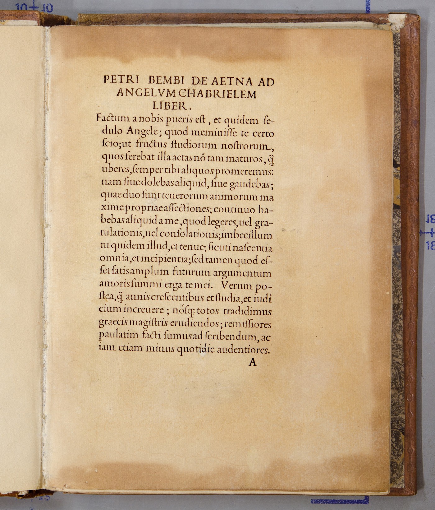
The foundation of beautiful books is a beautiful typeface, and to my mind there are none more beautiful than the old-style humanist book typefaces of the Italian Renaissance. Here is an example, Aldus 114R cut by Francesco Griffo in Pietro Bembo’s ‘De Aetna’, printed by Aldus Manutius in February 1496.
This style remains popular today under such names as “Garamond”, “Jensen”, “Bembo”, etc. For a long time I have looked for a font in this style that would satisfy my requirements.
- large character choice
- optical sizing
- excellent craftsmanship and design
Few fonts, whether free or commercial, make the cut. And of those that do, none support the special characters we need for Pali and Sanskrit.
Robert Slimbach is a type designer for Adobe who has spent much of his life developing and refining fonts in this style. Recently I have found myself drawn to his Arno Pro.
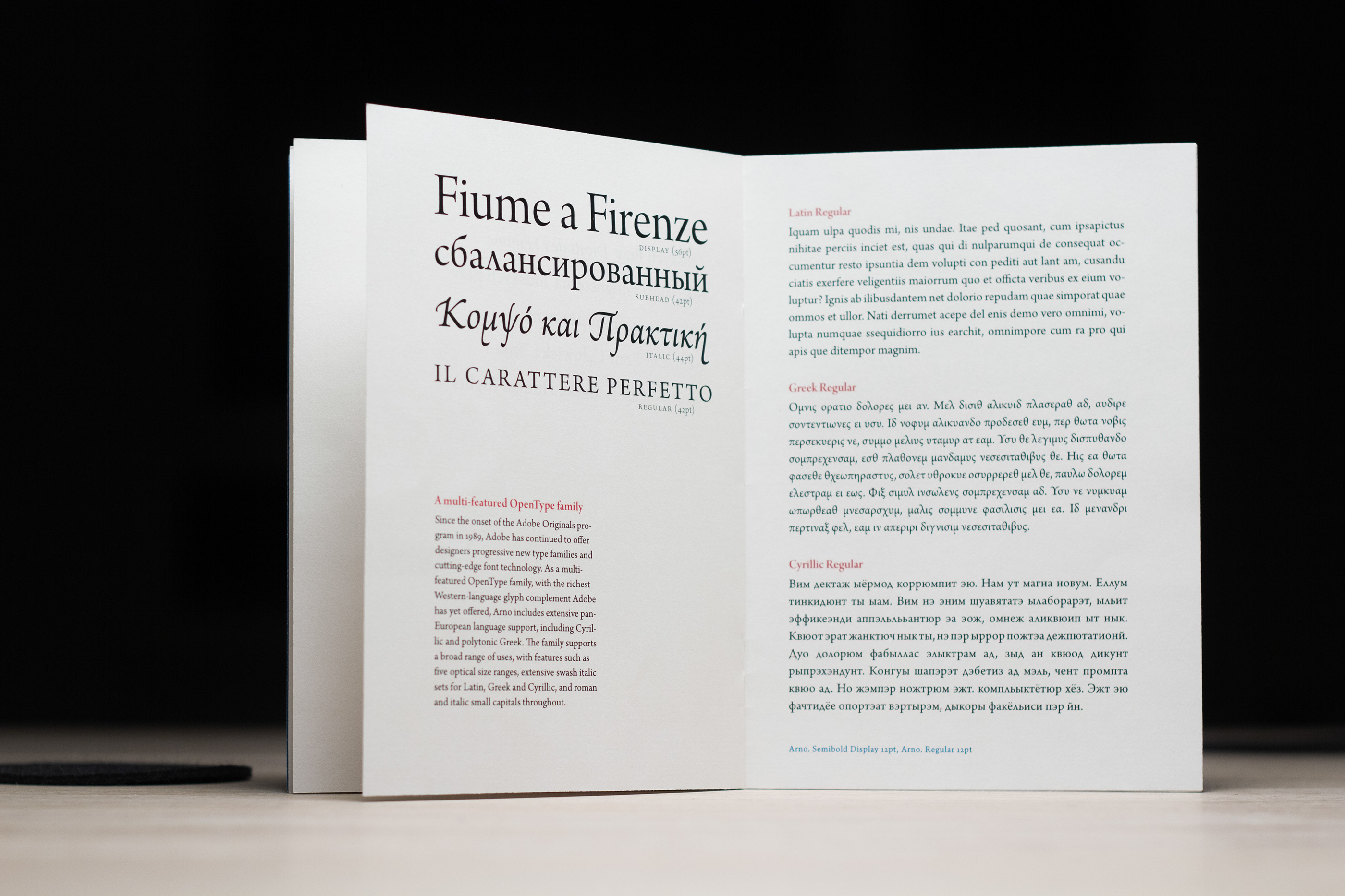
Named after the Florentine river which runs through the heart of the Italian Renaissance, Arno draws on the warmth and readability of early humanist typefaces of the 15th and 16th centuries.
While inspired by the past, Arno is distinctly contemporary in both appearance and function. Arno is a meticulously crafted face in the tradition of early Venetian and Aldine book typefaces. Embodying themes Robert Slimbach has explored in typefaces such as Minion and Brioso, Arno represents a distillation of his design ideals and a refinement of his craft.
As a multi-featured OpenType family, with an extensive Latin-based glyph complement, Arno offers extensive pan-European language support, including Cyrillic and polytonic Greek. The family also offers five optical size ranges, extensive swash italic sets, and small capitals for all covered languages.
This meets or exceeds all my requirements, except for one: it doesn’t support all the Pali/Sanskrit diacriticals. How to solve this? Commercial fonts are sold under licenses that prohibit changes to the font file. So we need a license arrangement to get around this.
I have approached Adobe and several other font foundries to see if this is possible, and up until now, have met with either a dead end or an exorbitant price. The cost of modifying the fonts has been quoted at around $10,000. This seems excessive; after all, it’s simply a matter of putting dots under some characters.
Finally I have got a good response from TypeNetwork. They assessed the work at an hour or two, and quoted accordingly. So now we can go ahead. We need to purchase a license for Arno Pro from TypeNetwork, who will modify the font files to add support for Pali/Sanskrit.
I won’t quote the exact cost here, as we don’t have a final quote from TypeNetwork. But if you check out the cost of Arno Pro from TypeNetwork, the cost of modification will add around 20% to the sale price.
I thought I would reach out to the community here first of all to see if anyone would like to sponsor this purchase. If you do, your generosity in Dhamma-dana will be literally how people will read the suttas!