Thanks so much for all your help in this @musiko and @sabbamitta!
4 Likes
I love it when you guys talk technical. 
3 Likes
Hi Ayya @Vimala I’m still Loving the Light. ![]()
![]()
![]()
![]()
![]()
Overall it’s the easiest read for me, but two details don’t quite work (they seem better on the dark theme, but as I’m not using it regularly I may not be the best judge):
1 - there’s almost no differentiation between the greys that indicate what has been read and not read in the notifications menu and is very .hard to see at all.
2 - The stuff colour is the same grey as the grey behind quotes; I think it needs to be a bit shrieky so that users realise staff messages are of a different order.
![]()
5 Likes
What’s ‘shrieky’?
1 Like
Shrieky is the property of shrieking loudly. A colour that is bright and draws attention to itself. ![]()
2 Likes
Hah! Kidding ![]()
1 Like
Was I drawing attention to how the moderators behave? 
5 Likes
No I couldn’t pronounce the word and it took me a second before I understood what it meant! The moderators are doing a brill job 
 .
.
5 Likes


I like the green!
3 Likes
I’m still on the dark side. 
5 Likes
Me too! ![]()
5 Likes
I’m still on the dork side! 
9 Likes
I have very much come to like dark themes! ![]()
However I have come across a thing in the SC dark theme, I don’t think it’s relevant here on D&D:
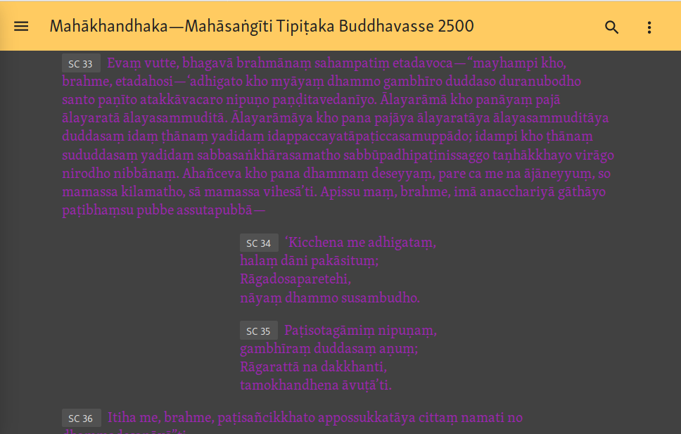
Passages with variant readings are marked in purple which becomes very difficult to read in the dark theme. Anything that can be done about this? With much thanks! ![]()
3 Likes
![]() Wow. I cannot read that at all!
Wow. I cannot read that at all!
2 Likes
Looks like there is a problem with the text here. Which sutta is this? The variant reading should not span more than a few words but not such a large amount of text.
@sujato?
1 Like
It’s in the Vinaya, Kd 1. The screenshot shows it from SC 33 on, but it’s a large section and doesn’t all fit in one screenshot.
1 Like
The variant is correct, it’s just an unusually large variant reading. The text has a passage, then a 'second" and a 'third" repetition, but the repetitions are not in all editions.
But obviously the colors for the dark theme need some work. I’ll put it on the to-do list!
3 Likes
Thank you!
2 Likes